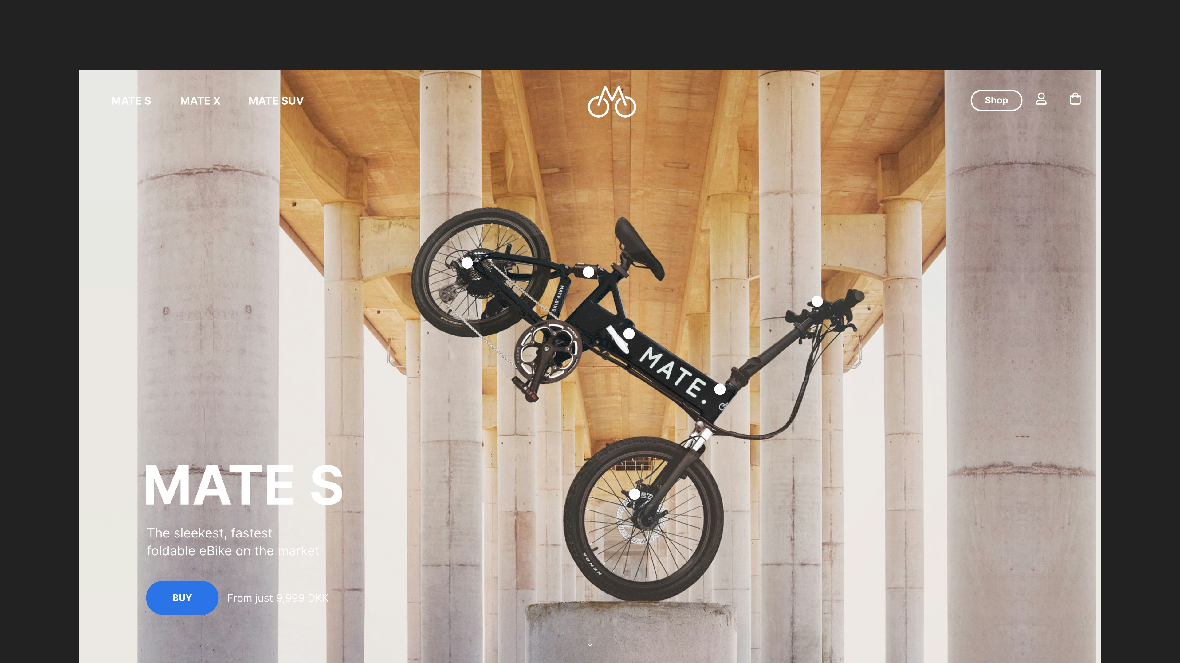
Mate.
Helping MATE.bike level up their brand experience
Client: MATE.
Key Focus: Brand
Timespan: 2020-2021
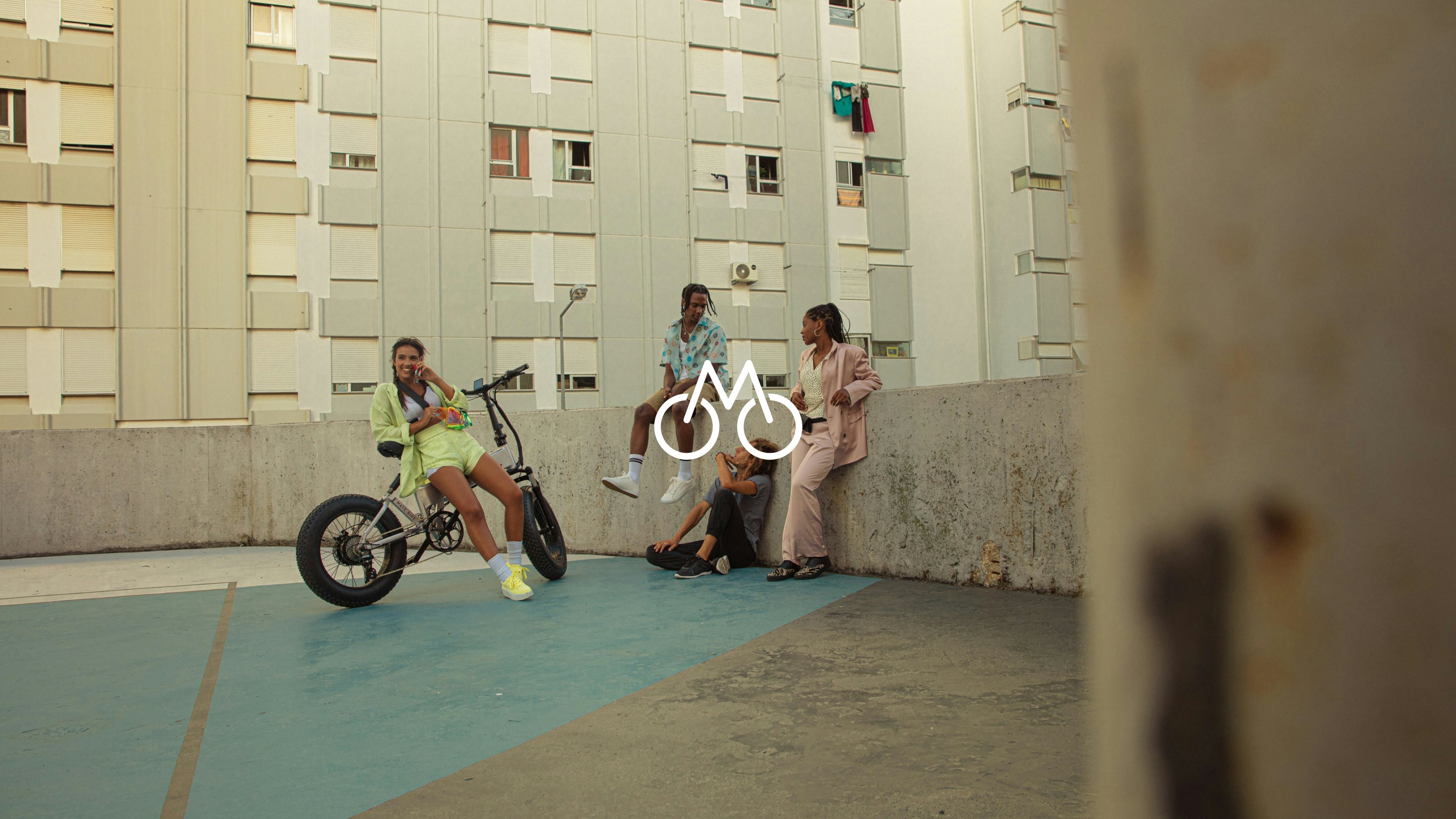
Case video
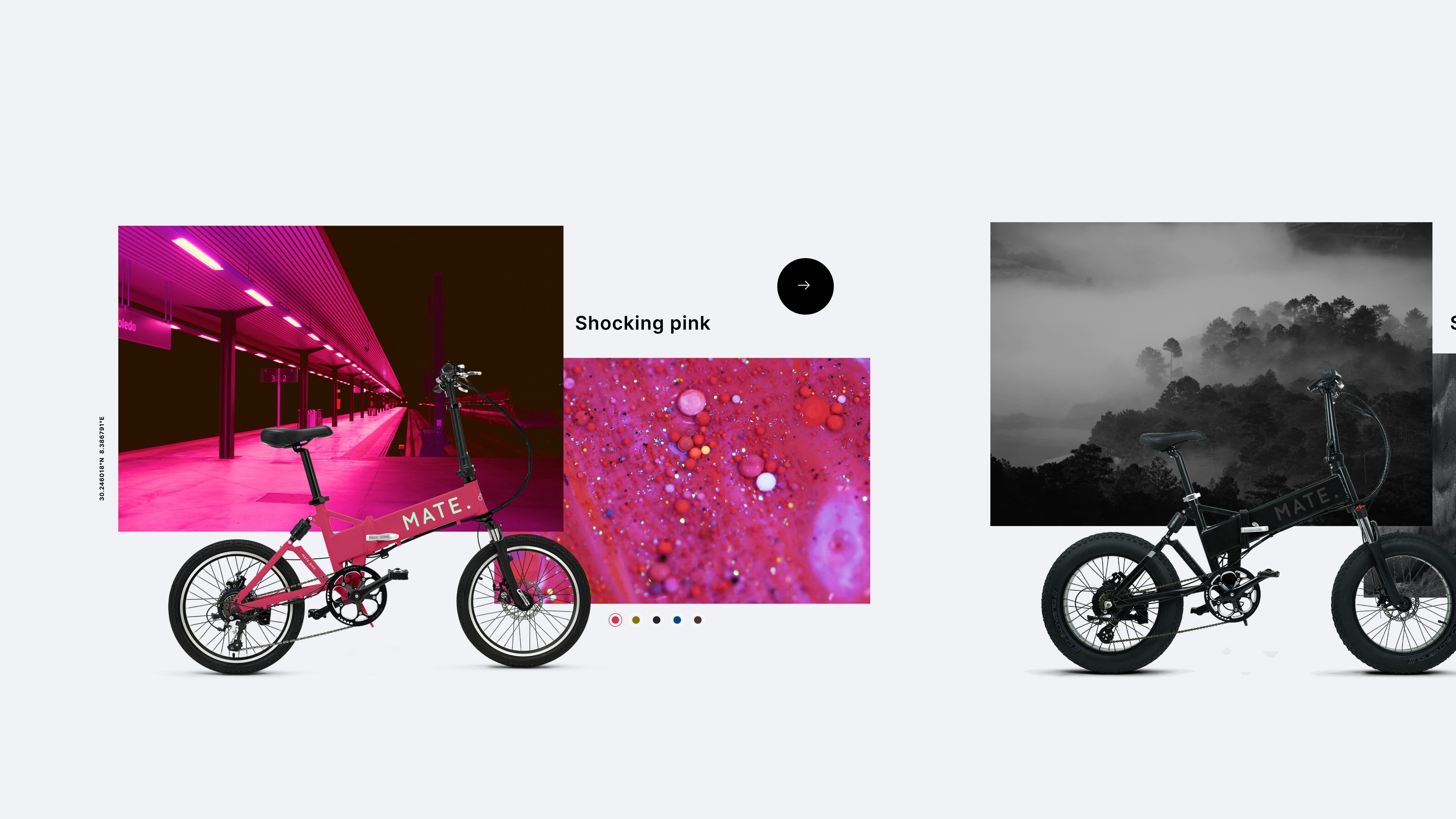
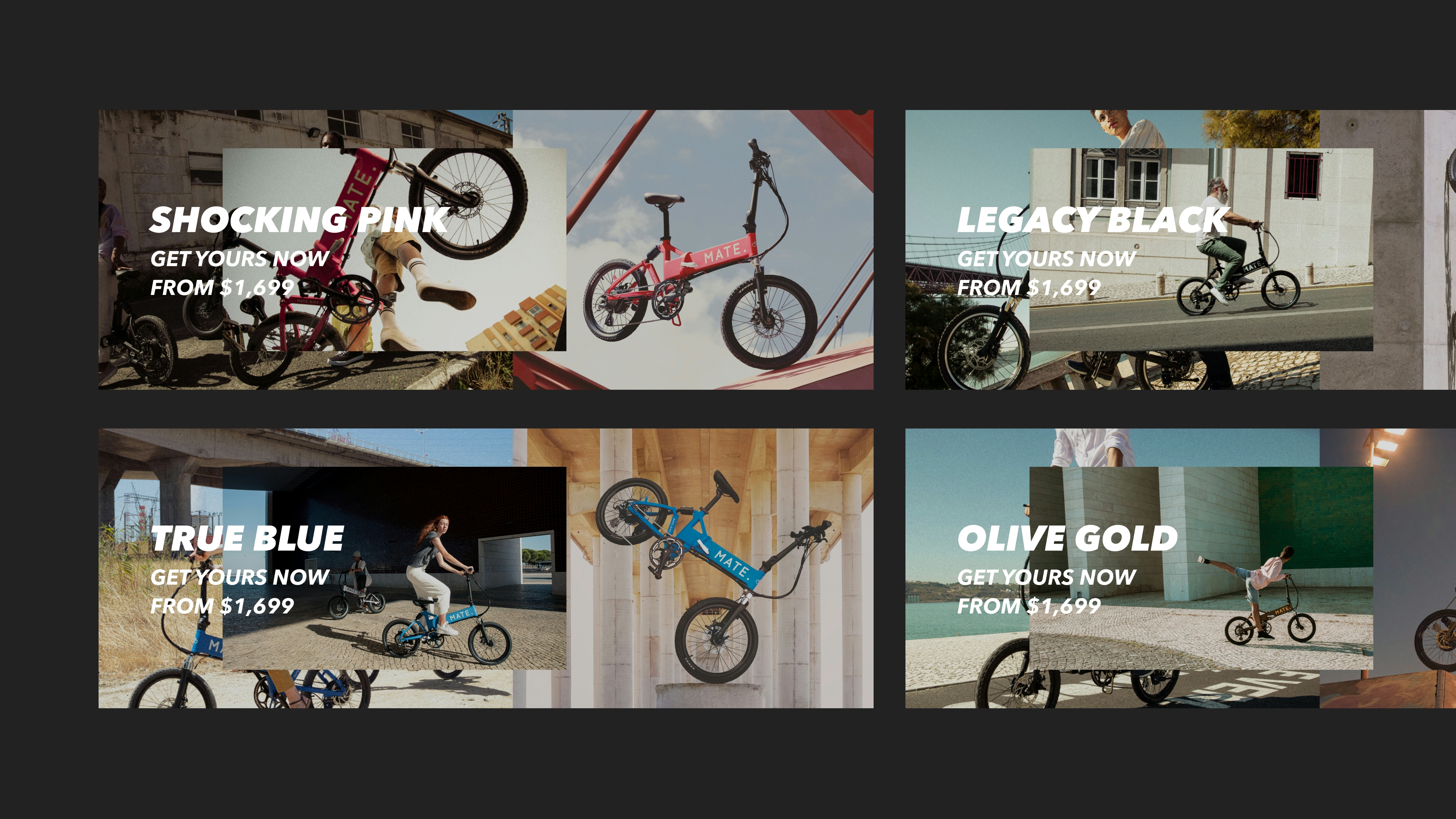
Color universes for each bike
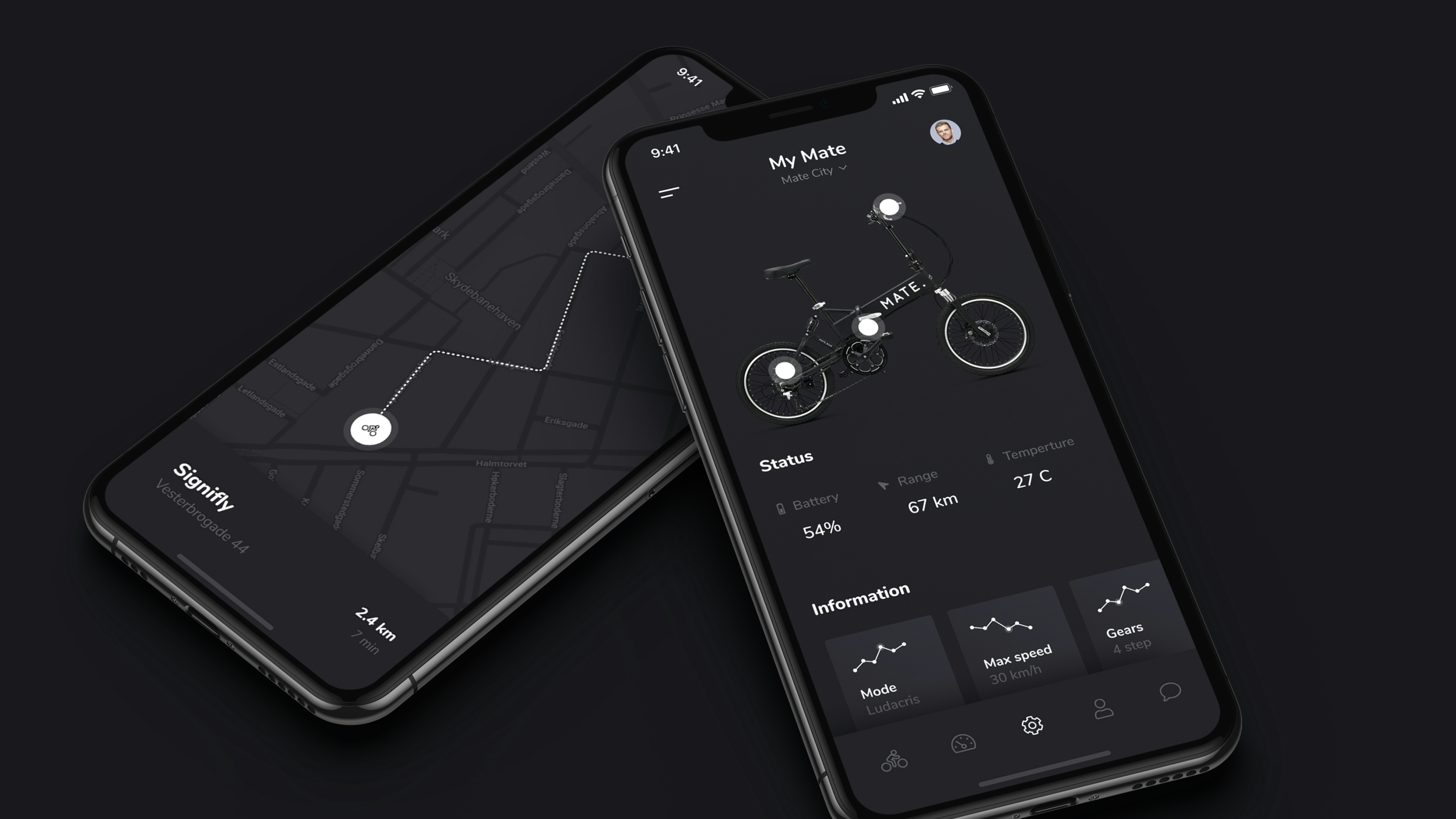
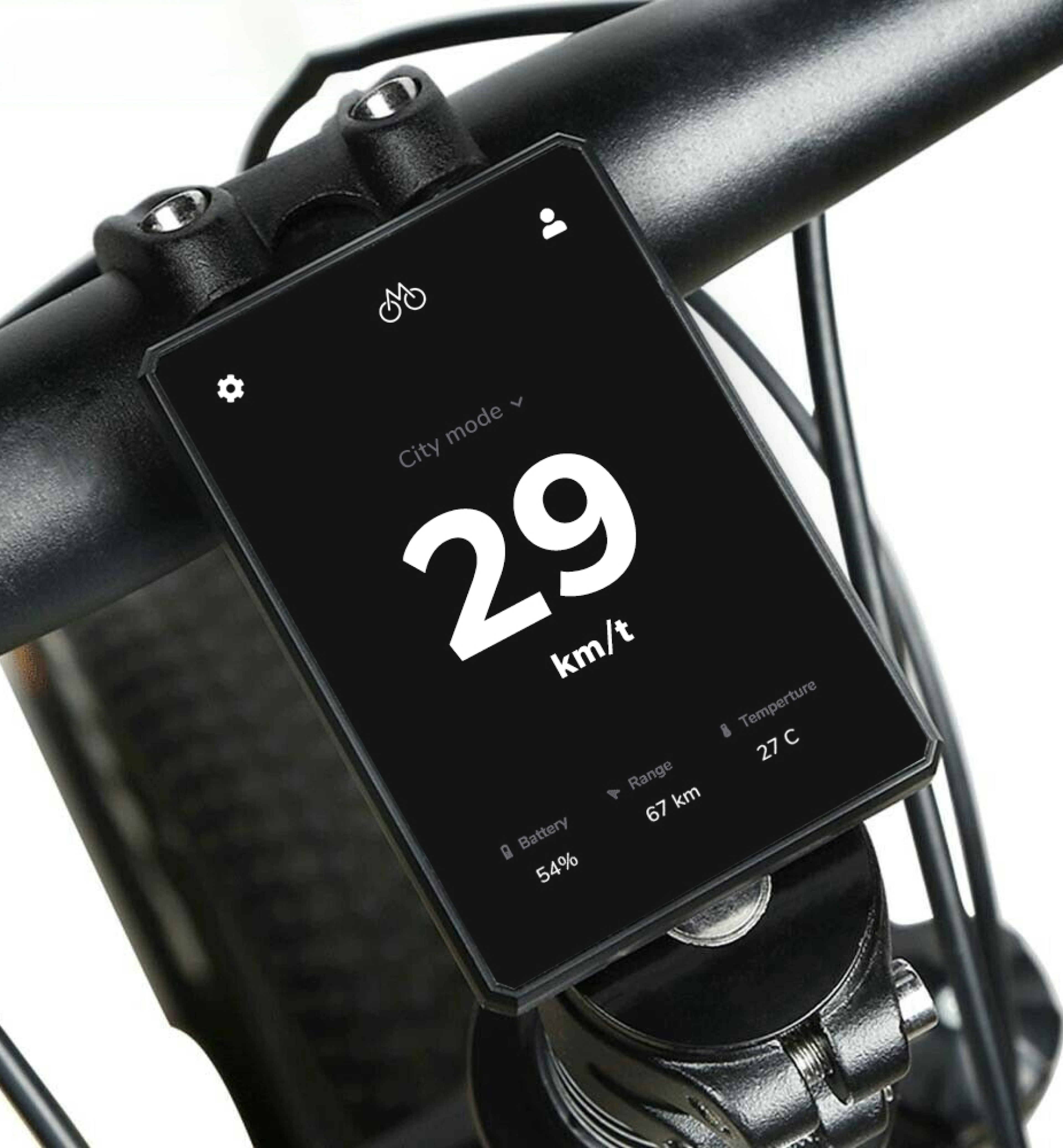
Companion app
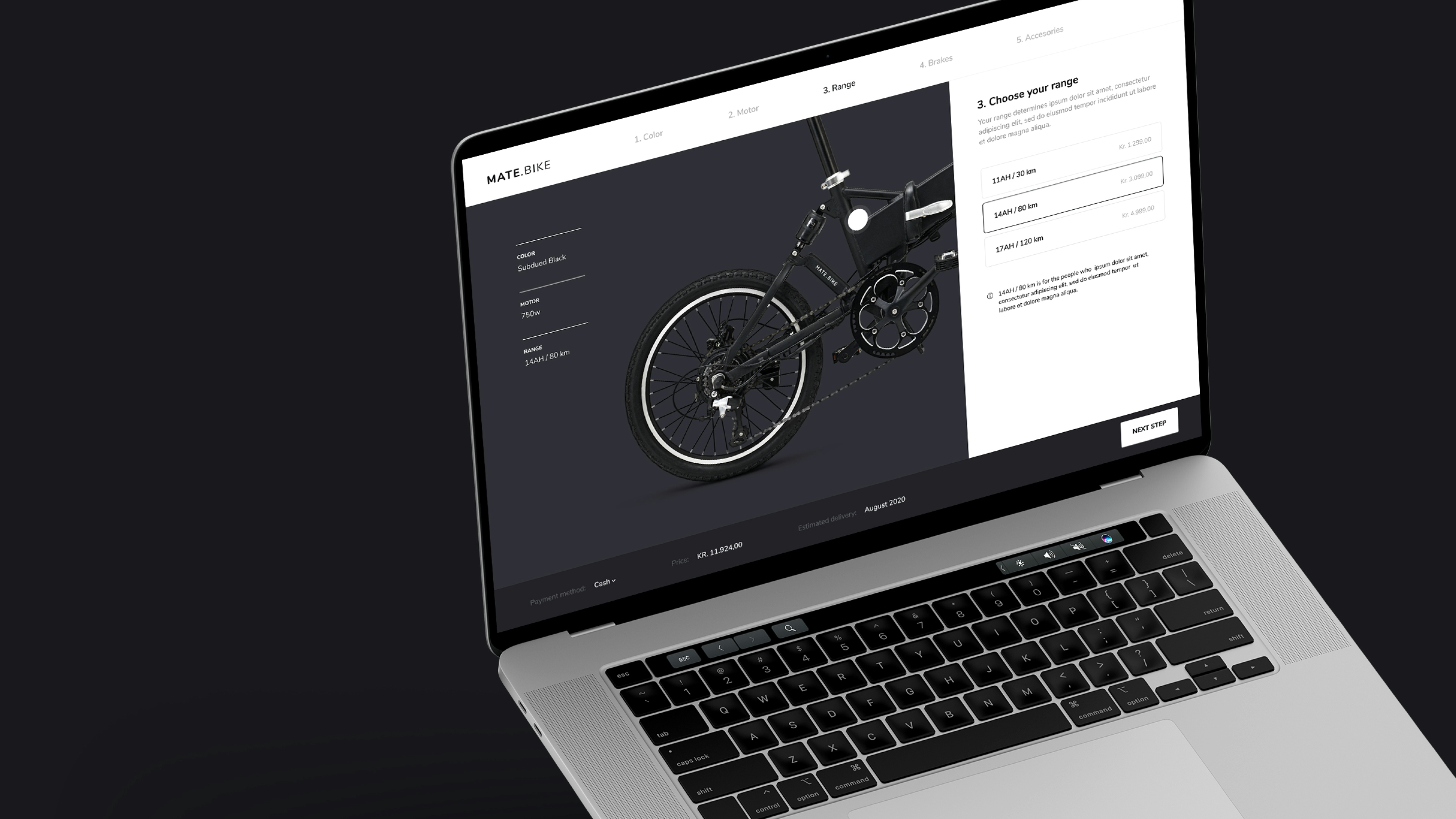
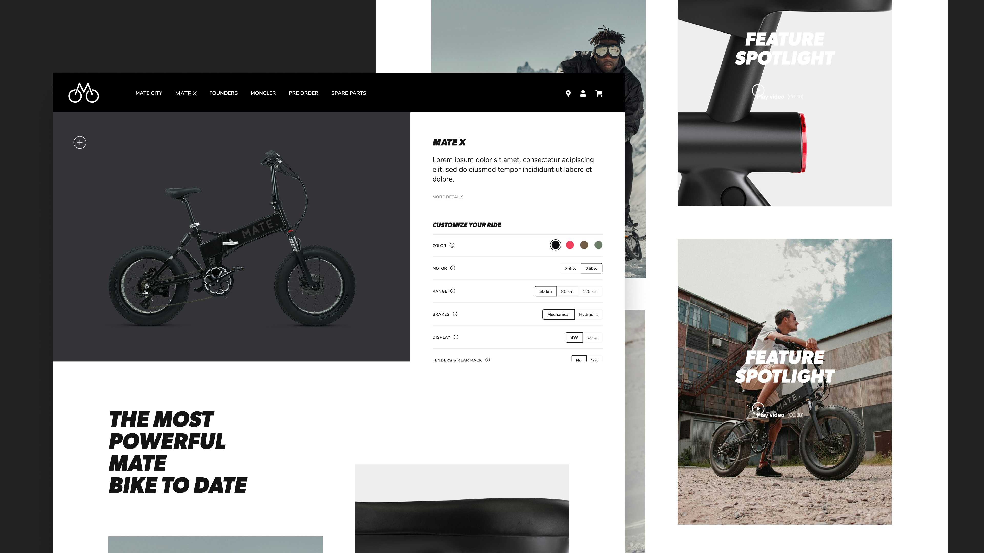
Customization and checkout
Mate X Campaign video
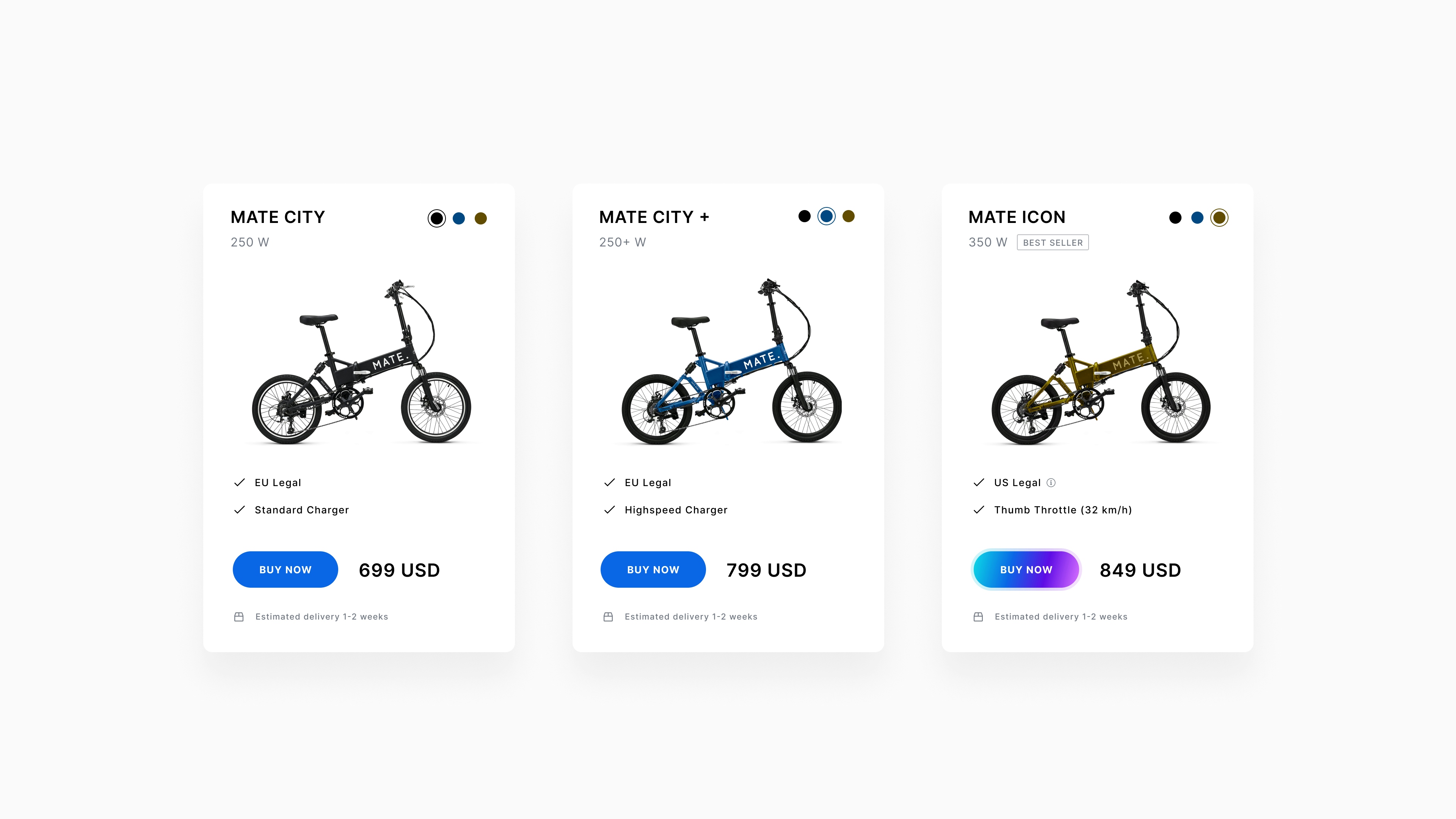
Optimization of ecommerce experience
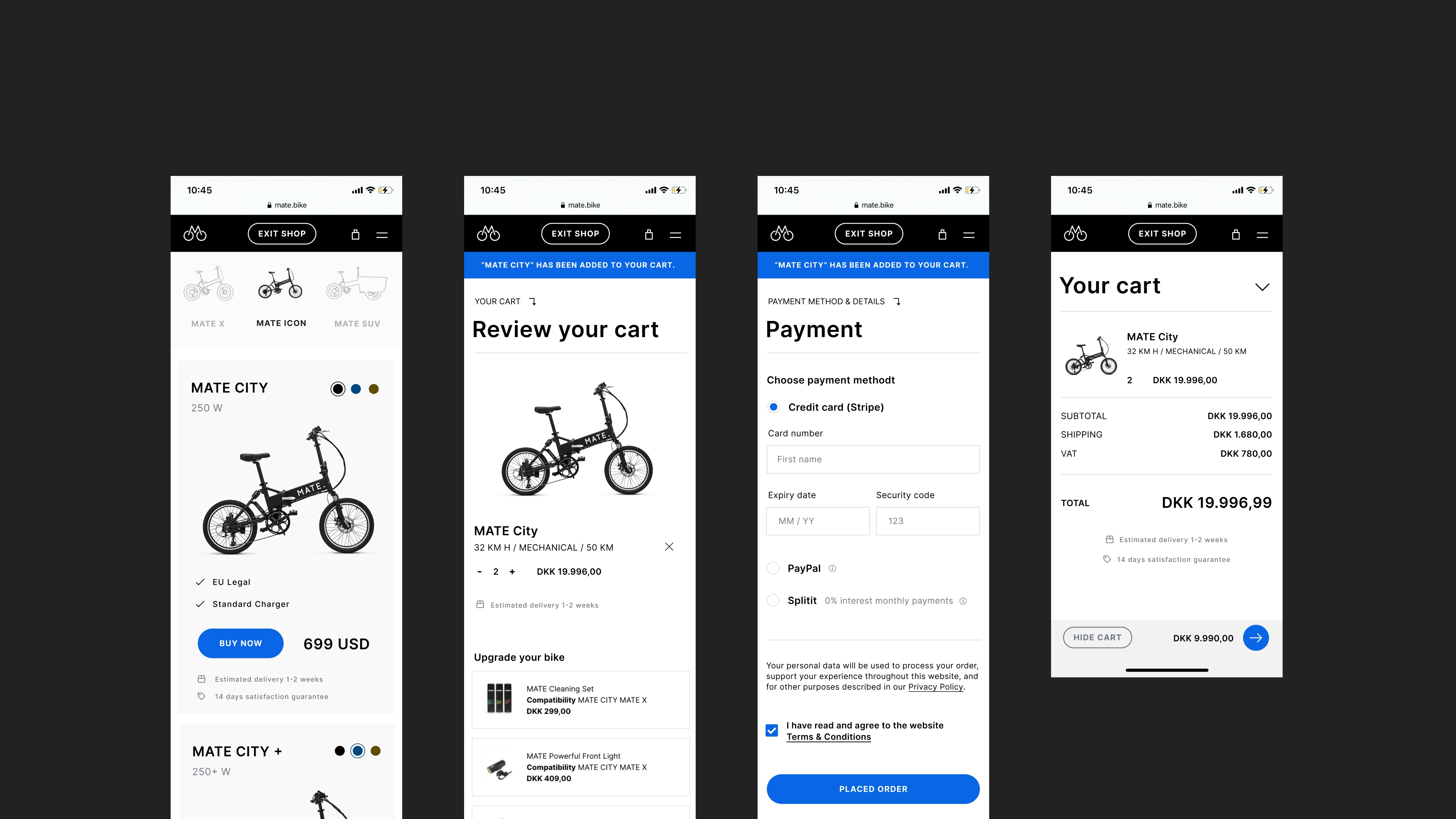
Checkout-flow optimization
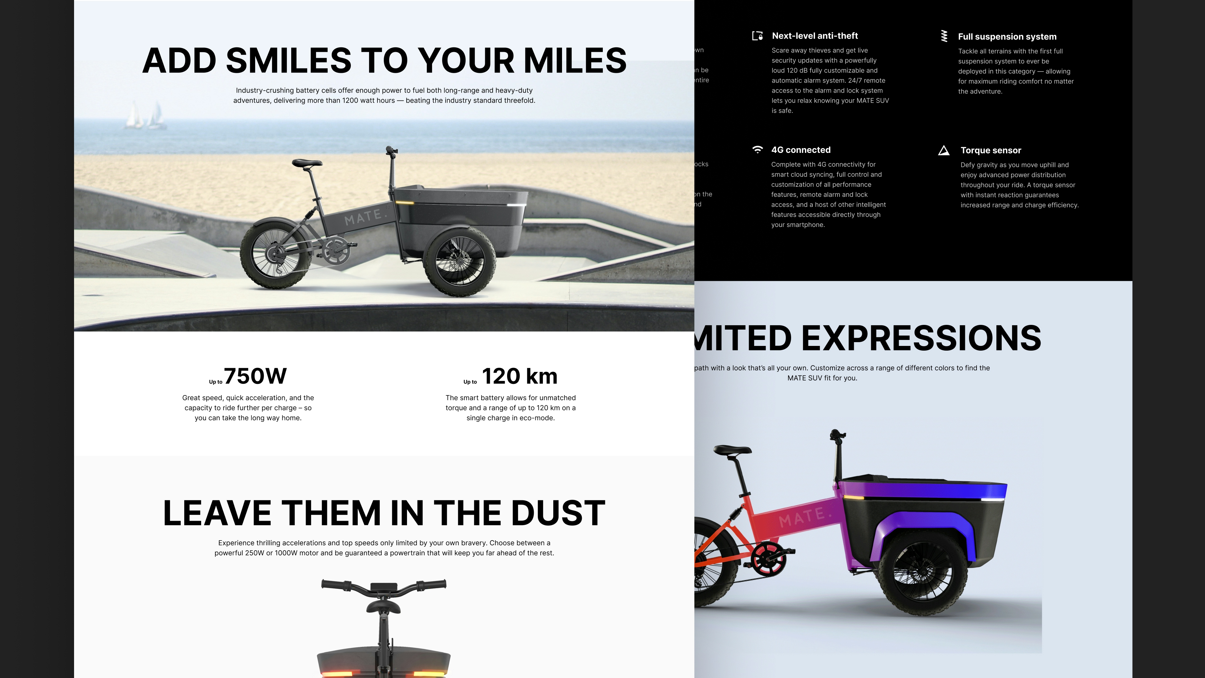
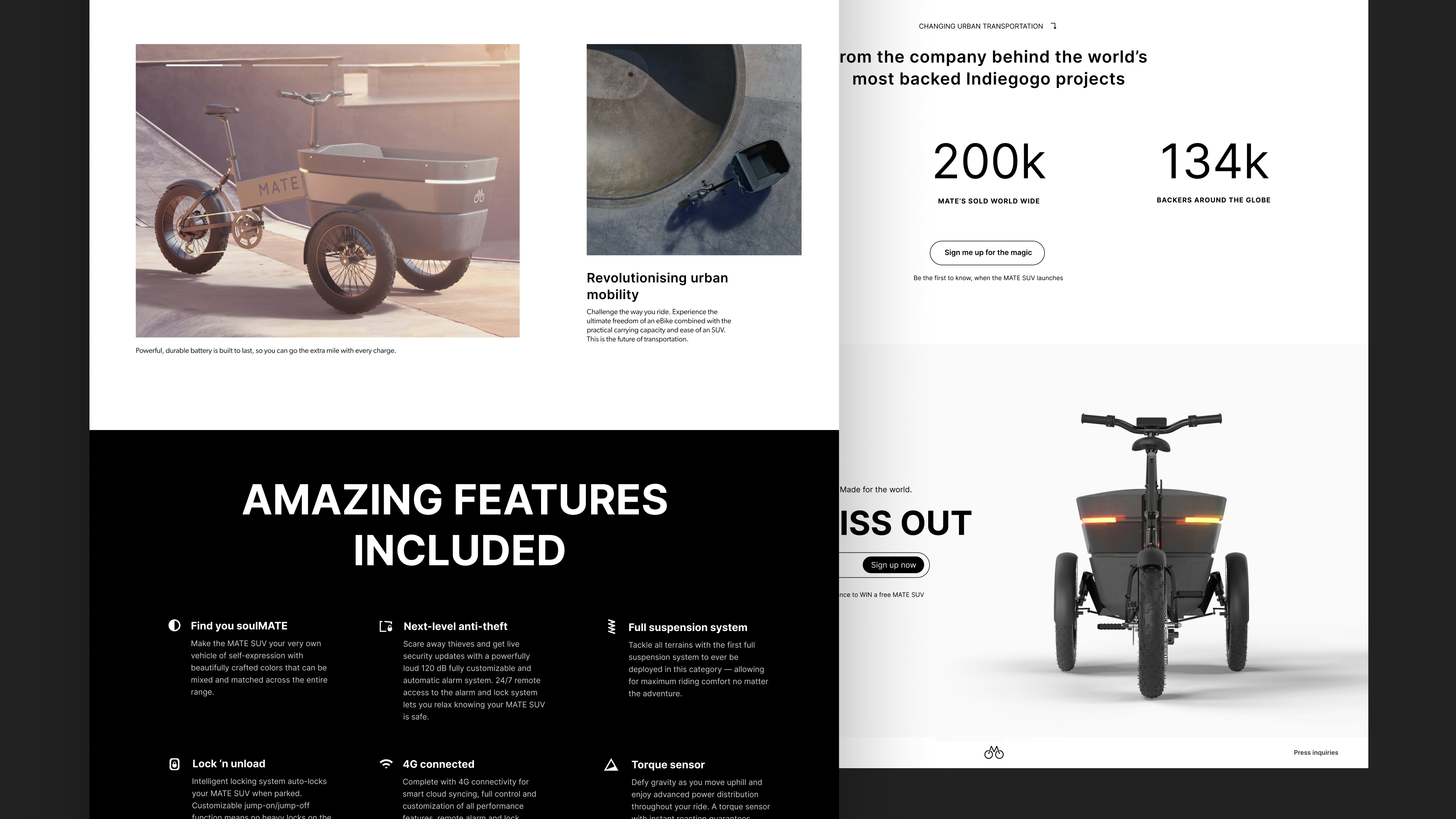
Introducing the MATE SUV -- testing out different color ranges early in development
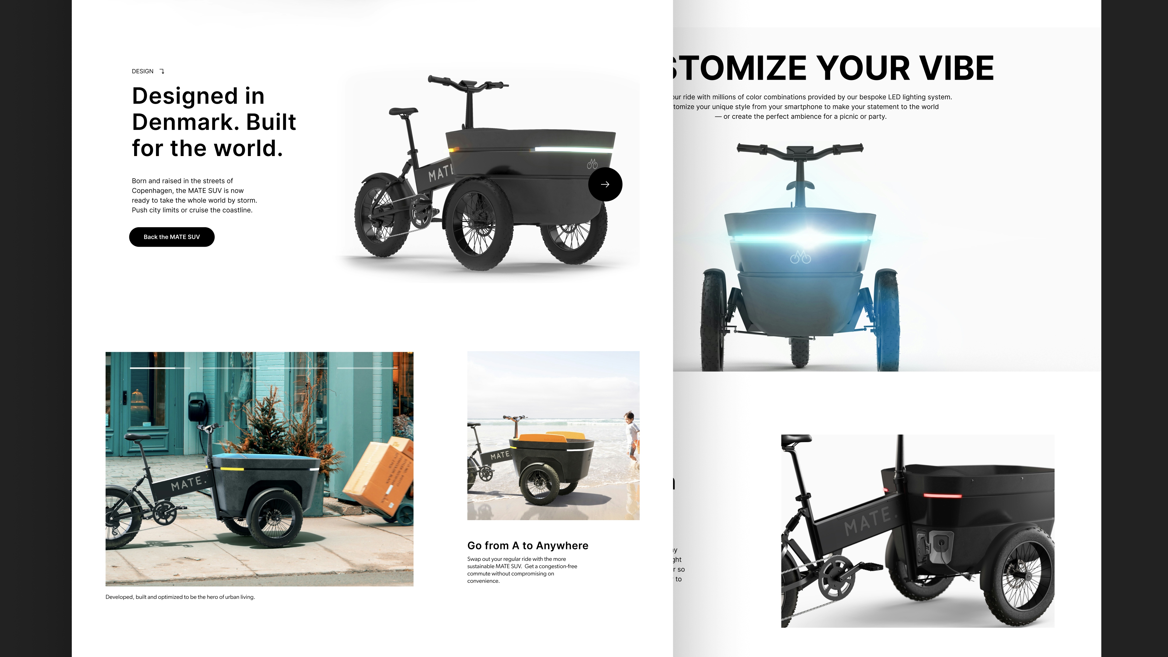
Copywriting and layout for MATE SUV landingpage
Digital ads
Special Edition Exploration
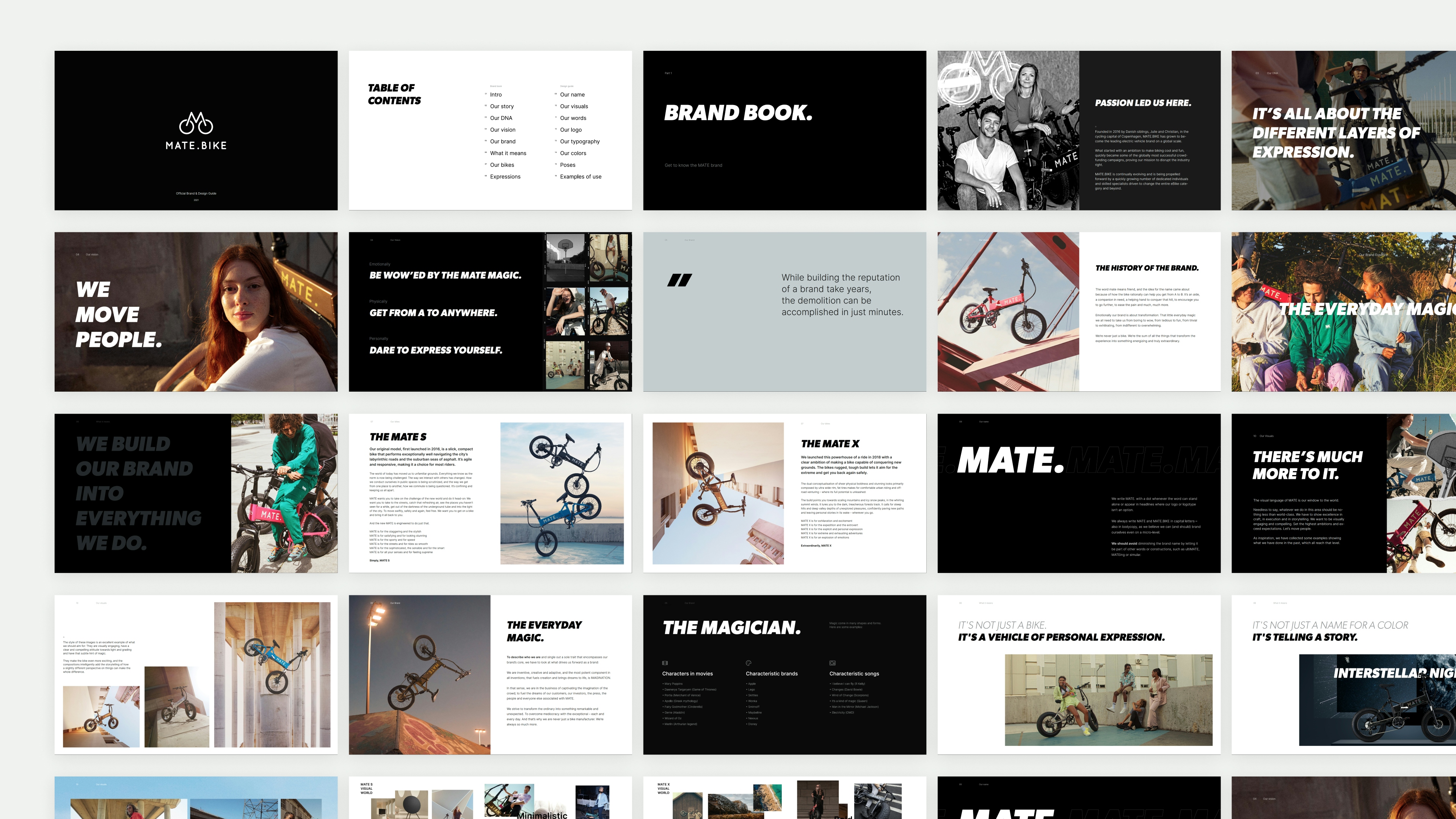
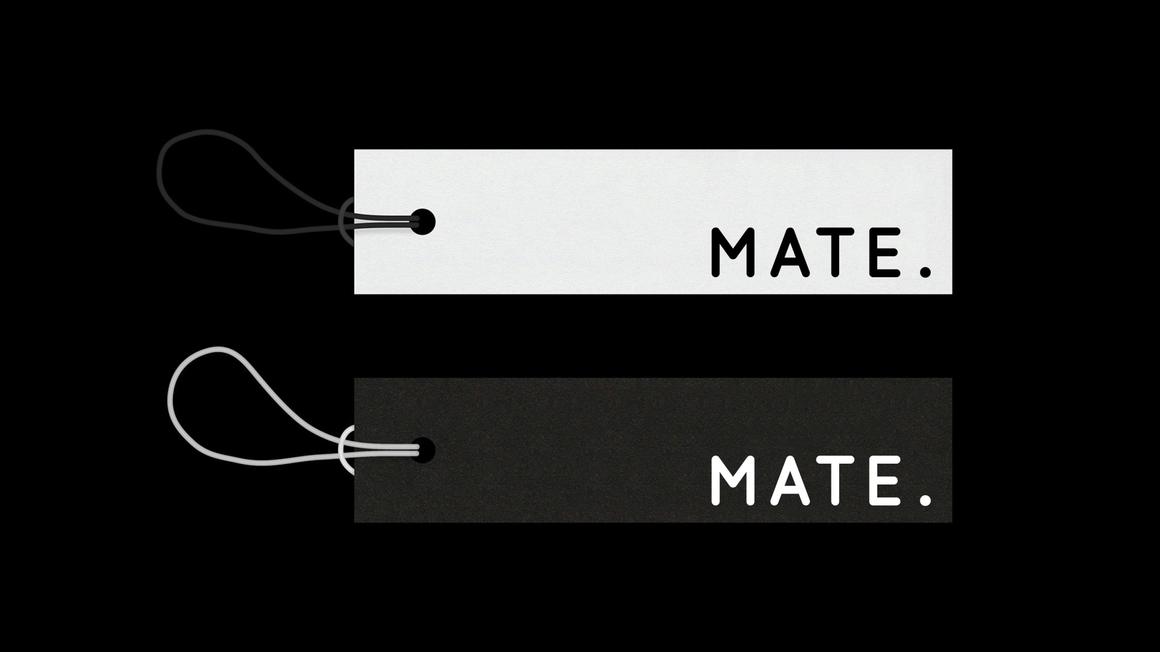
Design guide
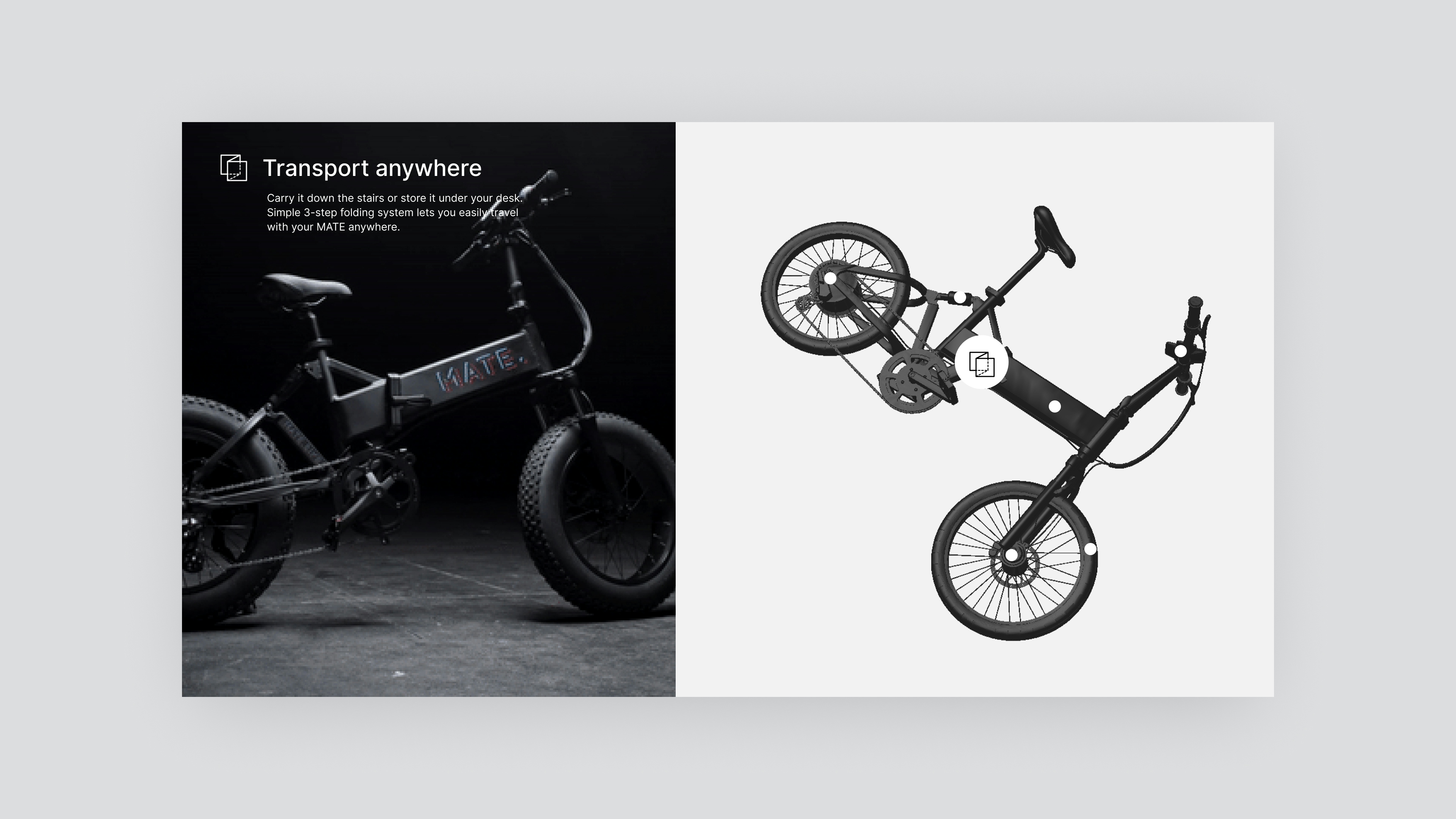
Packaging Concept
MATE Apparel
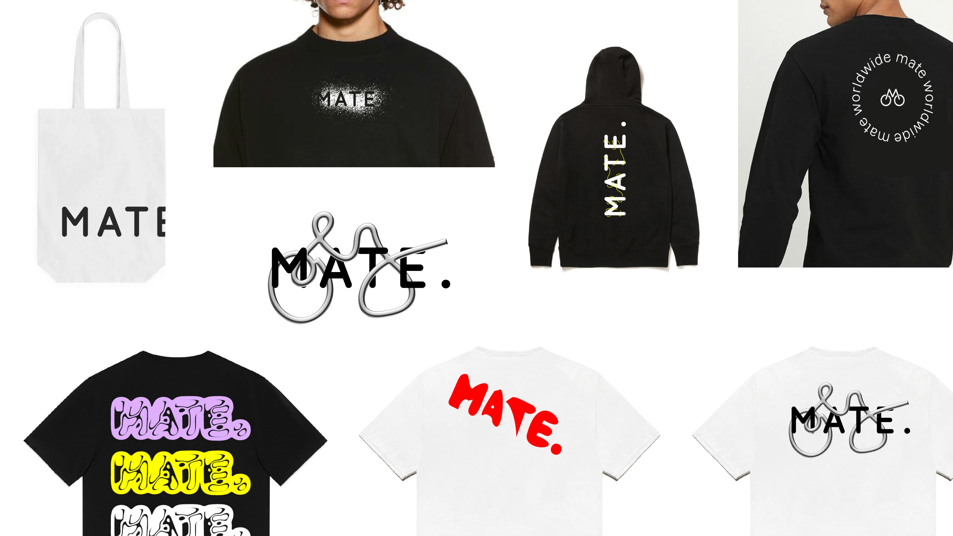
MATE Apparel exploration
Kudos to
Art Direction / Alexander Spliid
Client Lead / Mathilde Ive
Digital Design / Søren Schrøder
Film / Nikolaj Trane
Film / Christian Wienberg
Design / Mahendra Canaguy
Merch concepts with / Christian Knudsen
Photography / Signifly, Blonde and Yellow
E-commerce / Manyone + Signifly
Related work
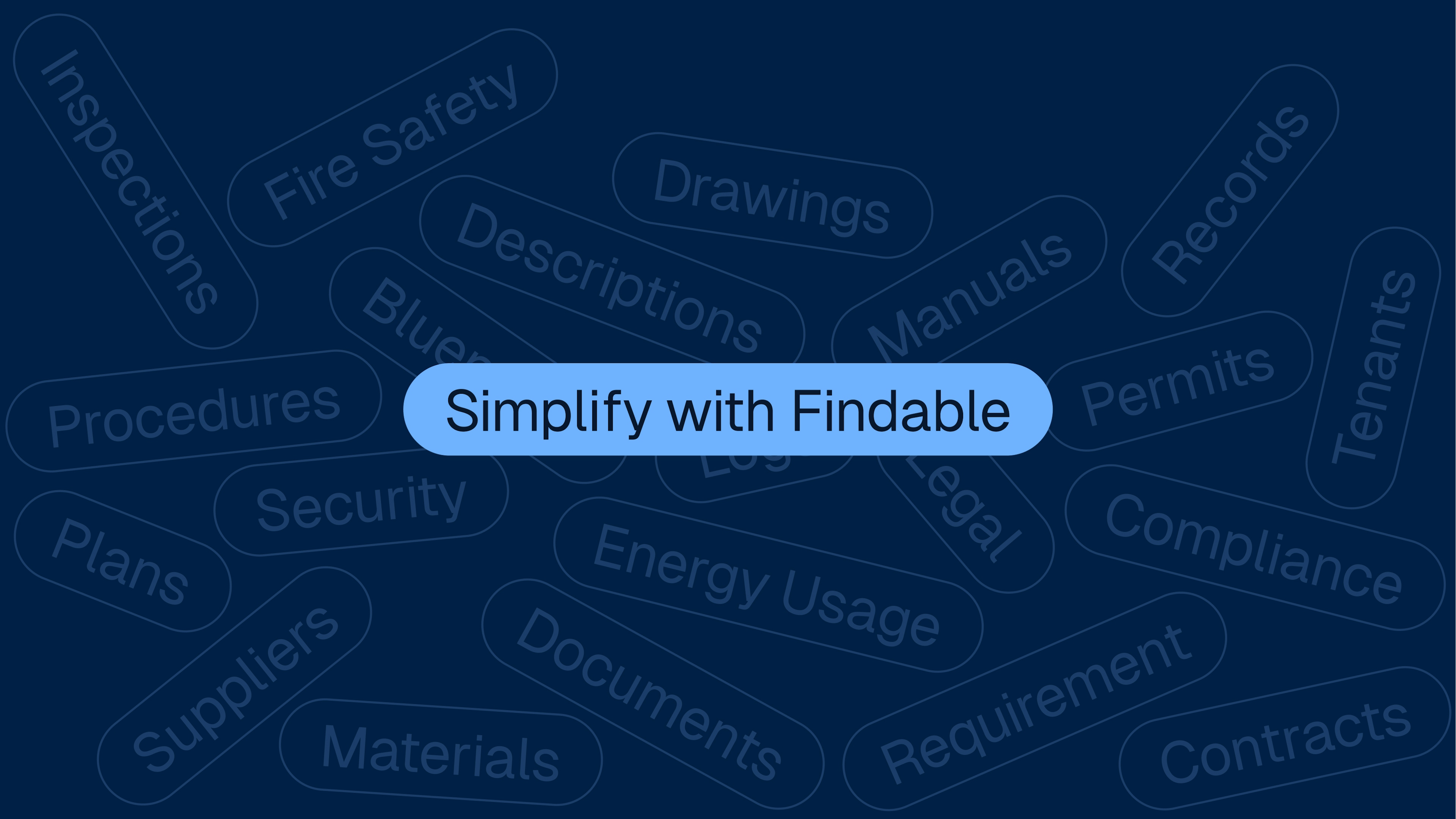
Findable
The future of property management
Client: Findable
Partnership Lead: Dženita Džindo
Key Focus: Branding and Website