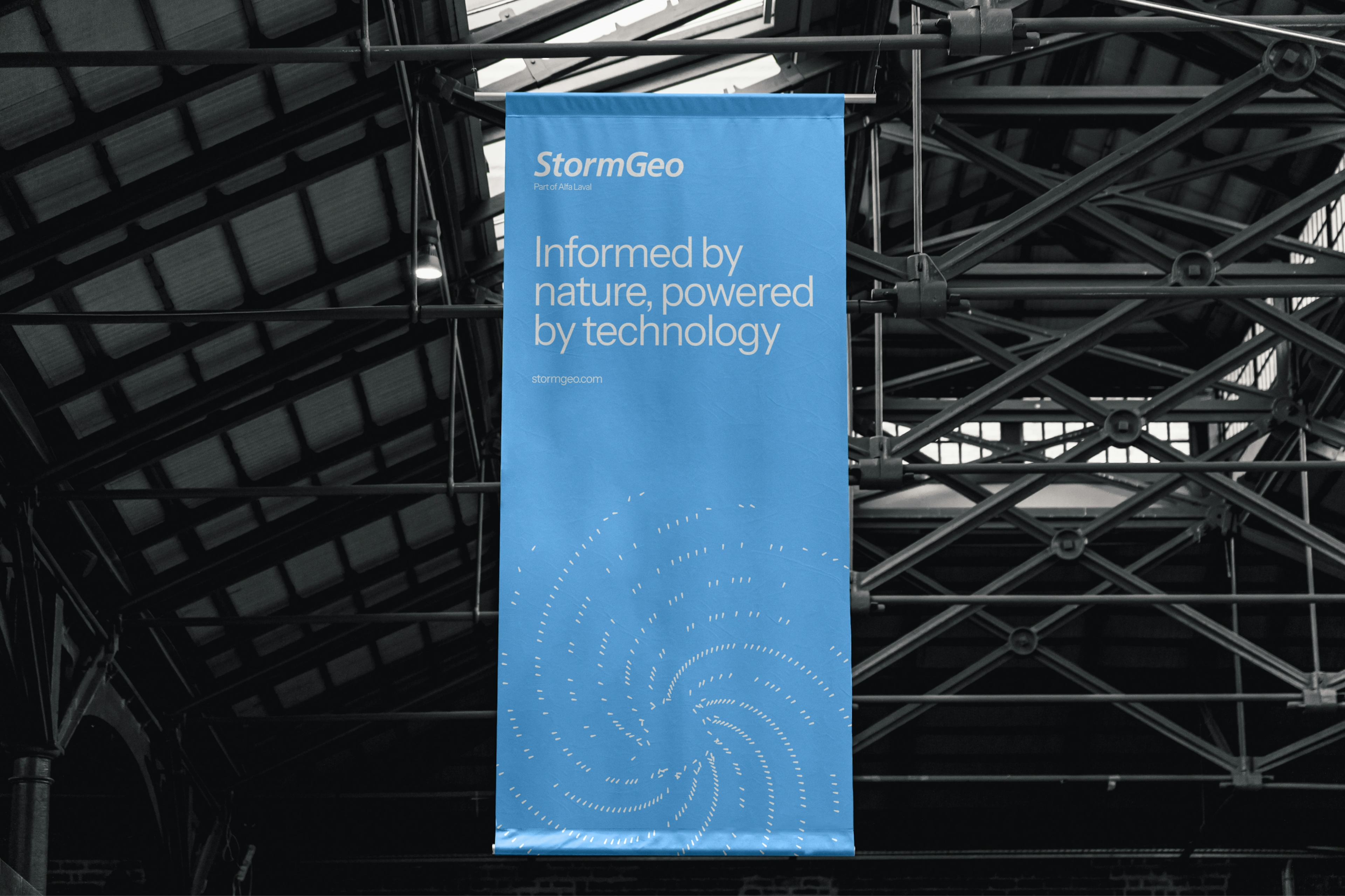
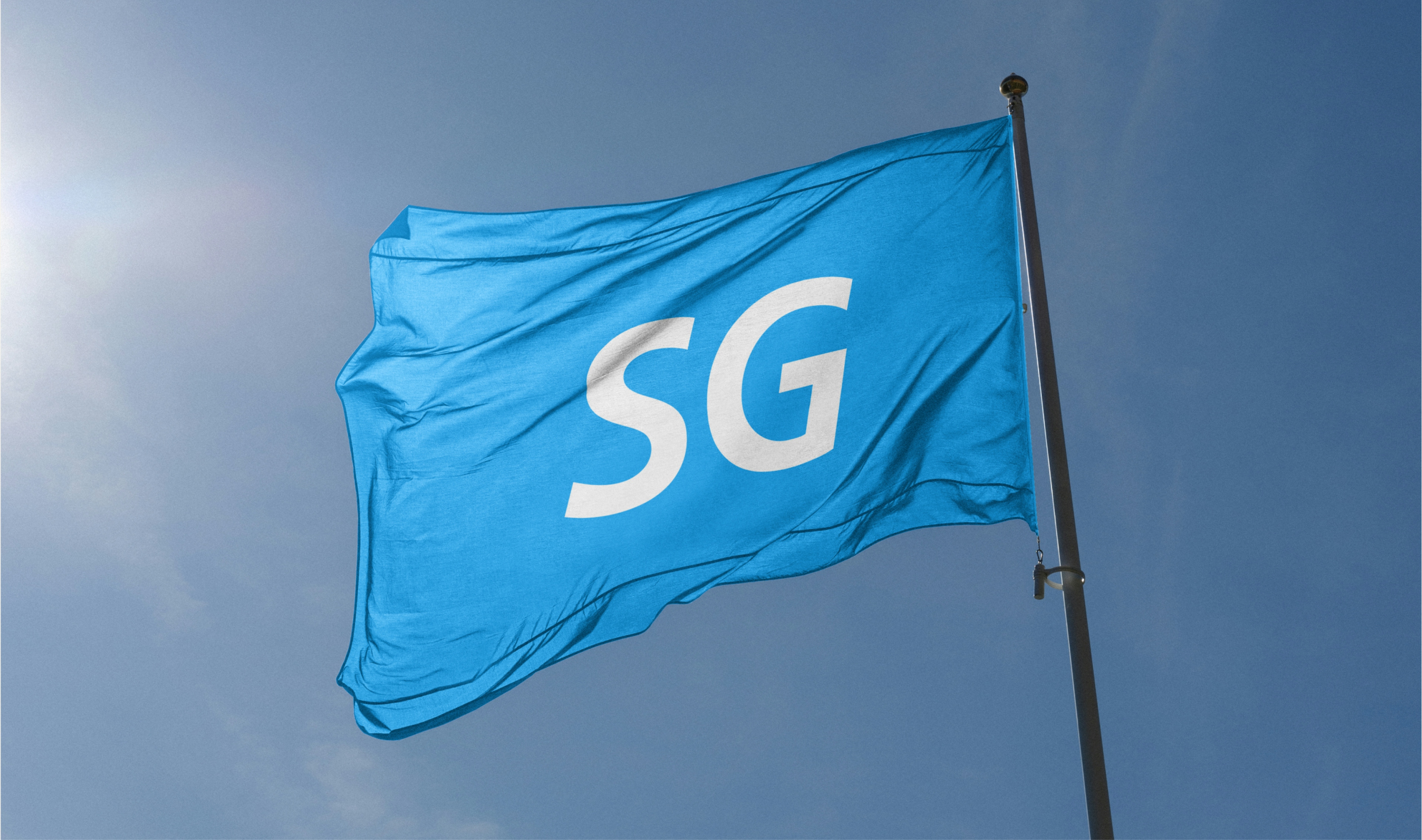
StormGeo
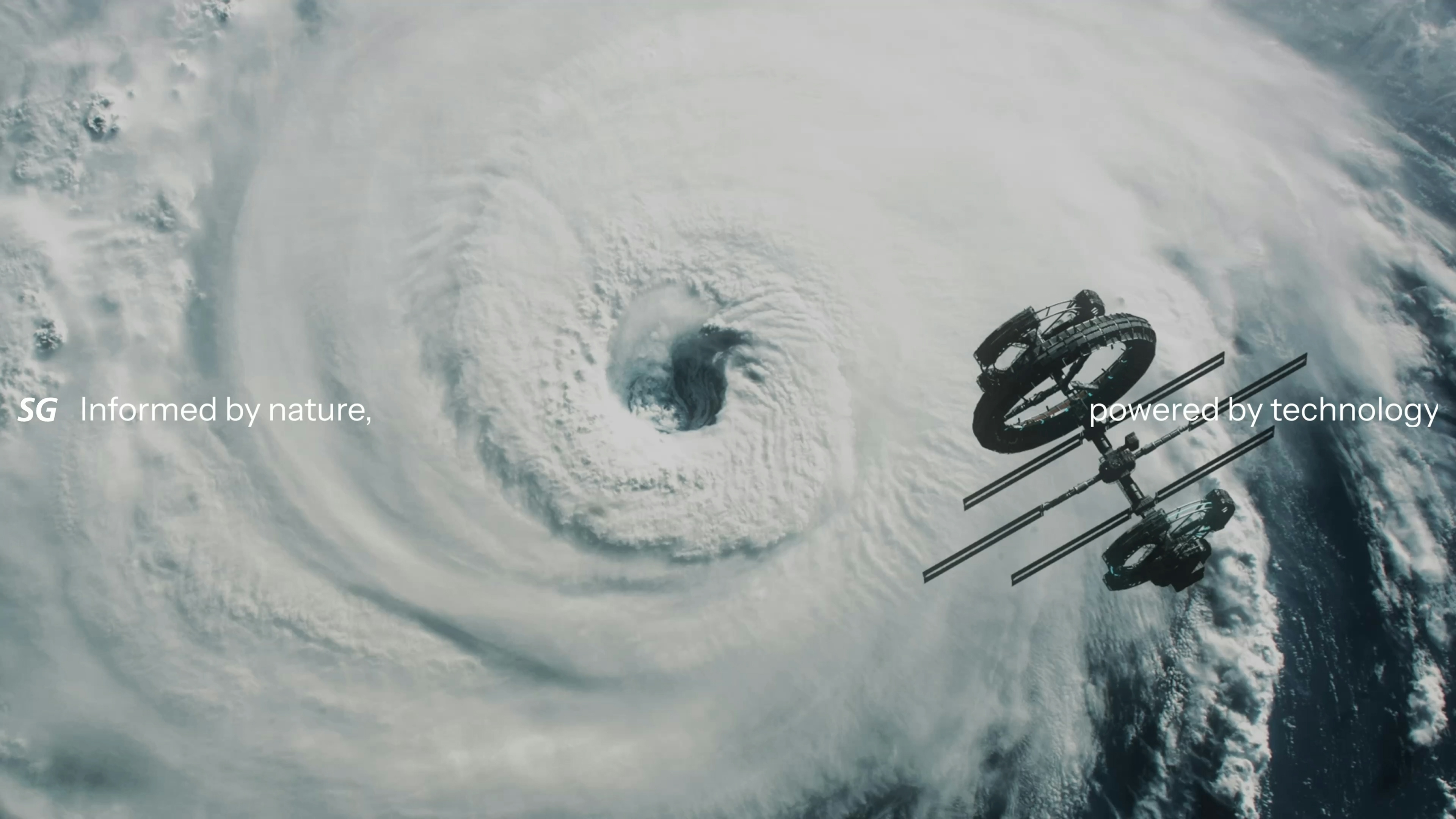
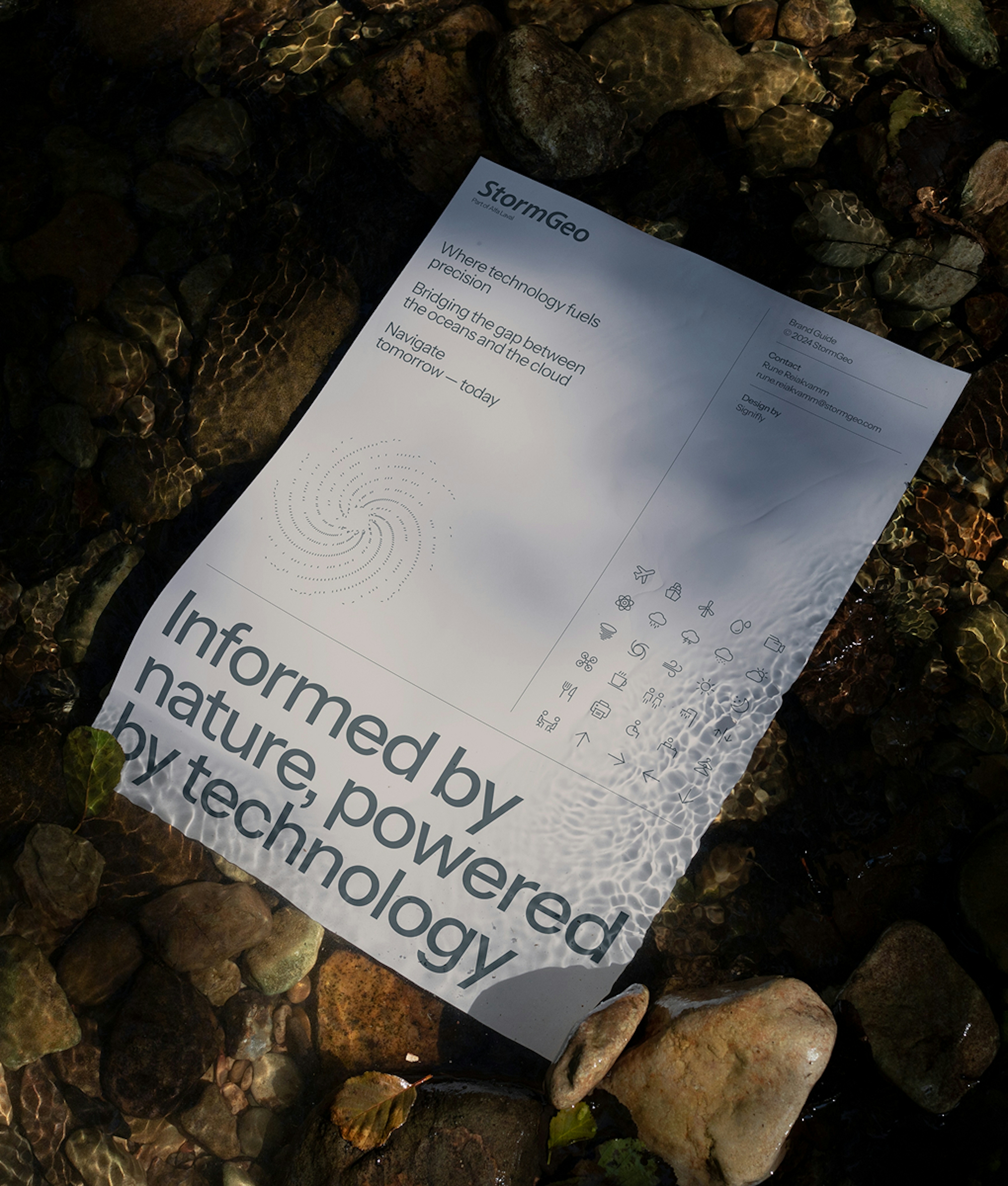
A new brand for new horizons
Client: StormGeo
Key Focus: Brand & Website
Timespan: Nov '23 - present
You can have the best tech in the world, but if your brand doesn’t communicate it, it’s a strong headwind going forward. StormGeo leads the industry of weather intelligence, but its brand was falling behind. A breath of fresh air was required to reinvigorate its brand and power its expansion into advanced tech-driven solutions for industries like renewable energy, offshore operations, and shipping.
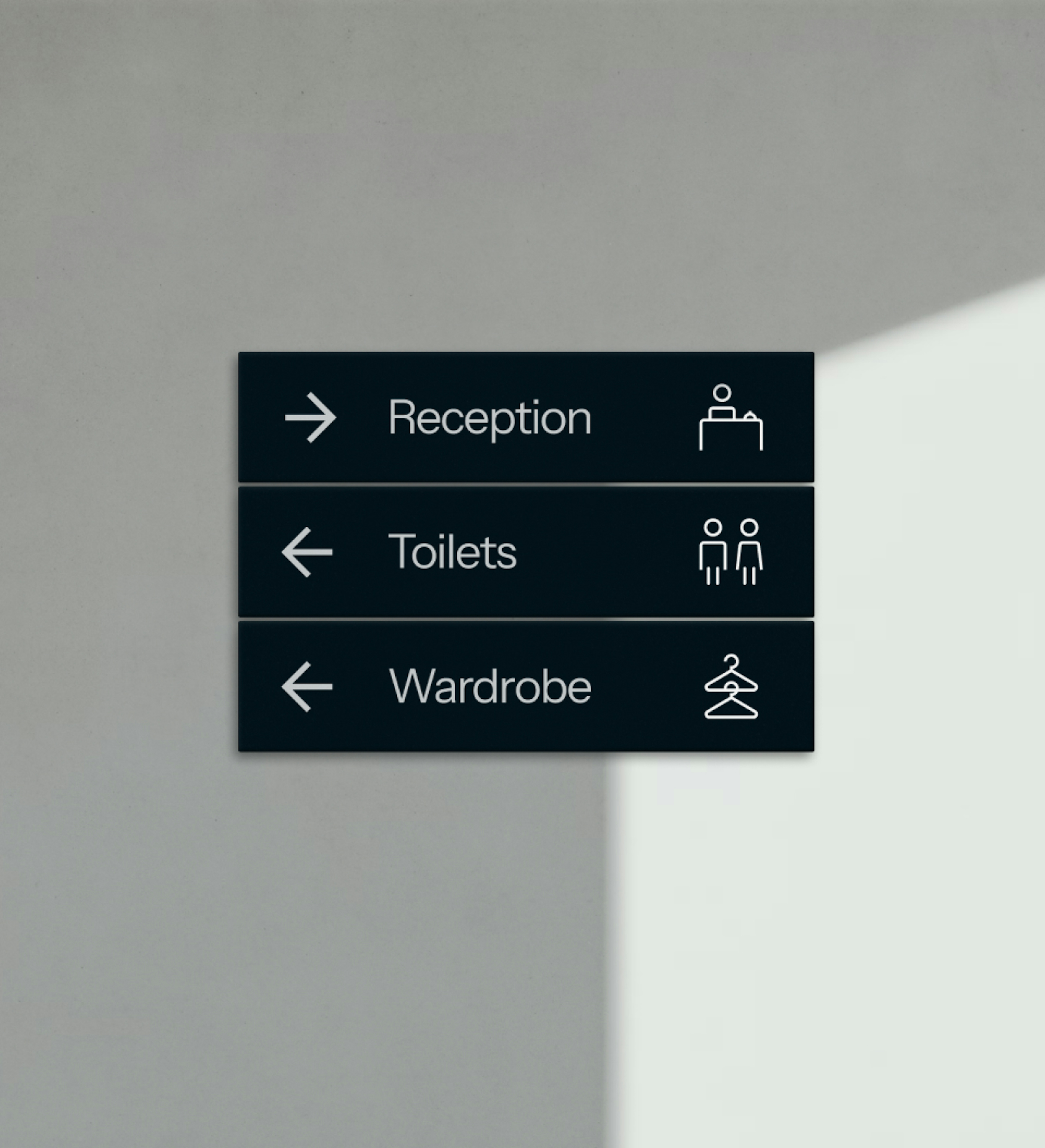
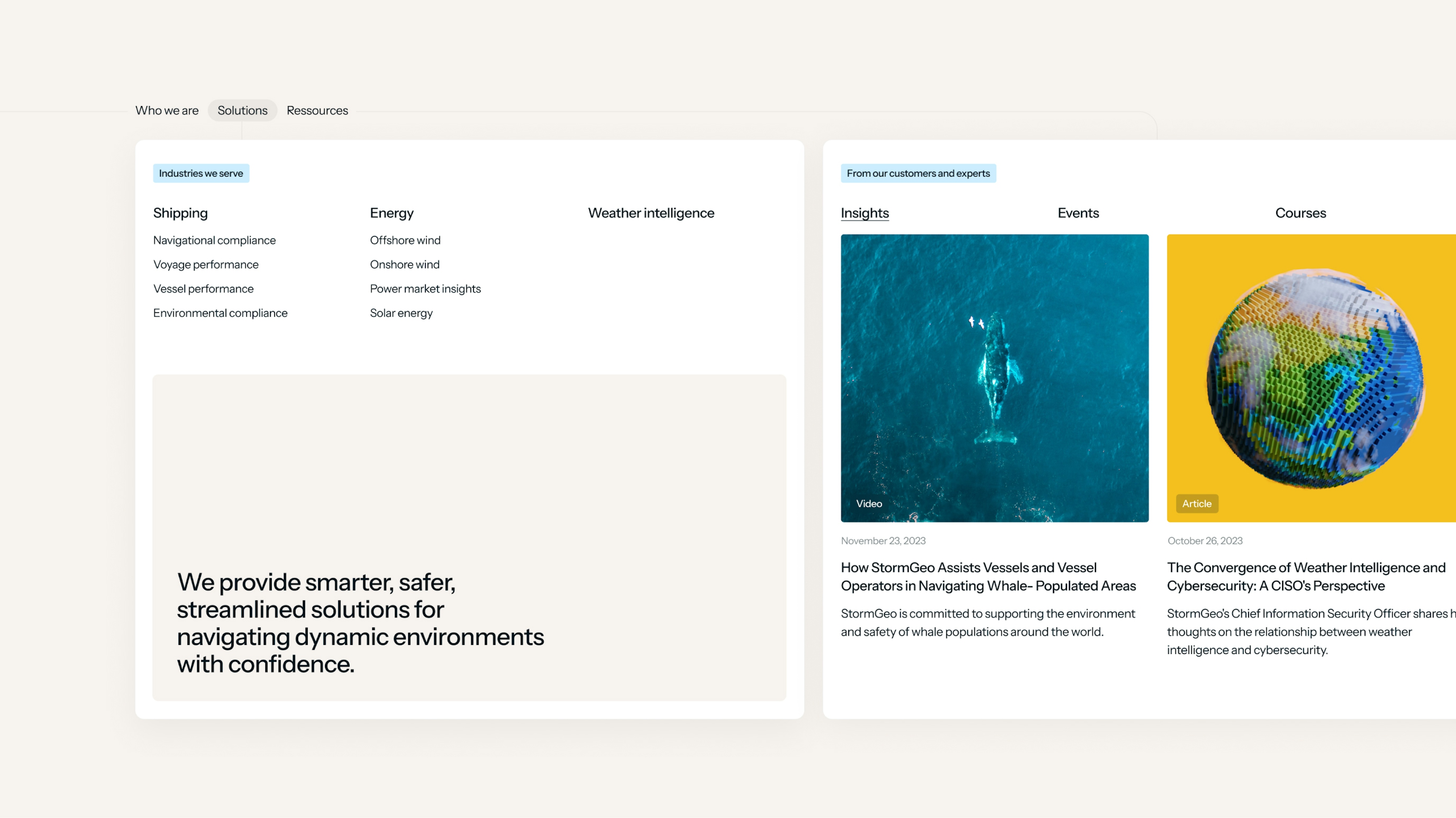
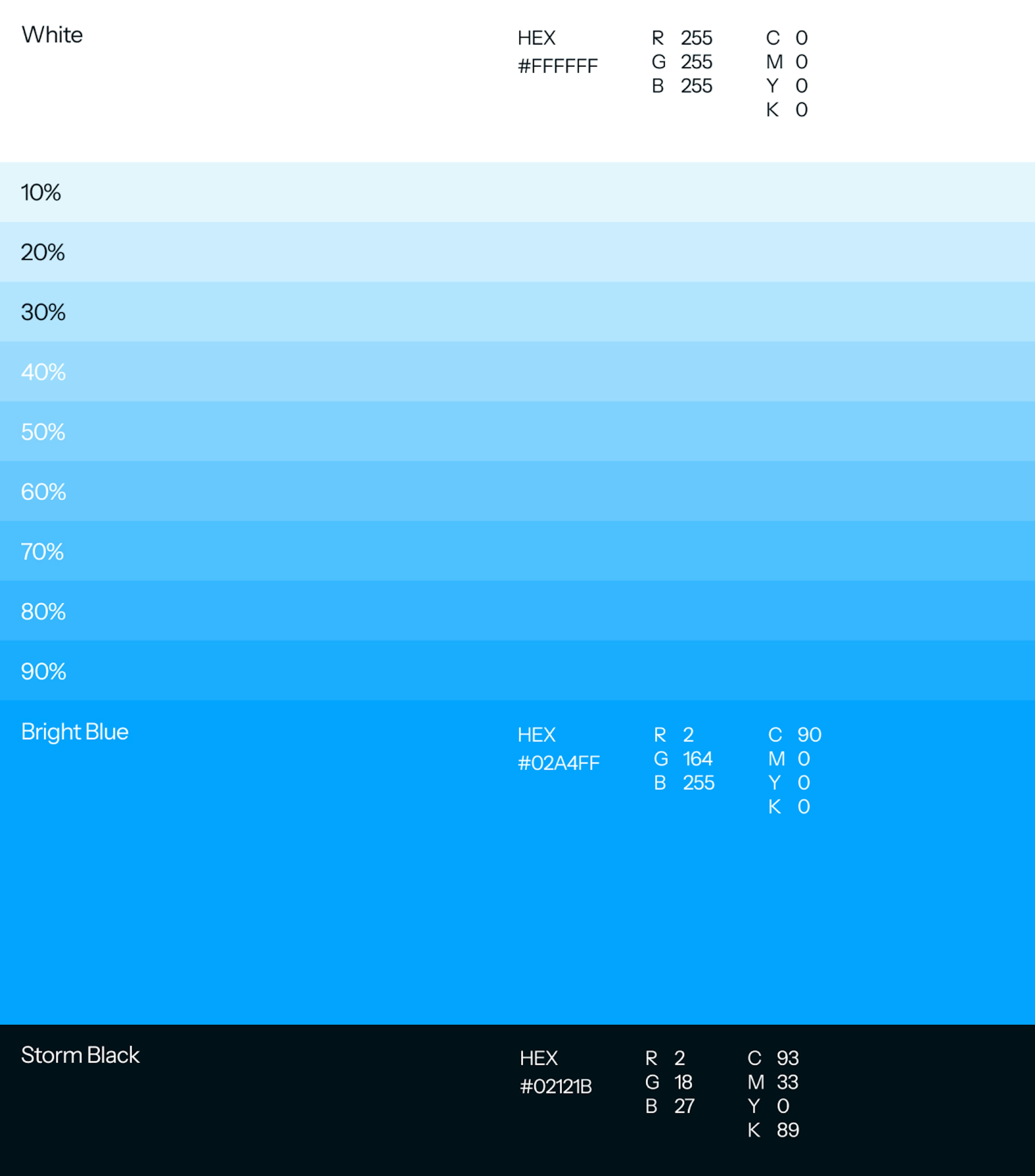
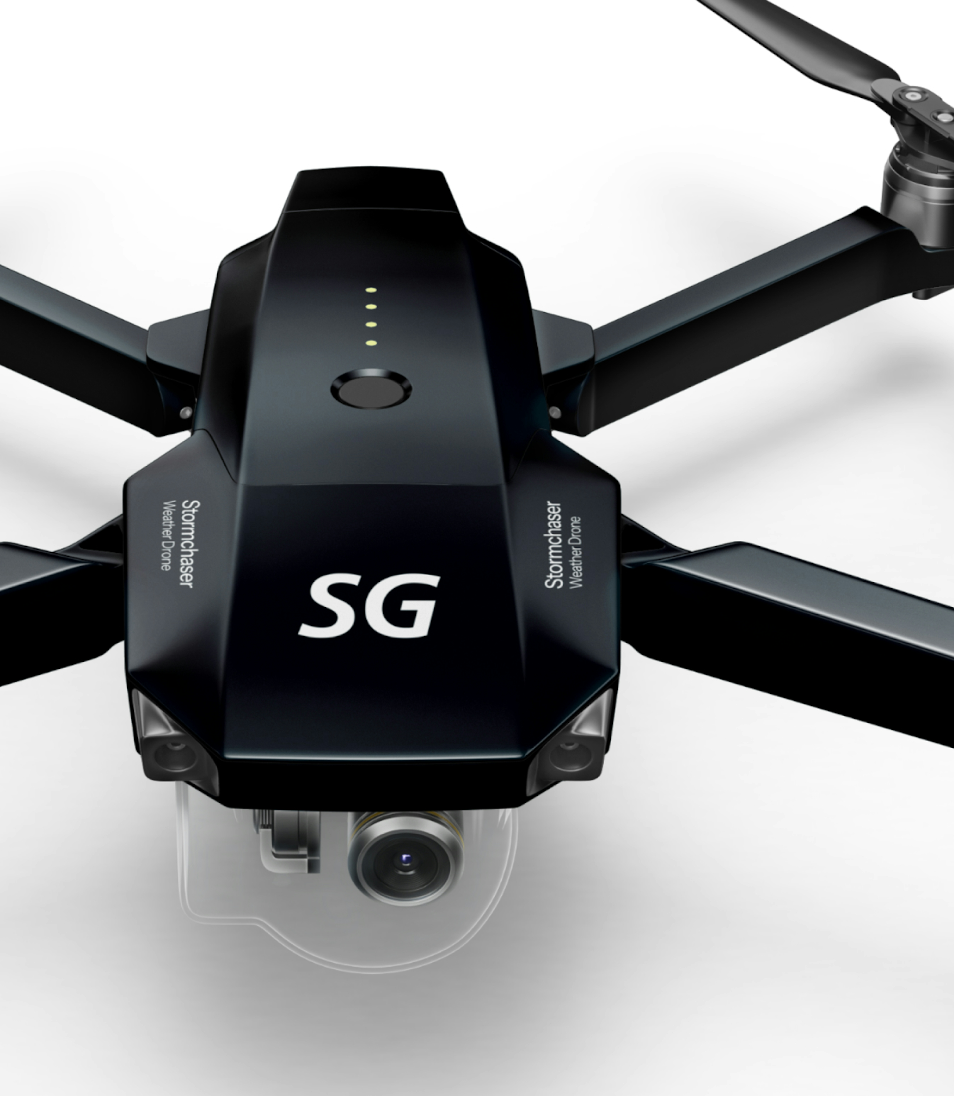
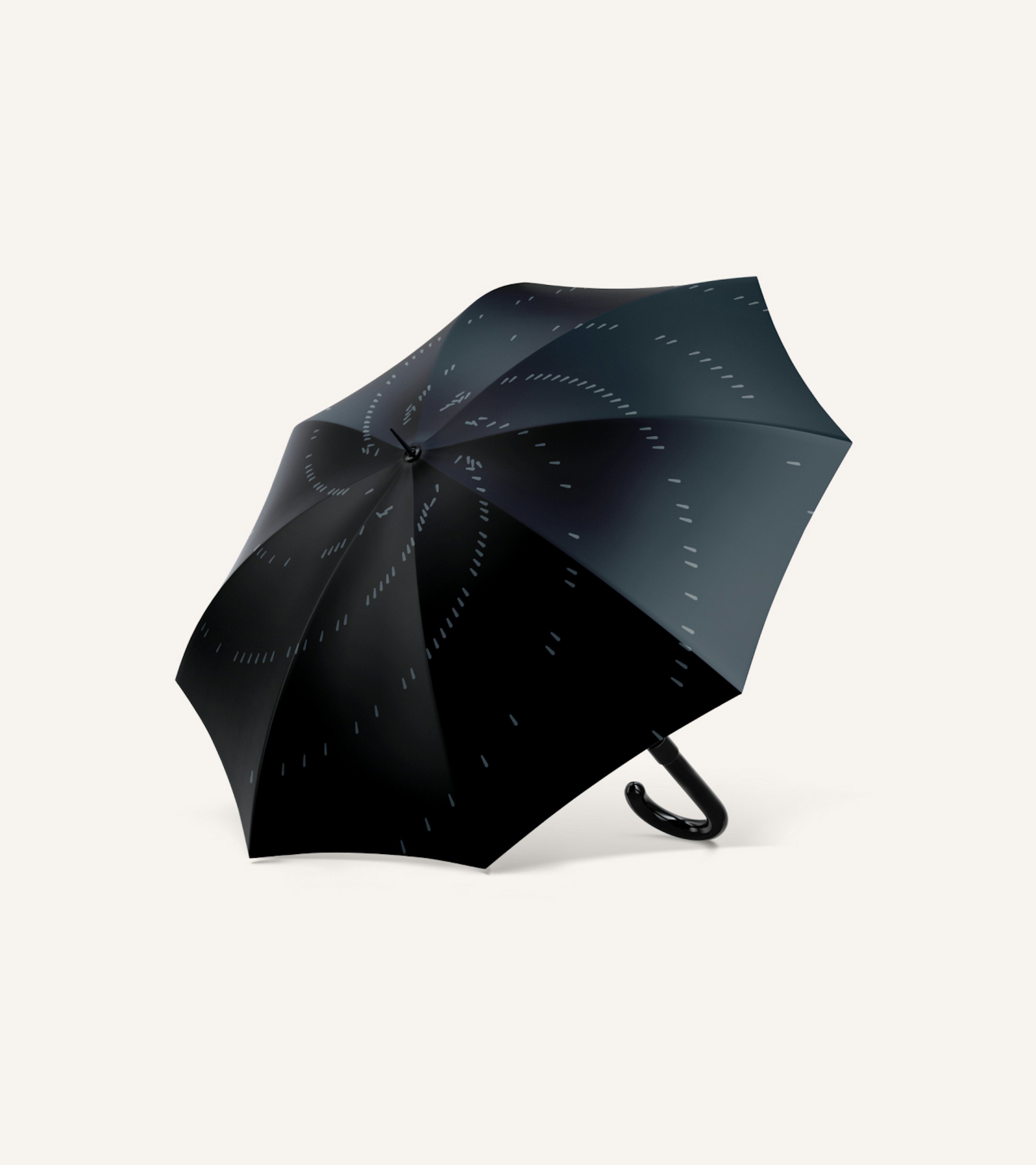
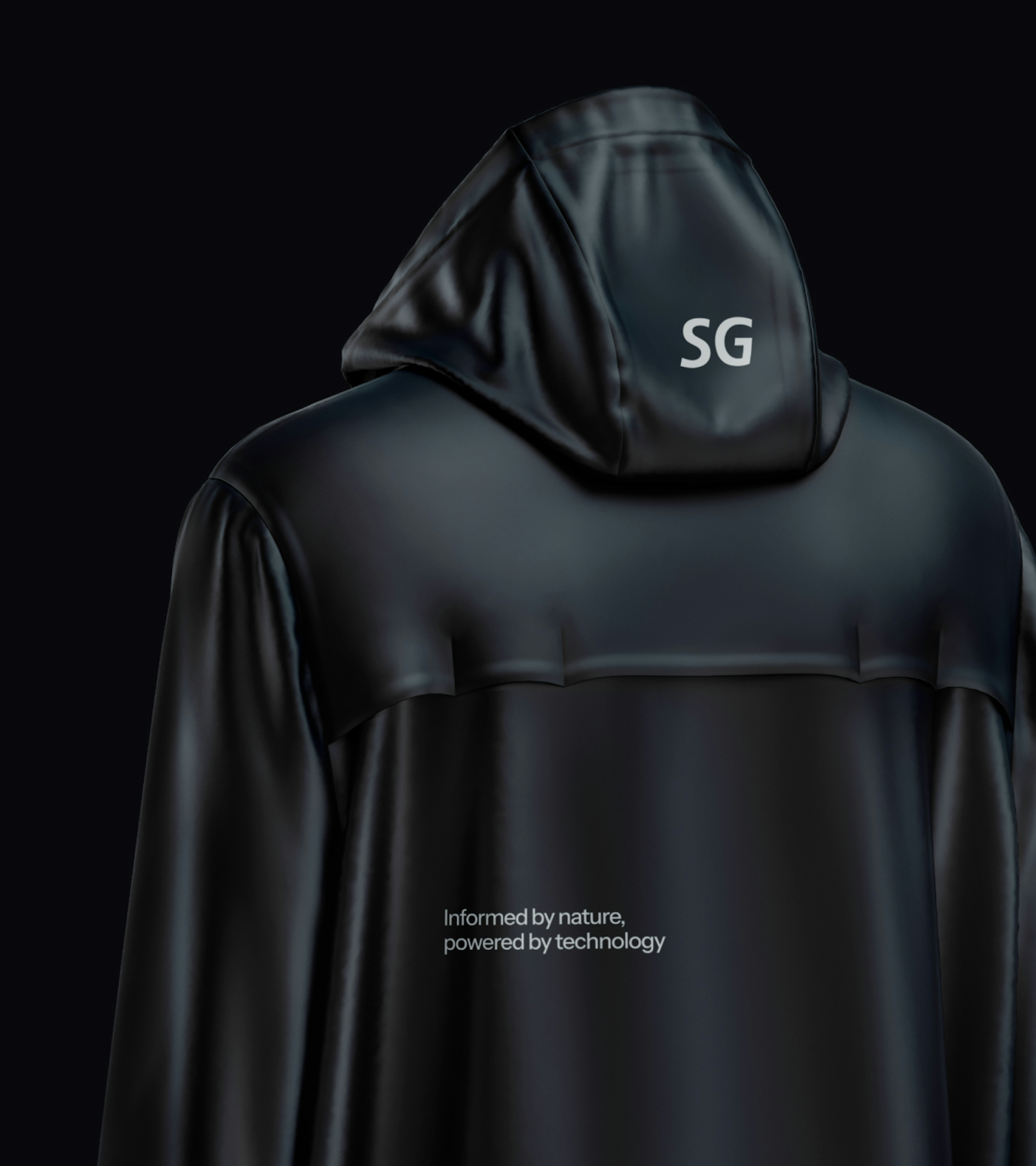
StormGeo’s market position builds on innovative technologies and deep industry expertise. Both strengths had to be communicated in the new brand across verbal and visual communication. This also resulted in a completely redesigned user journey on the website, guiding users from solutions to products.
The result? A seamless and holistic brand experience that resonates with customers and empowers the internal team, cementing StormGeo’s place as a tech leader in weather intelligence.
Kudos to
Client Lead / Hedvig Aanesen
Lead Designer / Martin Balle
Lead Strategist and Copywriter / Gabby Olivas
Creative Developer / Casper Juel
Front - End Developer / Junhwan Im
Creative Developer / Alexandra Meszaros
Digital Project Manager / Oliver Alminde
Support / Sara Friis Bache
Related work
Petainer
PET Packaging Solutions
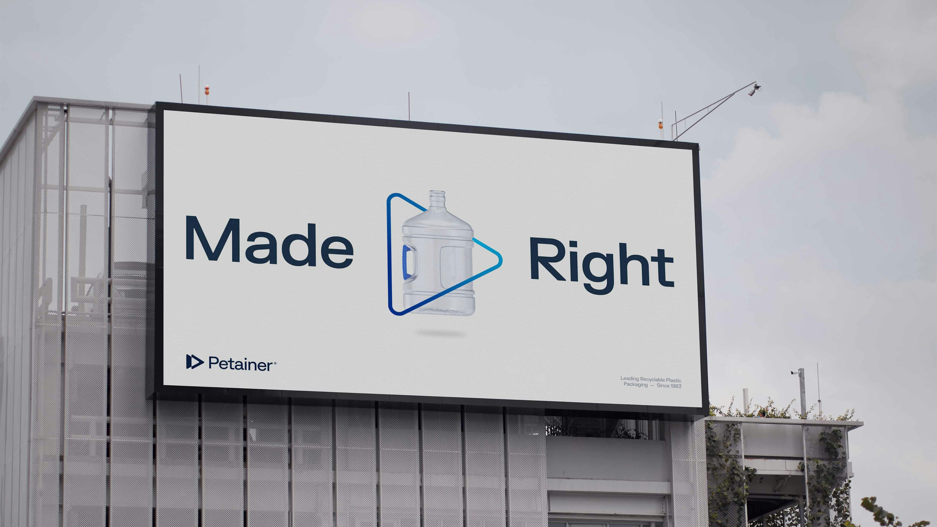
Client: Petainer
Partnership Lead: Jamie Vaughan
Key Focus: Branding
How do you transform a brand’s visual identity without losing the elements at the core of consumer recognition?
As a premium supplier of various PET packaging solutions for leading brands such as Coca-Cola, Carlsberg and Super Bock, Petainer had already earned brand equity and gained recognition due to their well-established reputation and dedication to sustainable plastic development. However, their visual identity felt flat rather than bubbled, so Petainer needed a refresh that instead embodied their feel, reflecting consistency, coherence and intention.
Today, Petainer’s logo, colour scheme, product illustrations and company brochure have more of a pop to them. They’ve been modernised to reflect a uniform feel, whilst still maintaining aspects of their original brand identity.
We'll drink to that!