Poetry
The Spirit of Creativity
Client: Poetry
Key Focus: Brand, E-commerce
Timespan: Feb - June '25
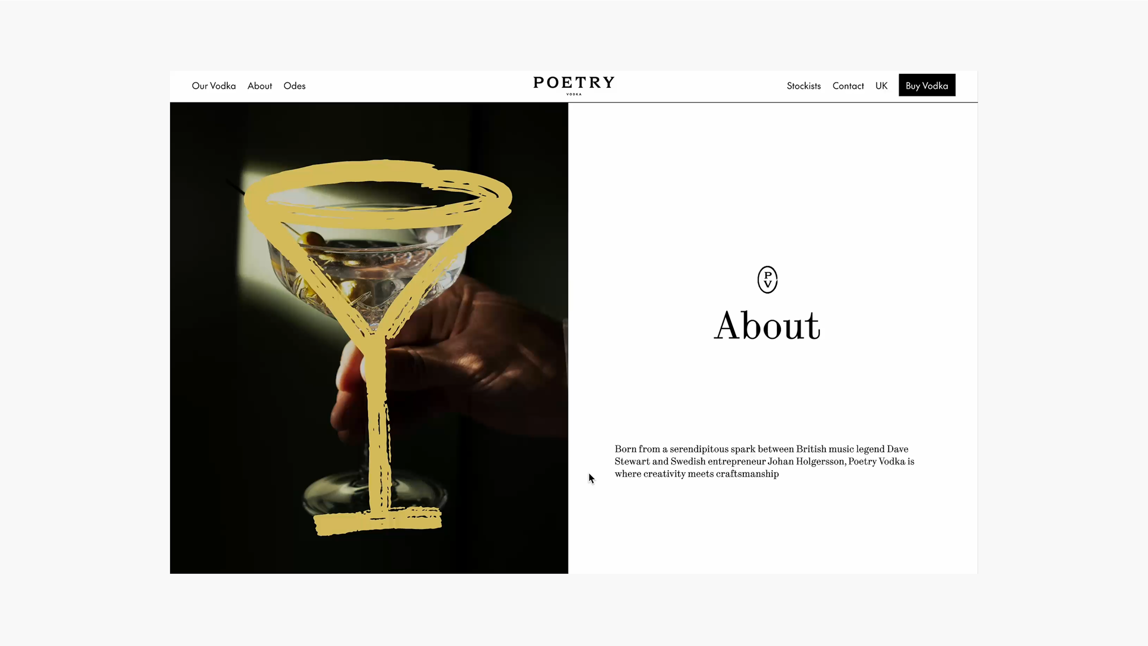
Poetry Vodka isn’t your average spirit. Born out of a love for martinis, it’s a brand that celebrates creators, dreamers, and anyone who dares to view the world differently. Founders Dave Steward and Johan Jolgersson wanted a vodka that didn’t just sit on a bar shelf - it needed to feel alive, aspirational, and a little bit trippy. Signifly was faced with a challenge: how could we best craft a brand and website that embodied the free-spirited energy, whilst still delivering premium polish?
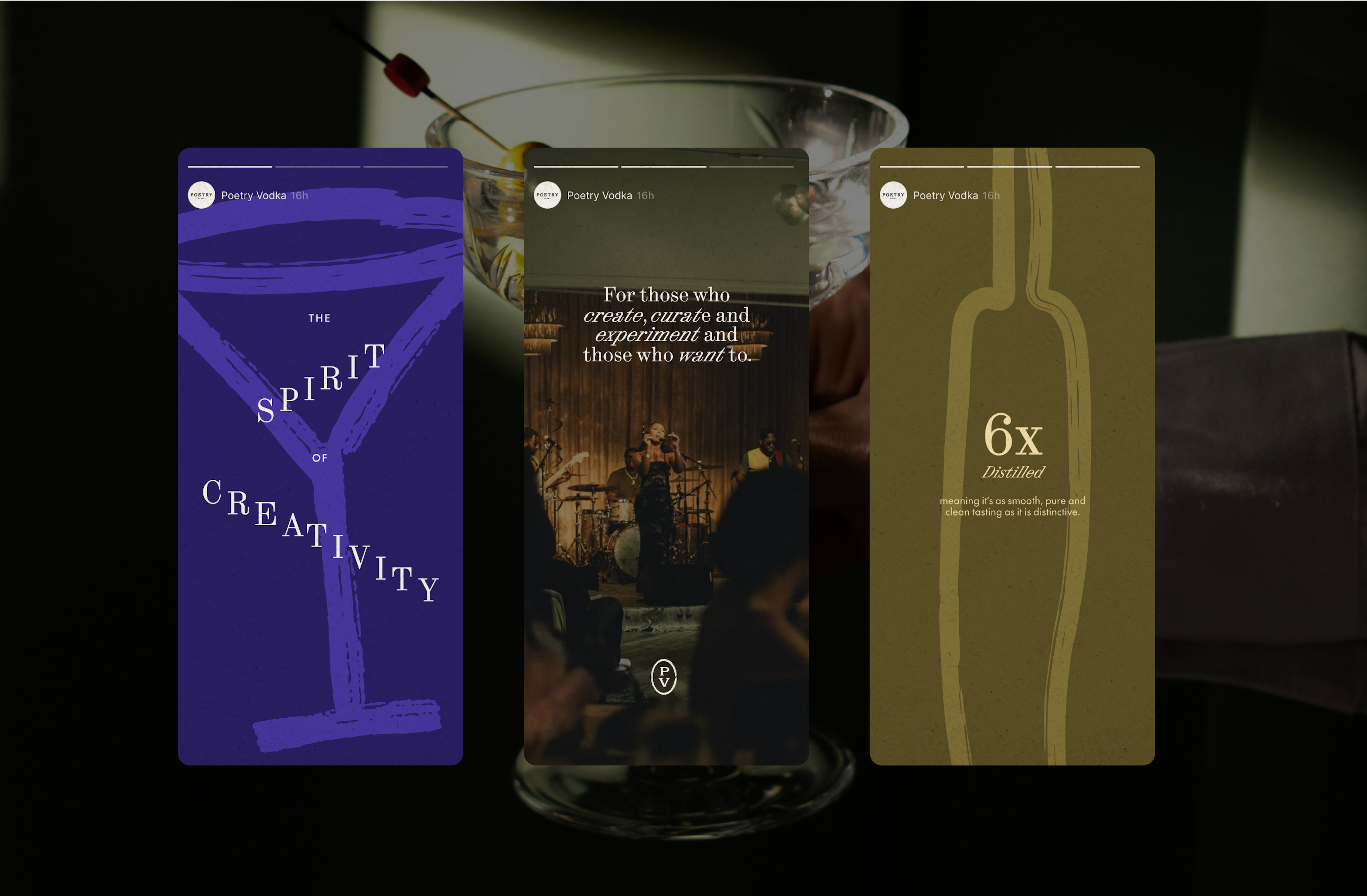
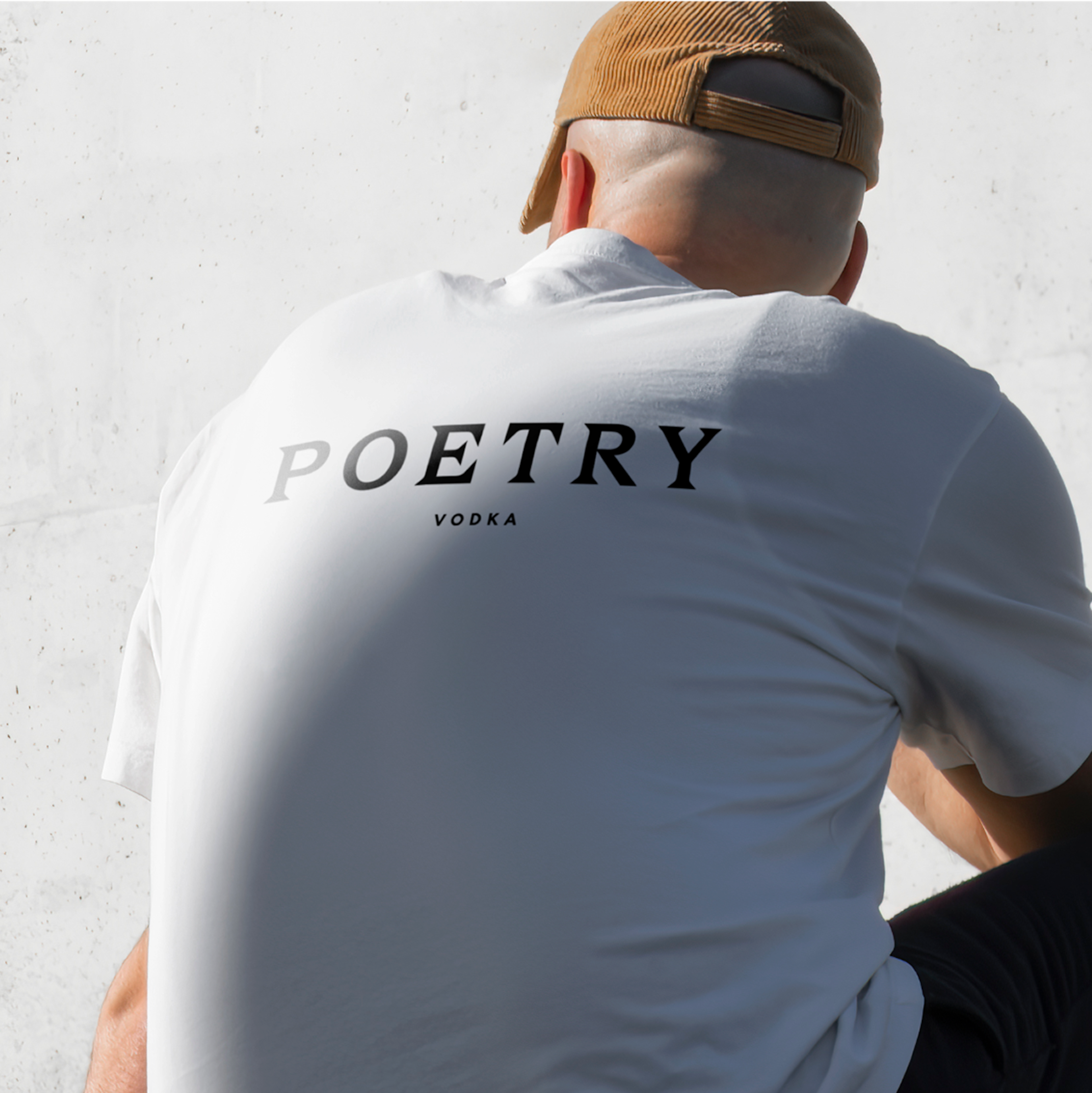
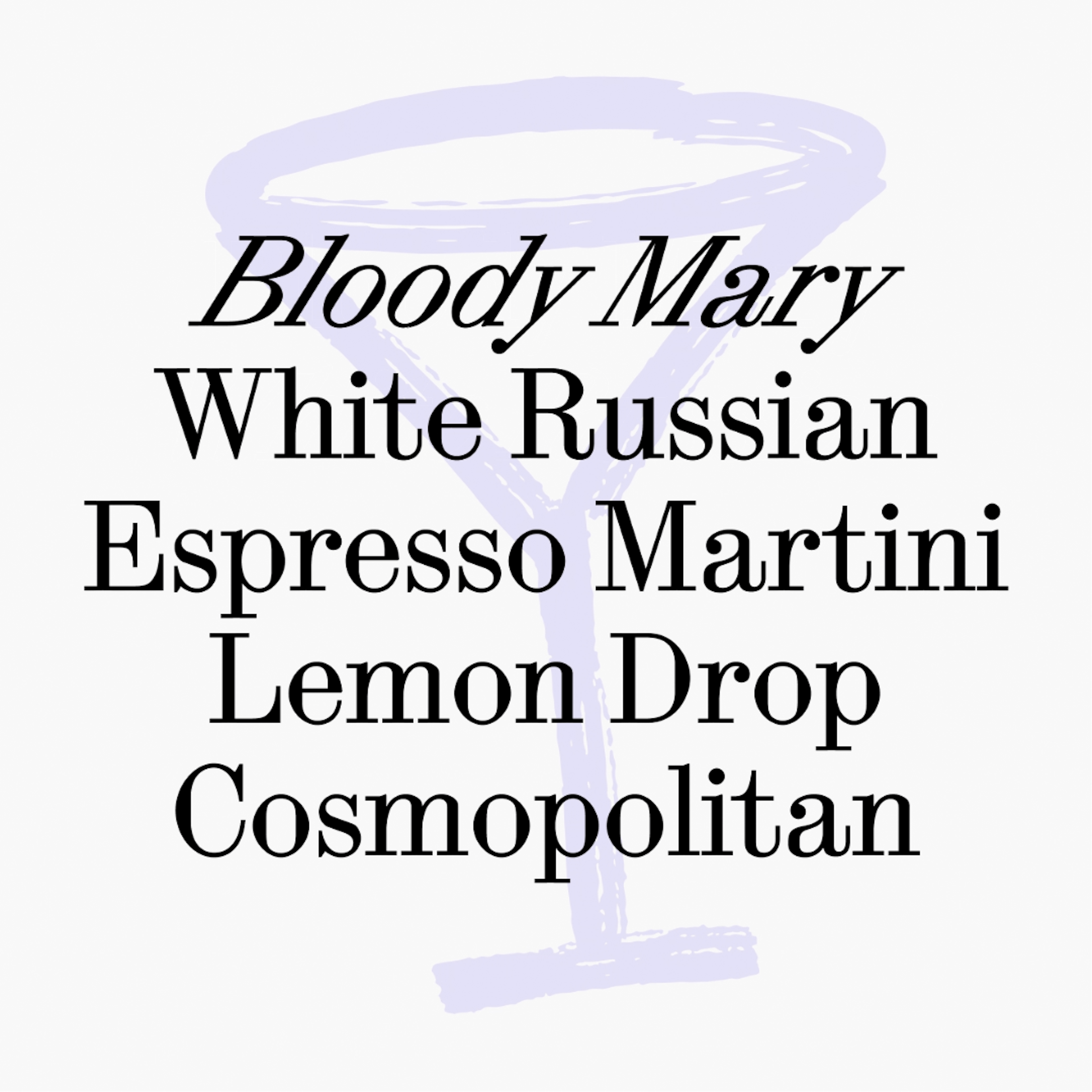
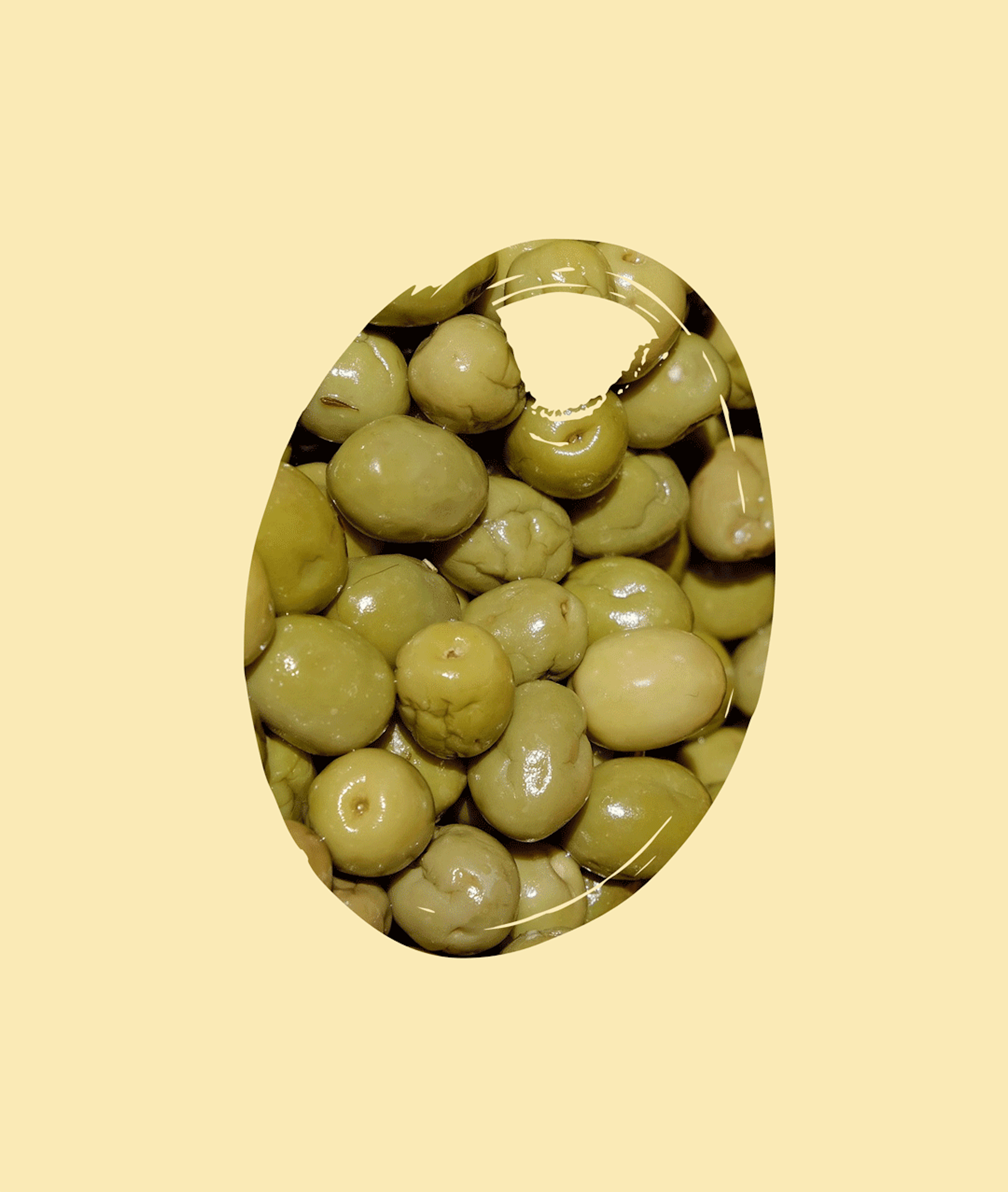
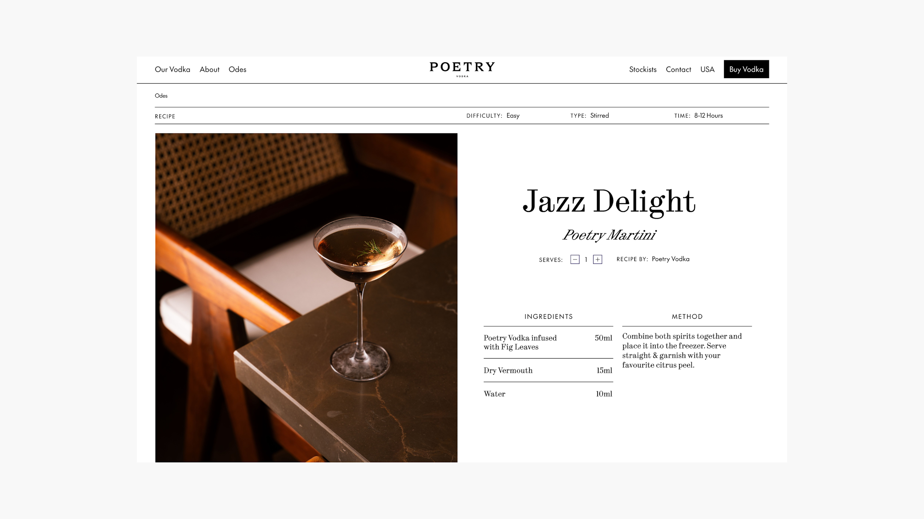
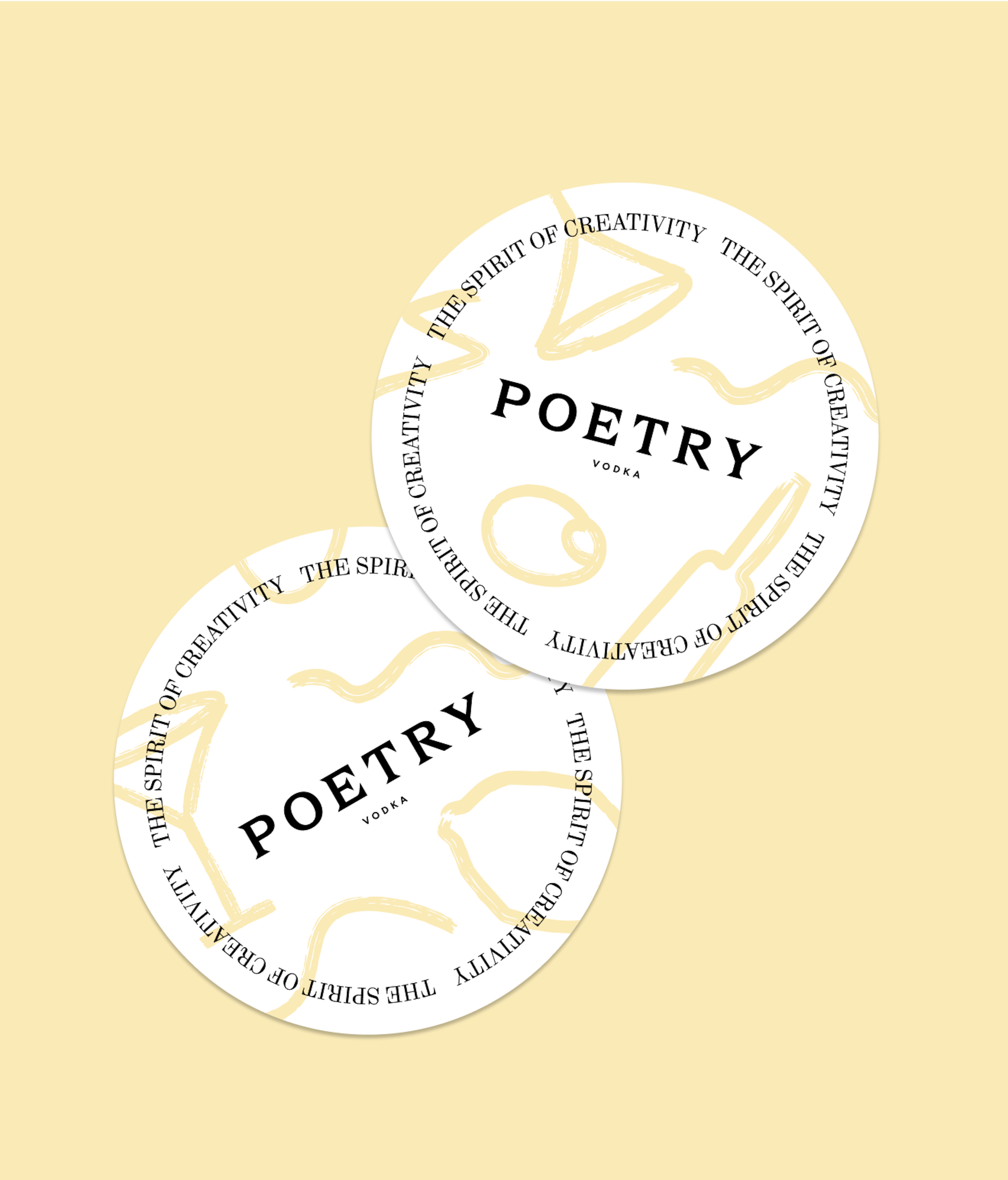
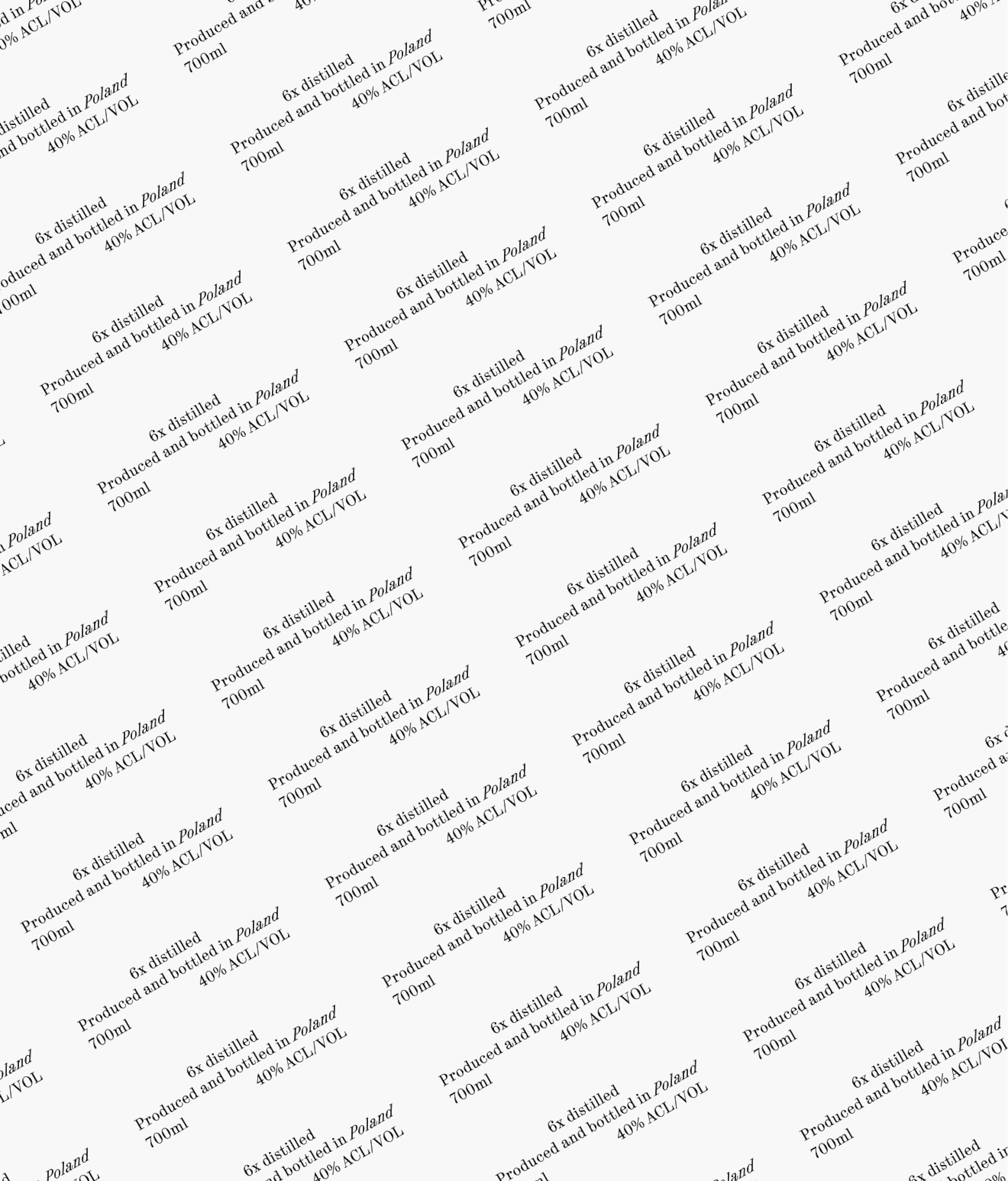
We gave Poetry a distinct visual and rhetorical identity that makes every sip feel like an ode to creativity. Playful brushstrokes, collage-style illustrations, and poetic limericks turned the brand into a canvas of its own. We delivered an elemental design system that offered Poetry and partners the opportunity to play and produce on-brand and perpetually fresh content, again and again. From the handcrafted Polish distillery story to the exclusive, creative-club positioning, Poetry Vodka is no longer just a drink. It’s a movement - a toast to artistry, individuality, and the magic of standing apart.
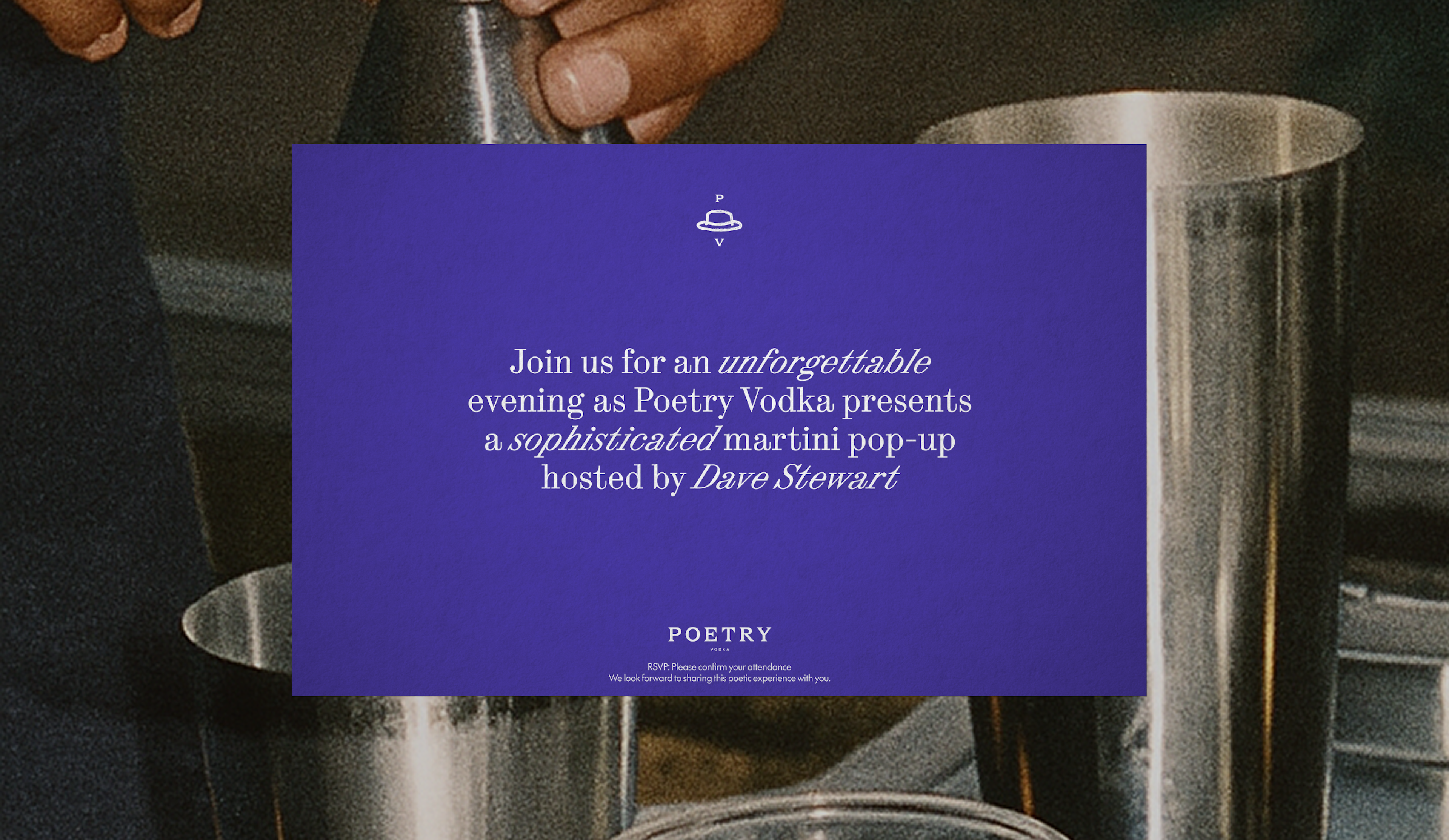
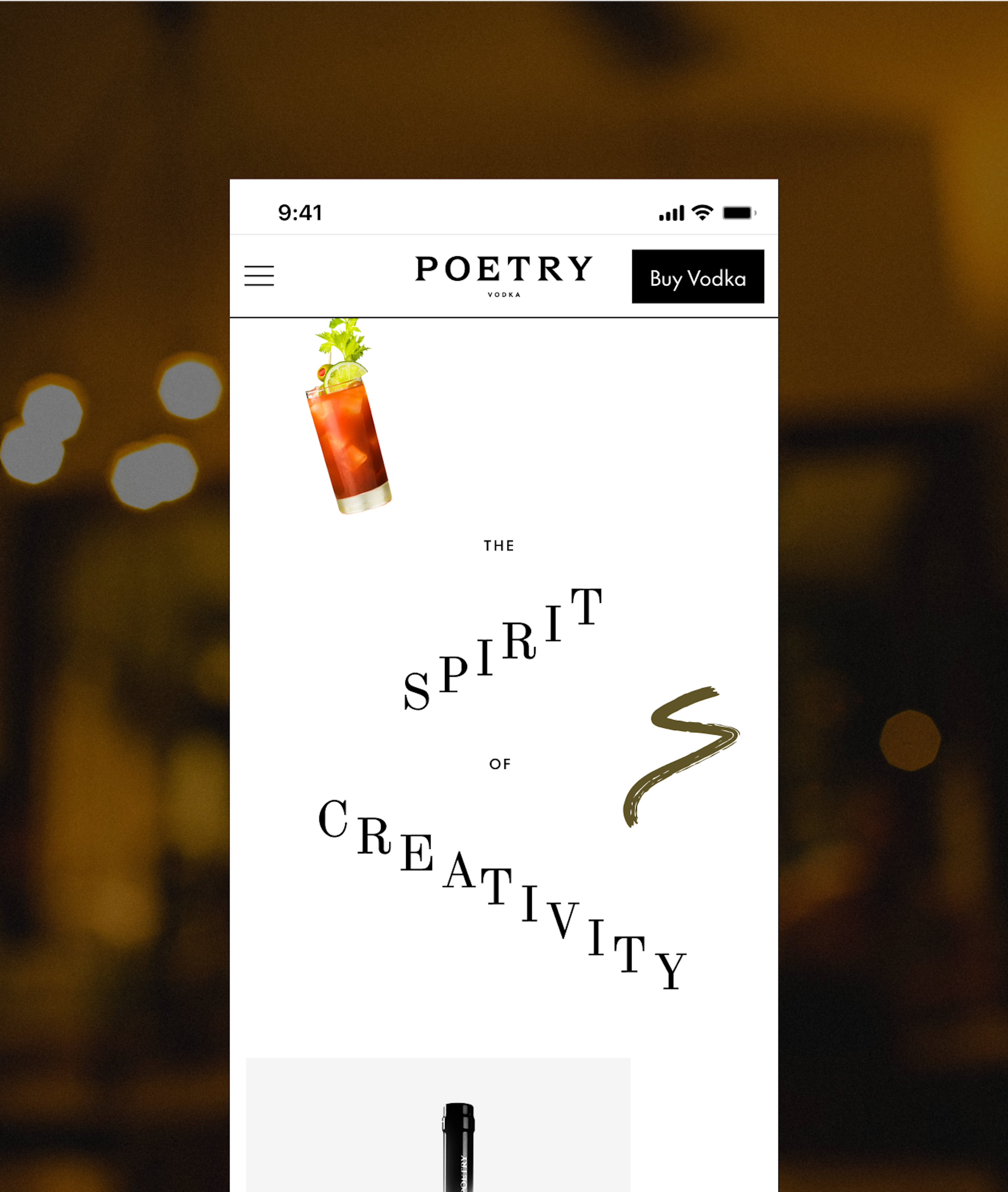
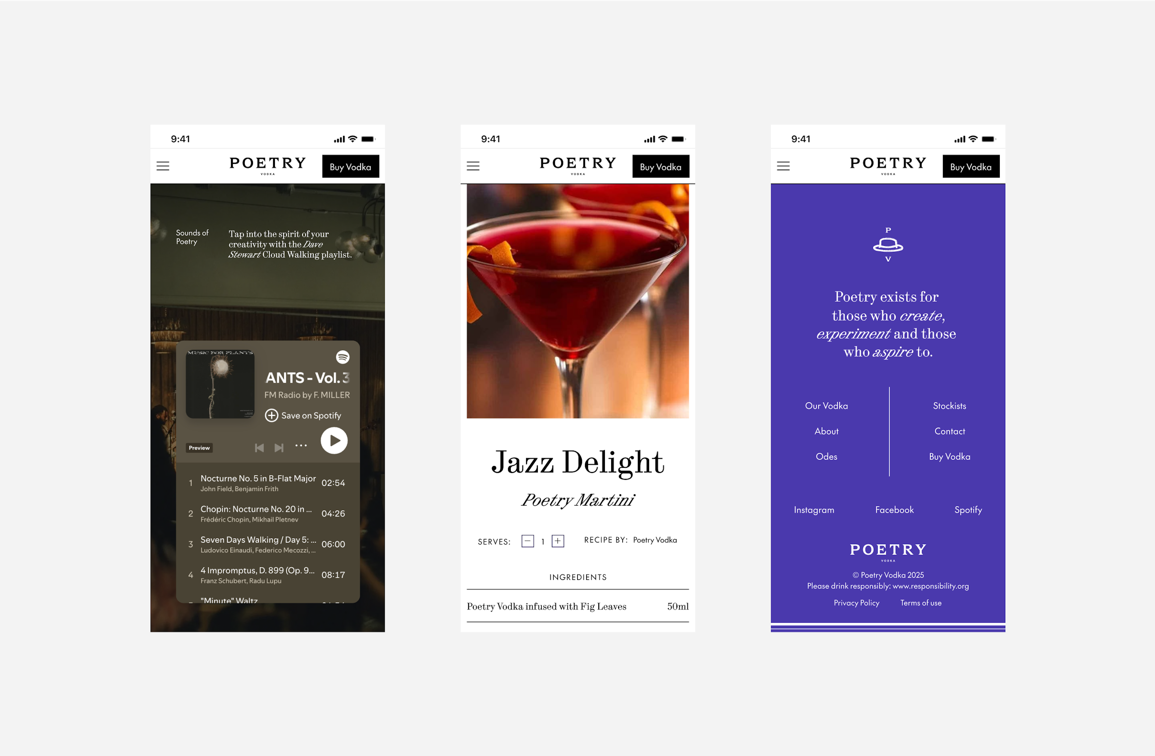
The website needed to offer an immersive experience. We brought it to life with graphic backdrops that flow like waterfalls, cascading type as you scroll, and hover effects that bring “Odes” (articles) to life. Full of surprise and delight, the custom-built site offers a lively journey, whether you’re passing through B2B or B2C.
Kudos to
Client Lead / Jamie Vaughan
Consultant / Ben Travis
Designer / Sarah Delfos
Developer / Kenan Yigitoglu
Strategist / Gul Cheema
Strategist / Ellie Valentine
Related work
Svaneke Brewery
Enjoy the present, slowly
Client: Svaneke Bryghus
Partnership Lead: Mathilde Ive
Key Focus: Visual identity, packaging design
In a world obsessed with what’s next, Danish brewery Svaneke Bryghus chose to pause. Rooted in the island rhythm of Bornholm, the brand embraced a position that celebrates craft, presence, and the beauty of doing things properly — not quickly. The ambition was clear: evolve the brand without losing its soul. The solution was a refreshed position and visual identity that feels as organic as the beer itself.
The identity draws from Bornholm’s raw nature, the lines of a sun setting and Svaneke’s uncompromising craftsmanship. A flexible design system now equips the brewery with a cohesive toolbox — from packaging and campaigns to digital touchpoints and in-bar experiences. Every element works harder, tells a clearer story, and scales without losing character.
The result is timeless rather than trendy. Confident rather than loud. Designed to live in the moment, while staying relevant for years to come. Because sometimes, the boldest move forward is to slow down.