Telgea
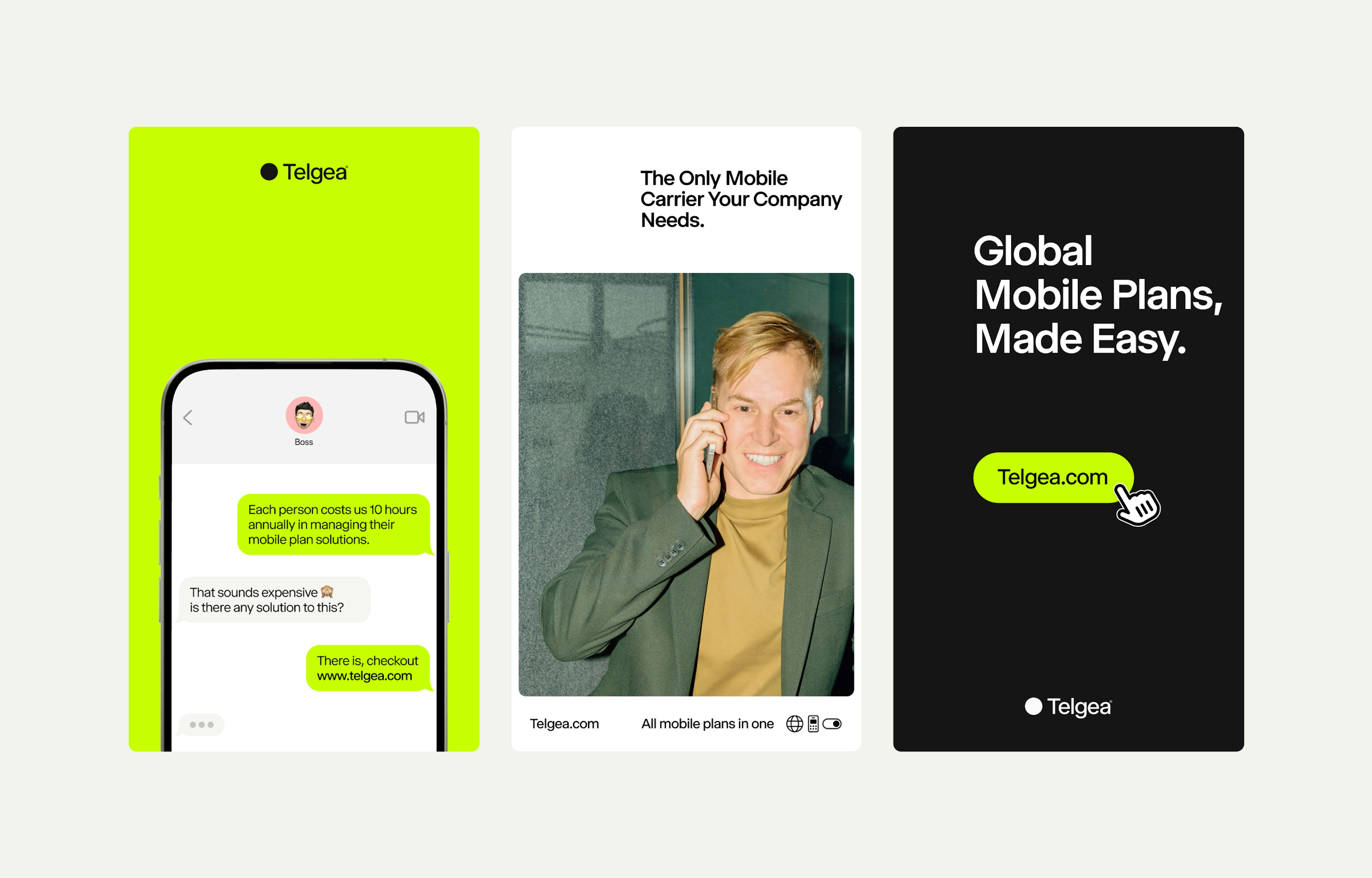
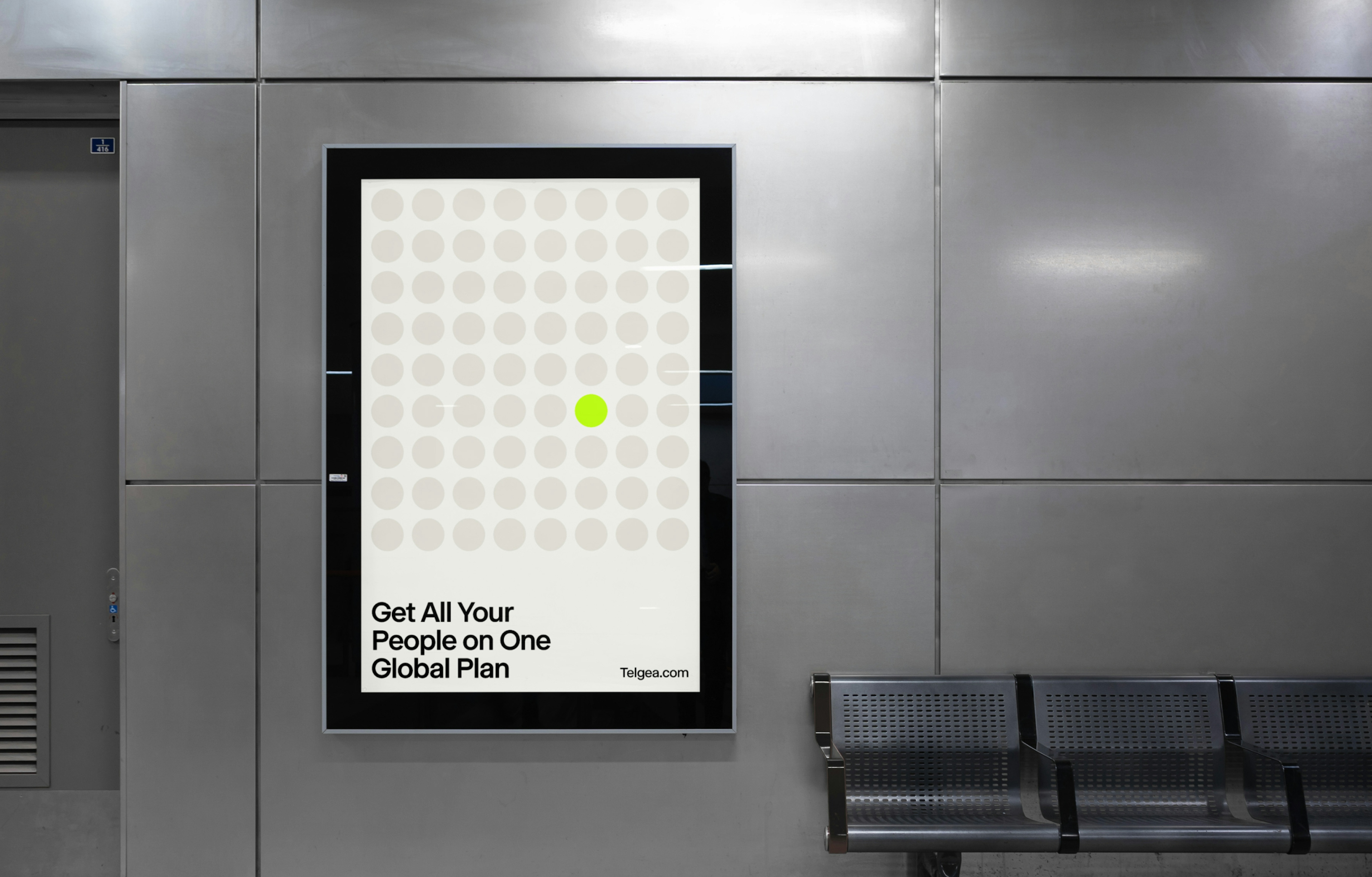
Global mobile plans, made easy

Client: Telgea
Key Focus: Brand identity, Product Design
Timespan: July '24 - present
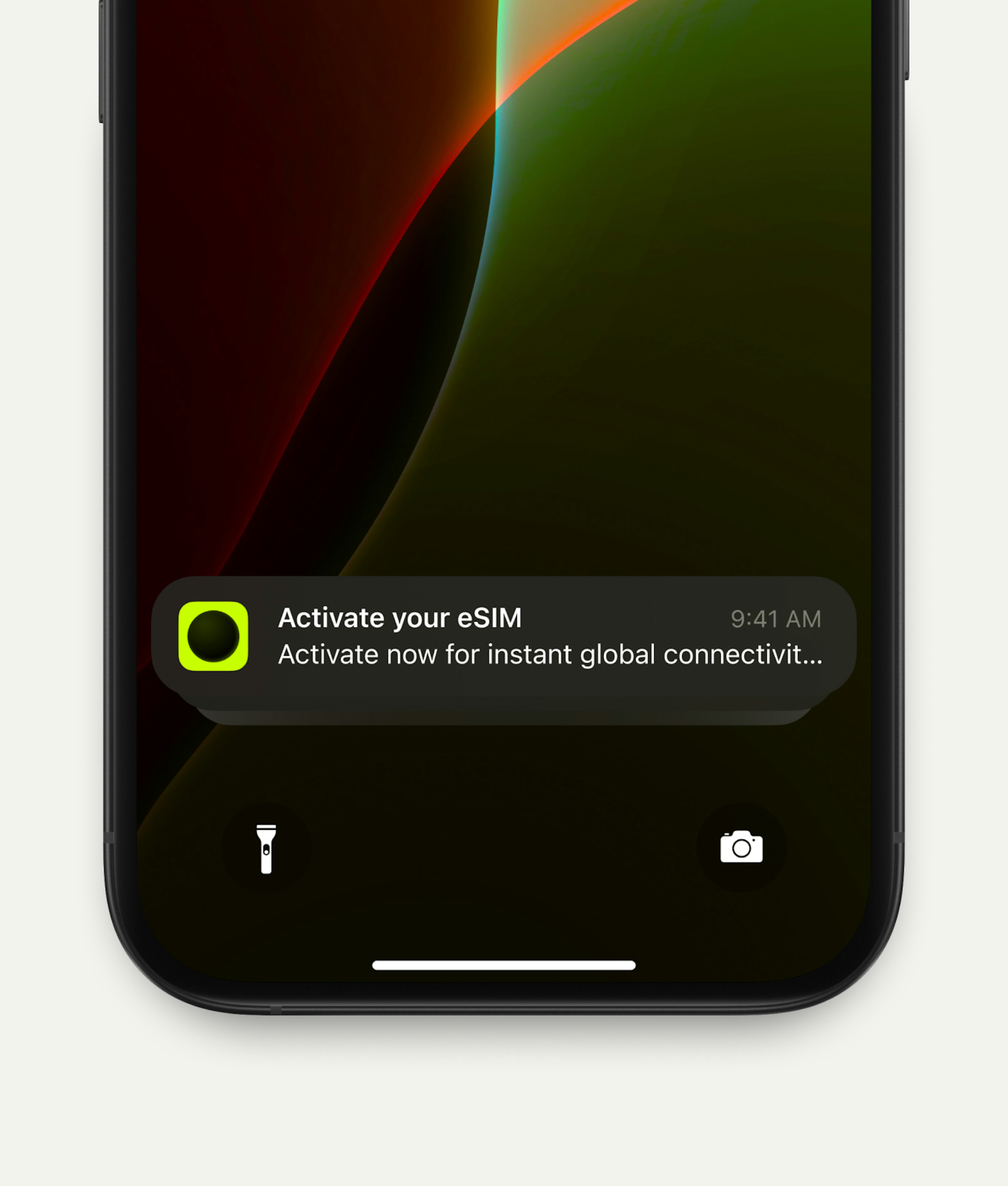
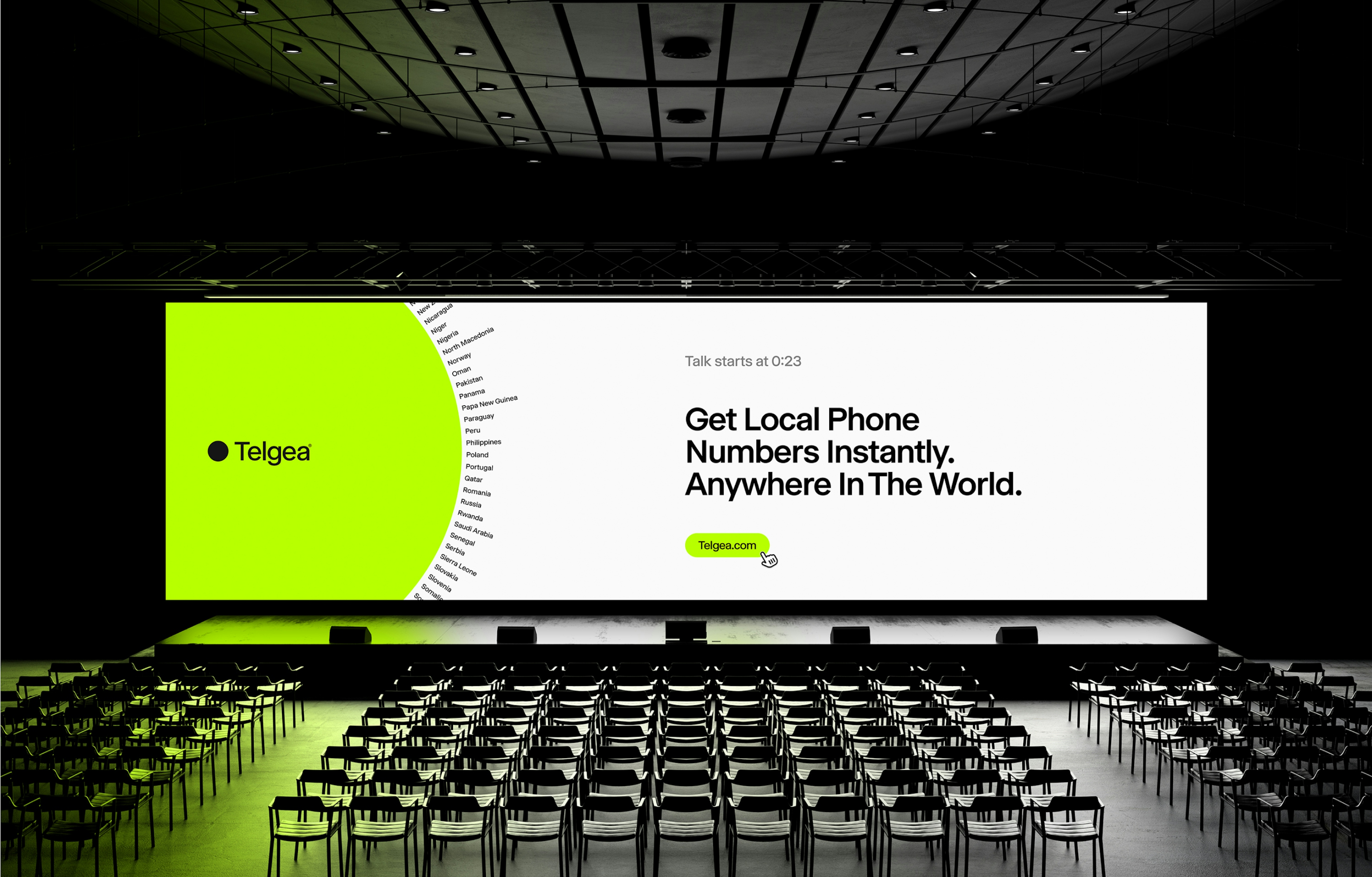
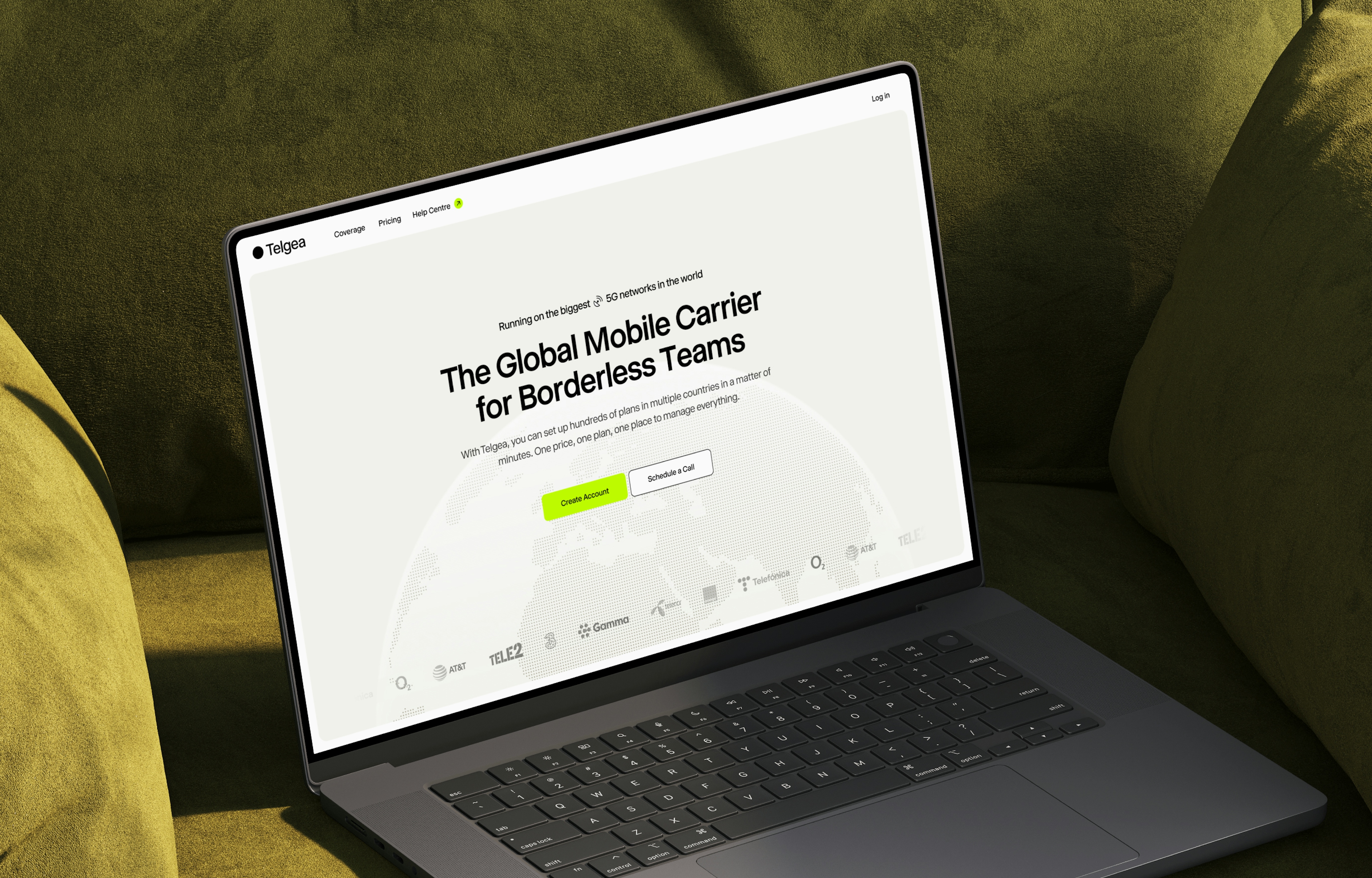
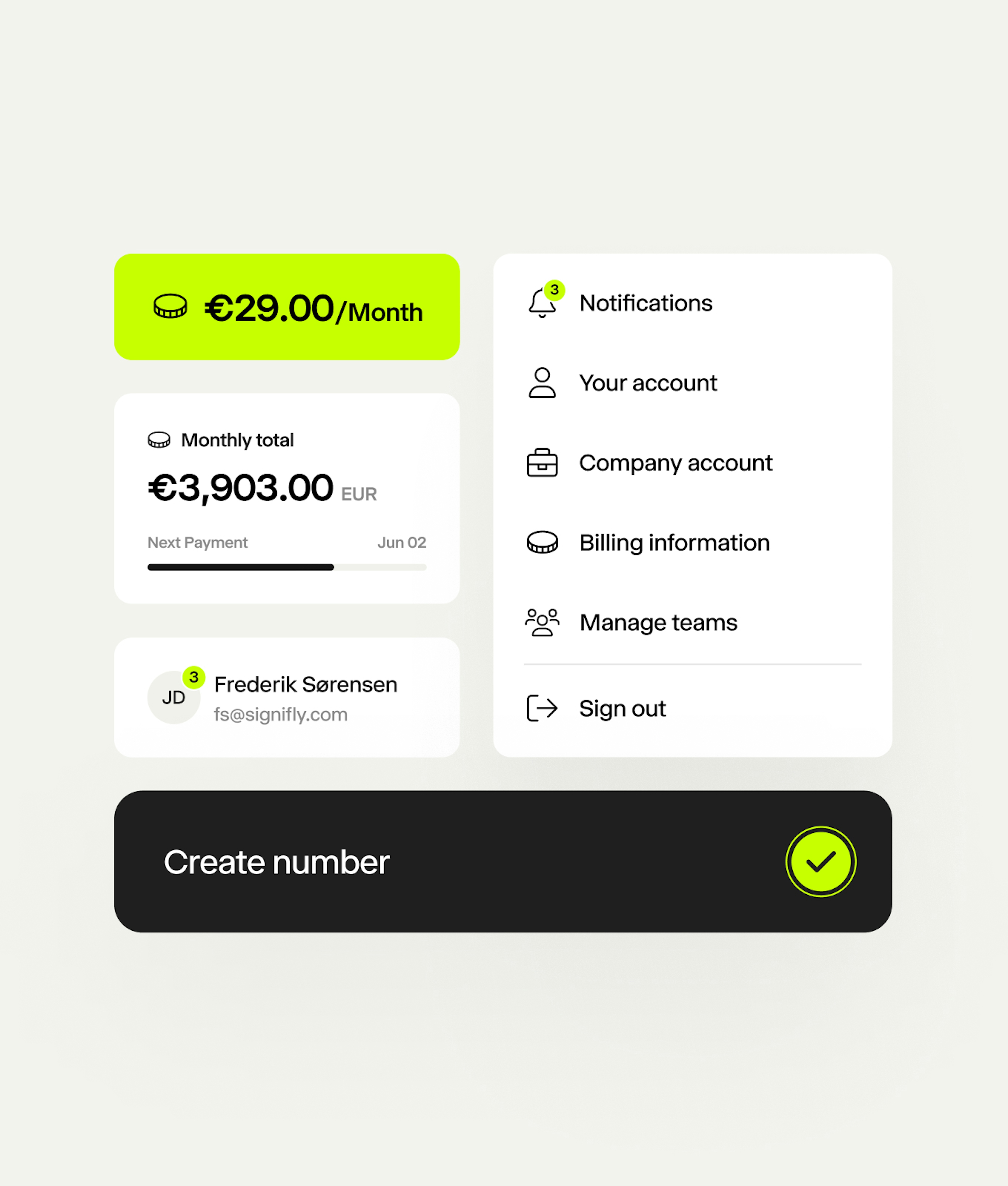
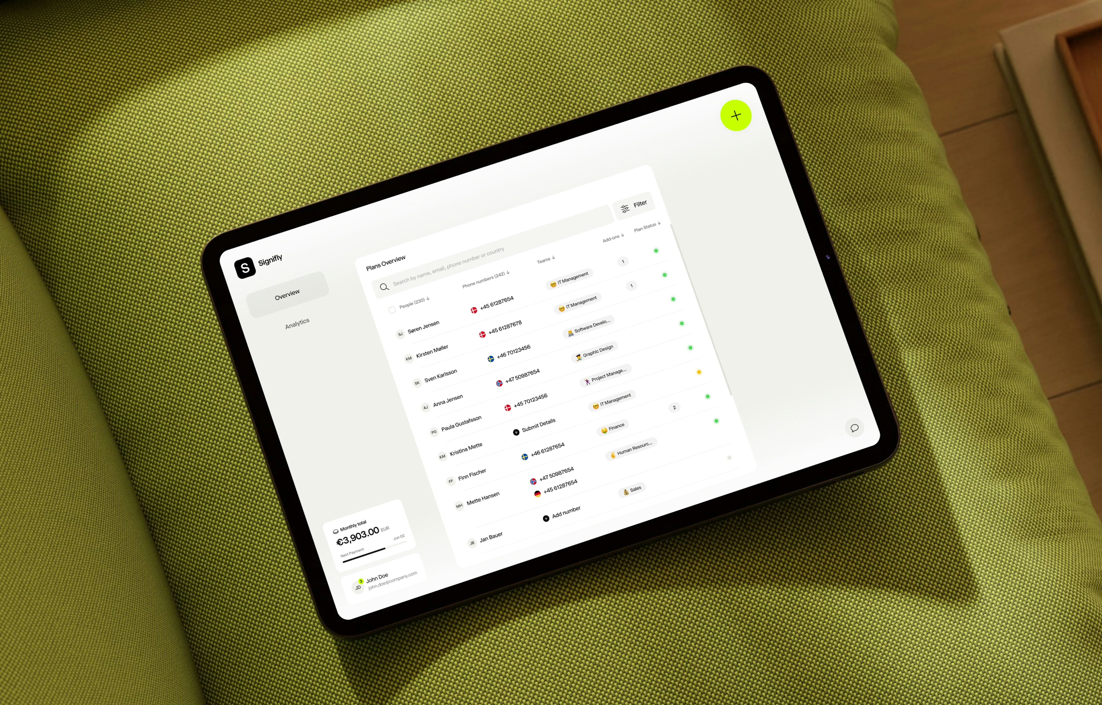
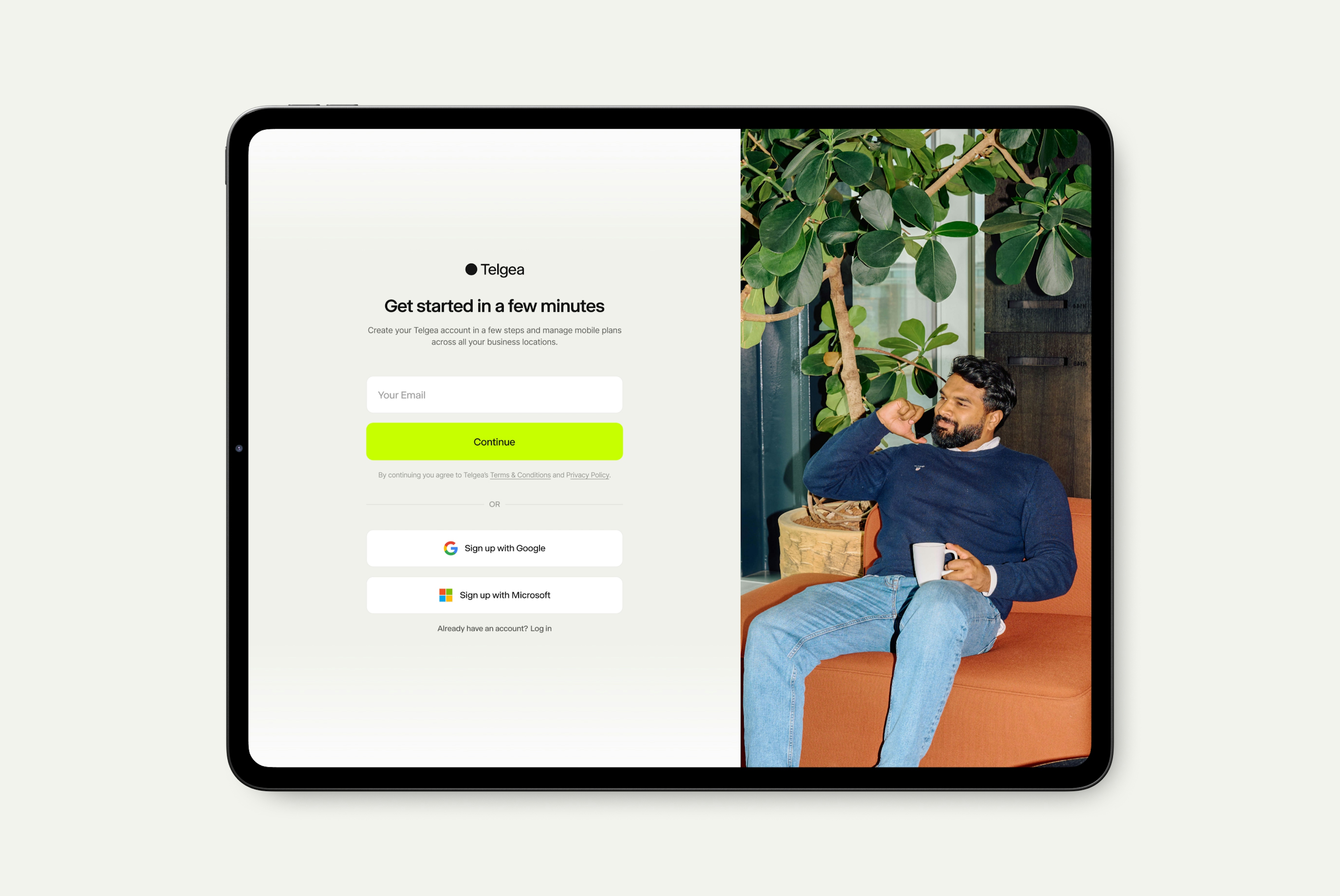
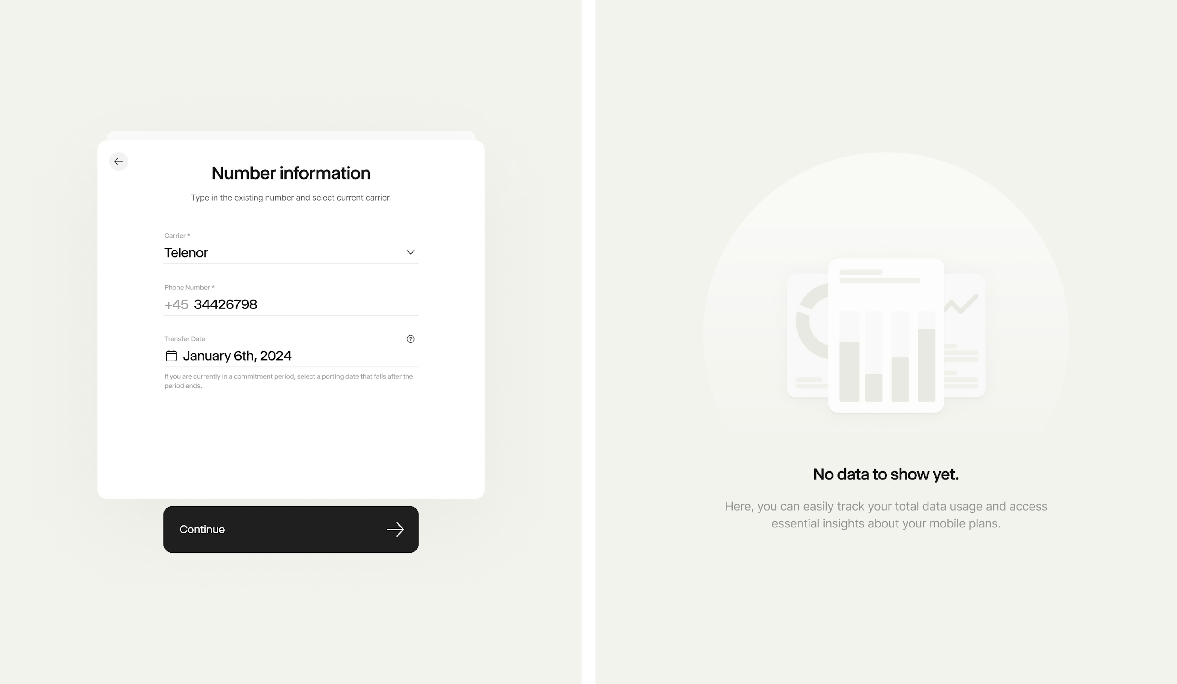
Telgea is a forward-thinking startup with a bold mission: to simplify and streamline telecommunications for businesses. They understand the complexities companies face when juggling multiple carriers, diverse plans across different countries, and managing telecom services for hundreds or thousands of employees. Telgea eliminates this chaos by offering an all-in-one solution. With their platform, businesses can easily acquire local numbers and enjoy a unified plan that meets all their needs.
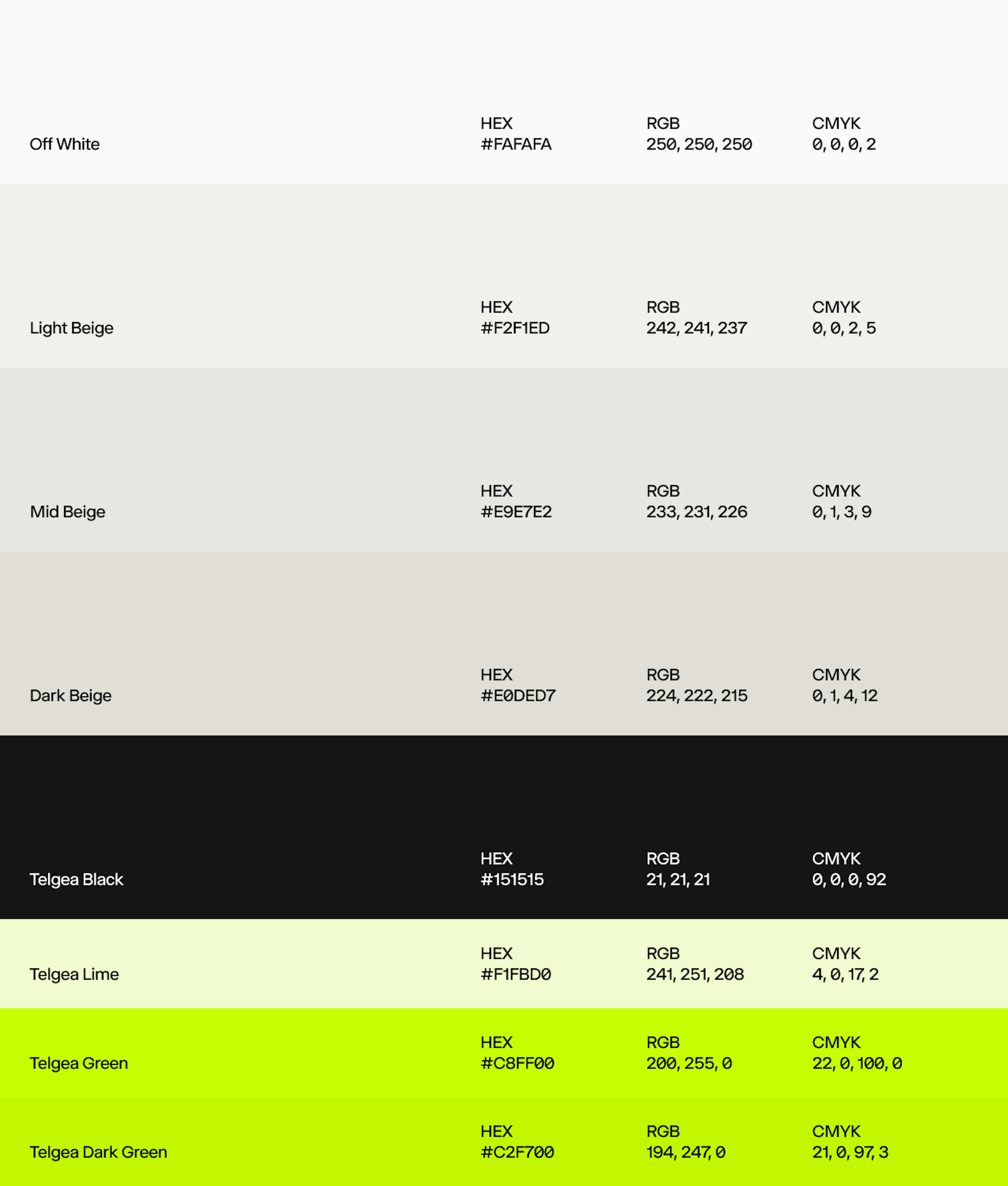
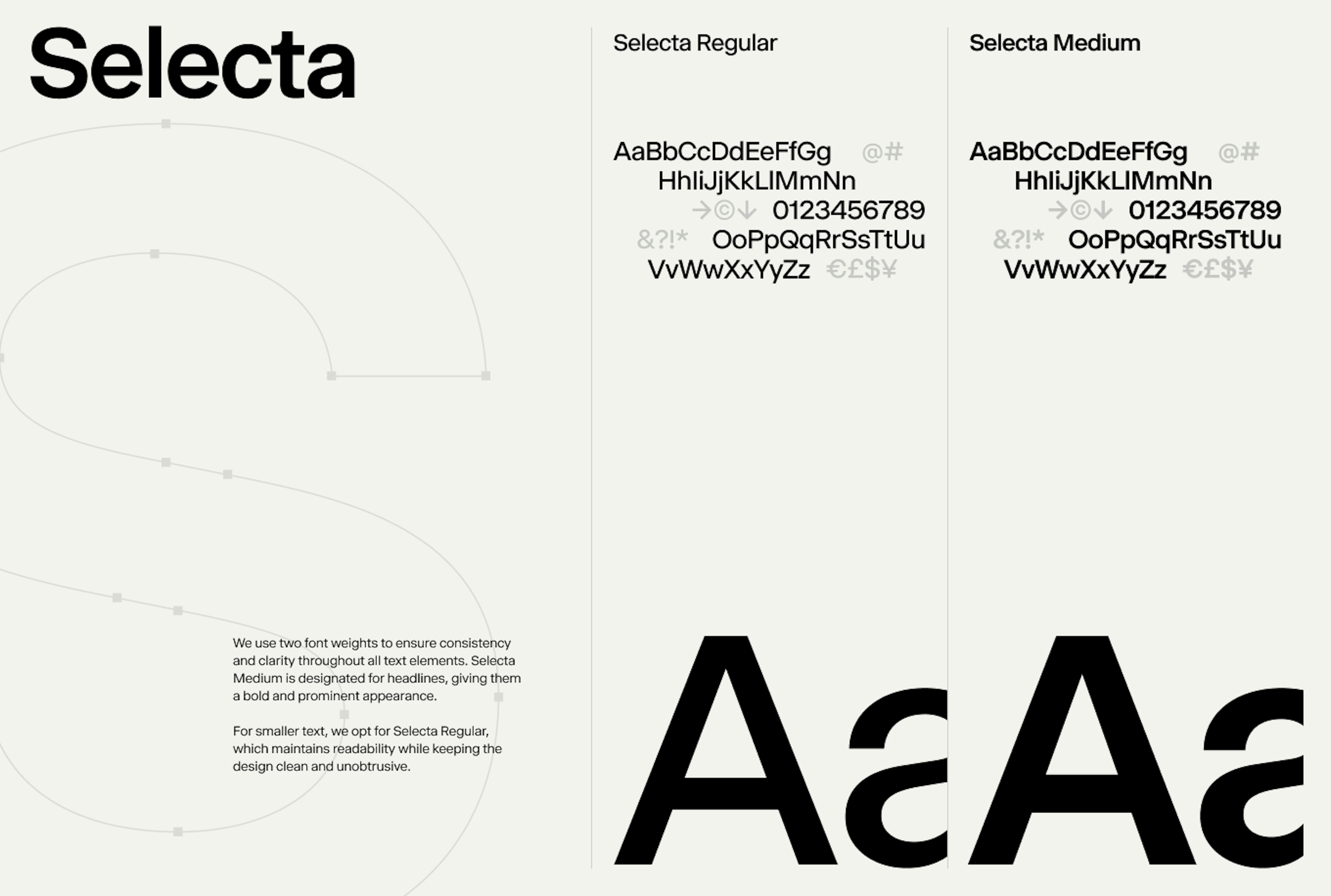
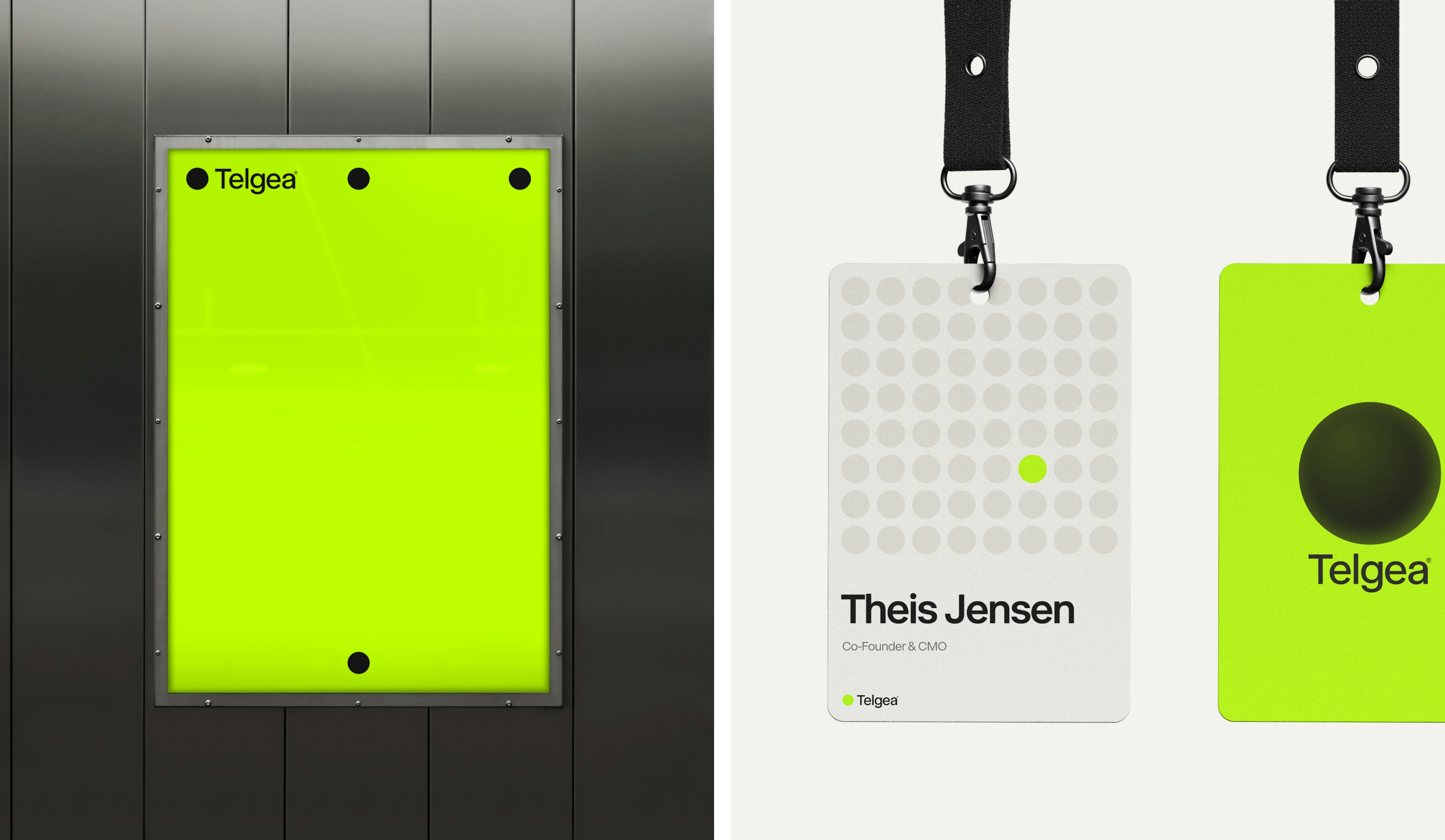
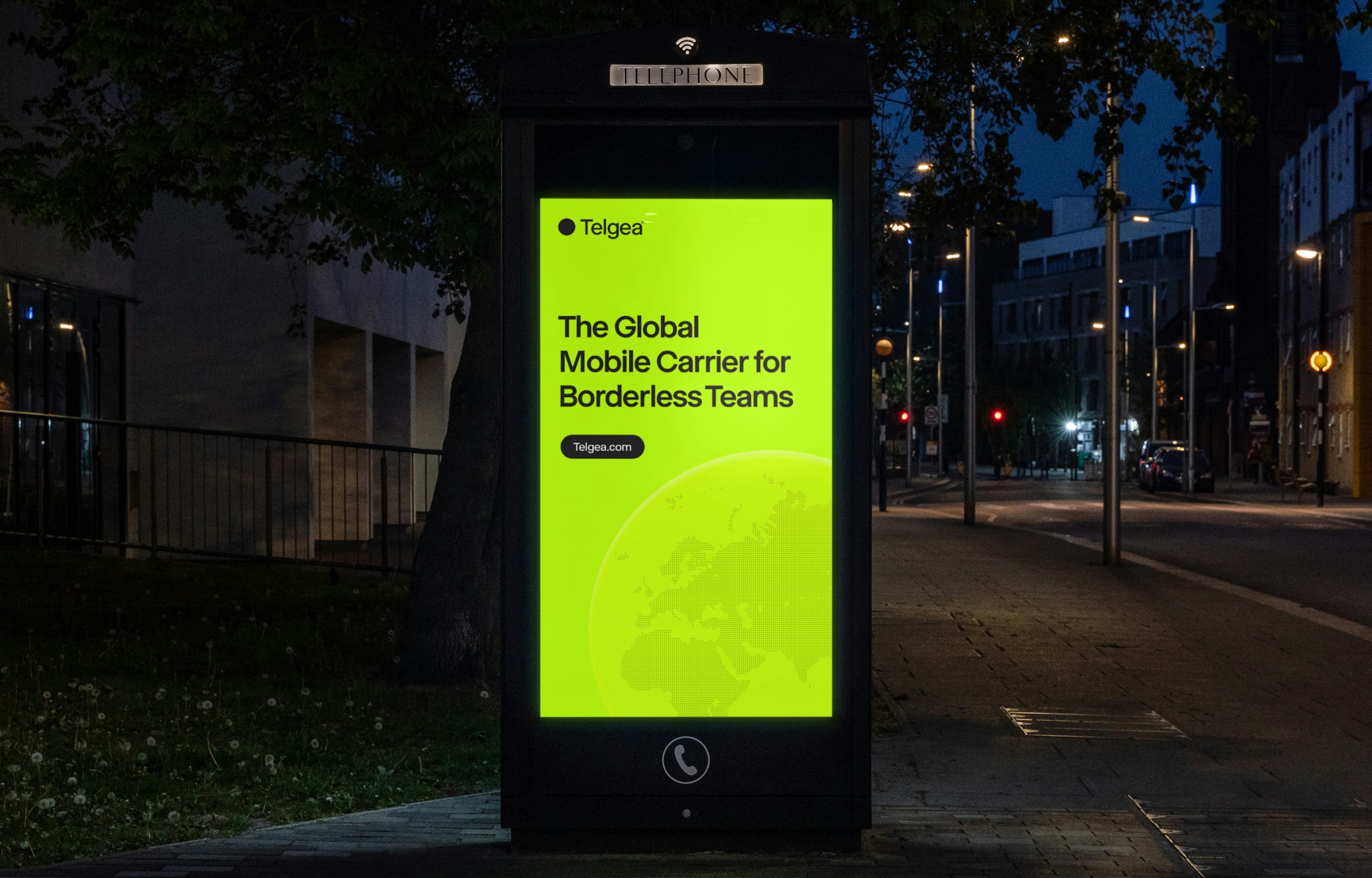
When developing the Telgea brand, the goal was to craft something that embodies digital innovation and simplicity. The name “Telgea” merges the concepts of “Pangea” and “Telco,” symbolizing a unified telecommunications experience across the globe. This vision inspired a minimalist logo mark, representing the coming together of all continents into a single, connected sphere.

Kudos to
Project Lead / Michael Valentin
Lead Designer / Lukas Jurcik
Designer / Alexander Spliid
Project Manager / Sofie Henriksen
Related work
DOT
Uncovering the story and services beneath the surface
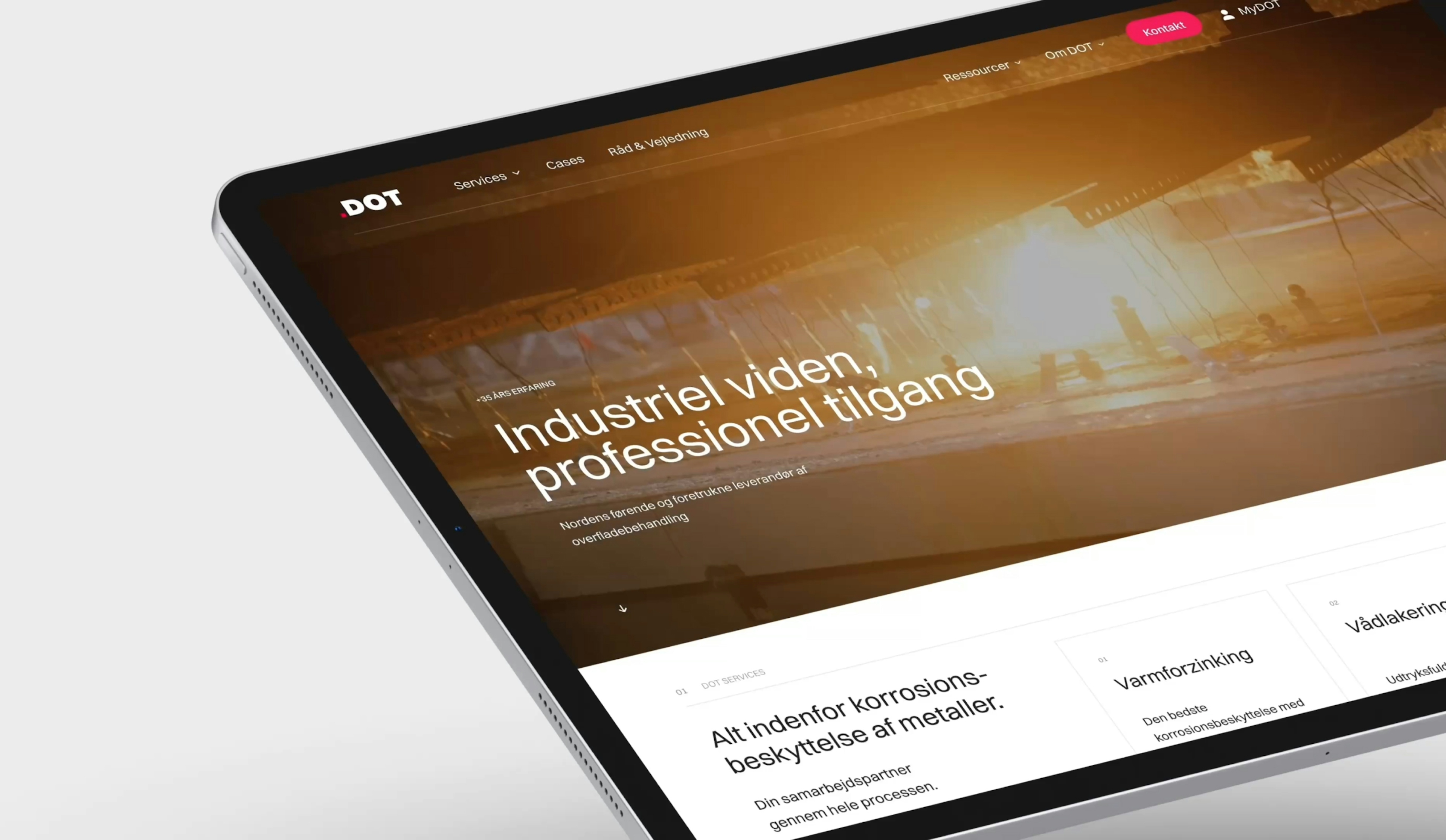
Client: DOT A/S
Partnership Lead: Oliver Alminde
Key Focus: Web design, Webflow, Brand
Surface treatment might not sound exciting at first, but it’s crucial - and DOT A/S has been proving that since 1984. Formerly known as Dansk Overflade Teknik, DOT has been protecting structures like buildings, bridges, and libraries with their innovative services for decades.
What began as a simple website redesign evolved into a complete overhaul of DOT’s external communication. The focus shifted from individual products to highlighting their full-service operations. The result? A dynamic Webflow website launched in five languages, fresh video and photo content, and a comprehensive marketing setup. This new brand presence positions DOT for global growth, elevating them as a leader in the surface treatment industry.