Diva — Soins conscients pour le cycle menstruel
Pour toutes vos périodes.

Client: Diva International Inc.
Key Focus: Refonte de la marque et construction de la plateforme de commerce électronique
Timespan: Déc '21 - Jan '23
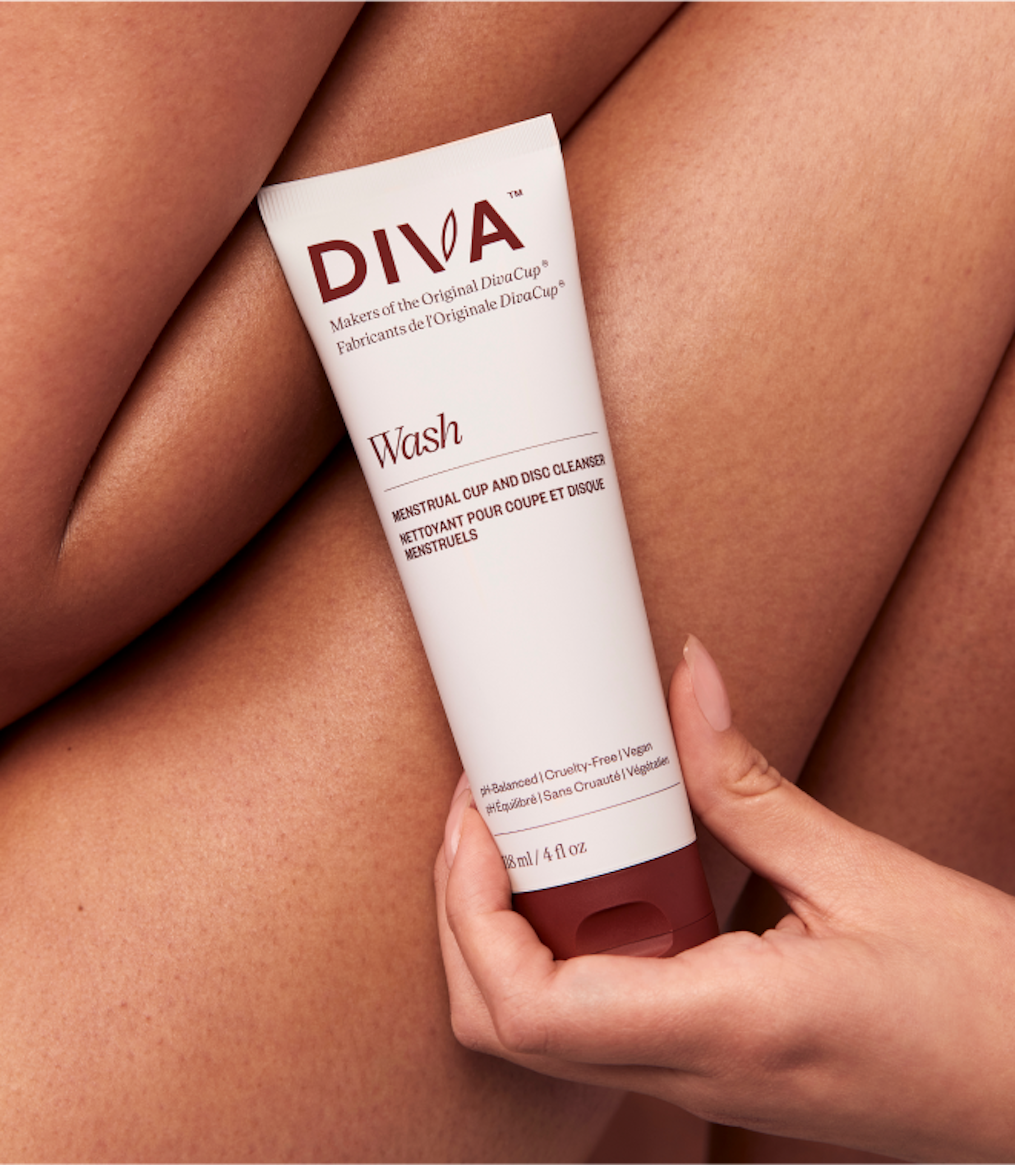
Diva est une marque emblématique connue pour ouvrir la voie dans l'industrie moderne des soins menstruels grâce à l'adoption mondiale de leur produit, la DivaCup. Alors que de nouveaux concurrents émergent dans la catégorie, le moment était crucial pour un rafraîchissement de la marque et de la plateforme afin que Diva reprenne sa position de leader.
La nouvelle identité de marque met en avant les voix de leur communauté et se concentre sur les valeurs de Diva, affirmant leur position en tant que partenaire de soins menstruels conscients. L'identité visuelle est épurée et plus neutre en termes de genre, avec des couleurs associées à la légèreté et à l'optimisme. Diva a consolidé ses différents sites en une plateforme de commerce électronique centralisée pour garantir une expérience positive à travers toutes leurs offres.


Diva reconnaît les défis liés aux soins menstruels modernes et embrasse la transparence pour fournir à notre communauté les connaissances et la confiance nécessaires pour vivre sans soucis.


Kudos to
Gestionnaire d'innovation / Aurelie Saïz
Stratège / Kathrine Elvira Boysen
Stratège / Sofia Gruchalla-Wesierski
Chef de stratégie / Nicolas Abou
Designer Principal / Alexandre Lee
Designer / Sasha Ng
Développement / Anna Chowattanakul
Développement / Pedro Padron
Related work
RW Blears
With you from formation to exit

Client: RW Blears
Partnership Lead: Matthew Staroste
Key Focus: Brand, Website
RW Blears has been helping shape the VC space for decades, offering sharp legal expertise in fund establishment, corporate finance, investments, and exits. While their work was agile, their digital identity still reflected a more traditional style rather than focusing on their innovative approach. With a client base of startups, founders, and fund managers, they needed to modernise without losing their well-earned gravitas. Their site wasn’t for lead-gen - it was more like a high-end business card - so it had to be clear, engaging, and unmistakably RW Blears.
We took an evolution, not revolution, approach. The goal: show their adaptability - approachable yet authoritative, traditional yet tech-ready. Instead of listing every possible service, we focused on how they partner closely with clients across the entire fund journey, from capital formation to exit. The brand needed to feel personal, flexible, and tailored - like the legal equivalent of a bespoke suit. The new identity kept their trusted blue but added a burst of vibrant yellow for energy, balanced with light stone and airy blue variations. Navigation was restructured to highlight expertise, and fresh photography captured the team’s personality in action. Subtle animations and a star-motif graphic system added warmth and dynamism, resulting in a brand that feels as nimble and future-ready as the firm itself.