Rejsepunkt
Connecting every city across the country
Client: Rejsepunkt
Key Focus: Branding, App design, Visual identity
Timespan: Jan ’24 - Present
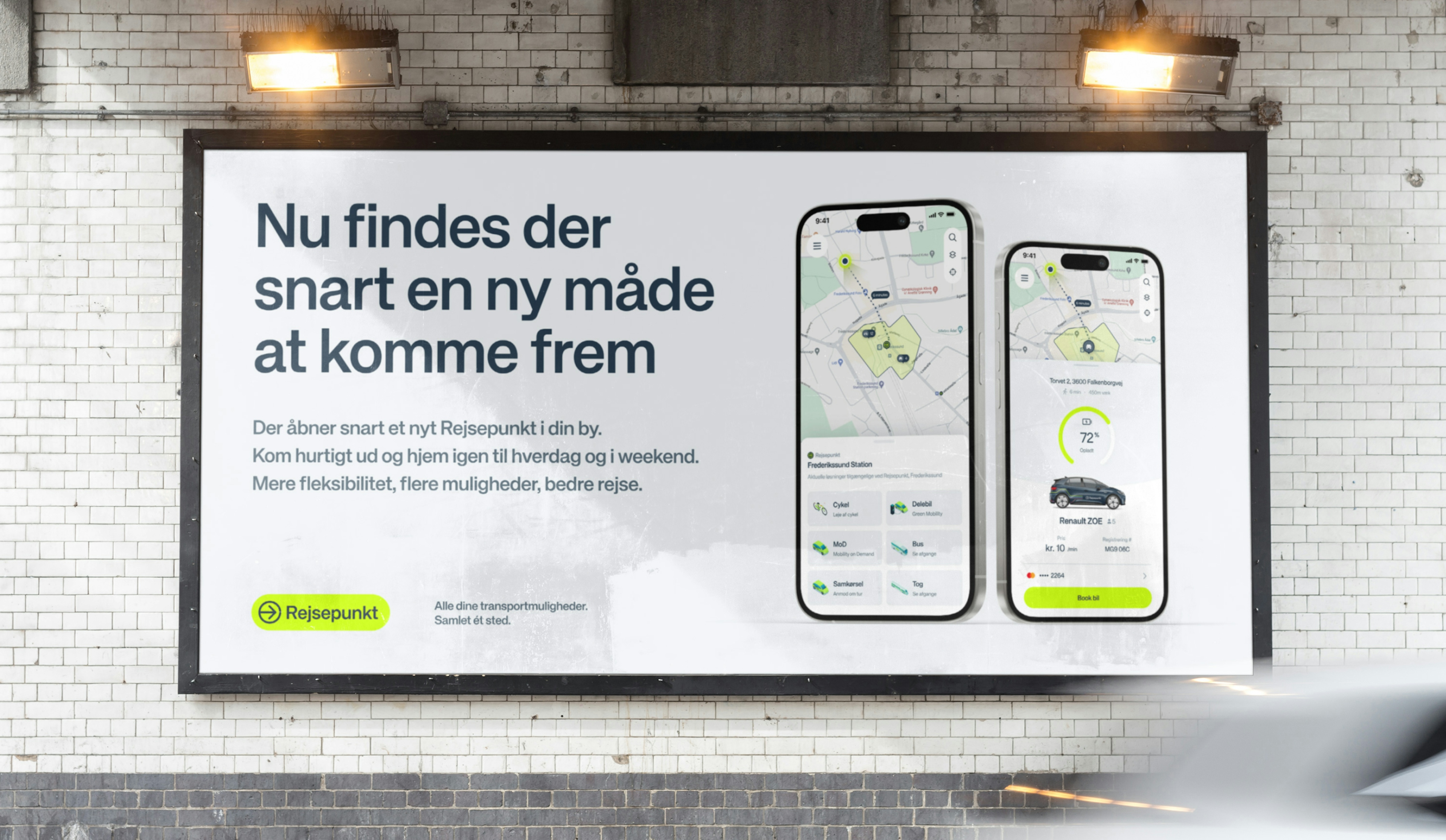
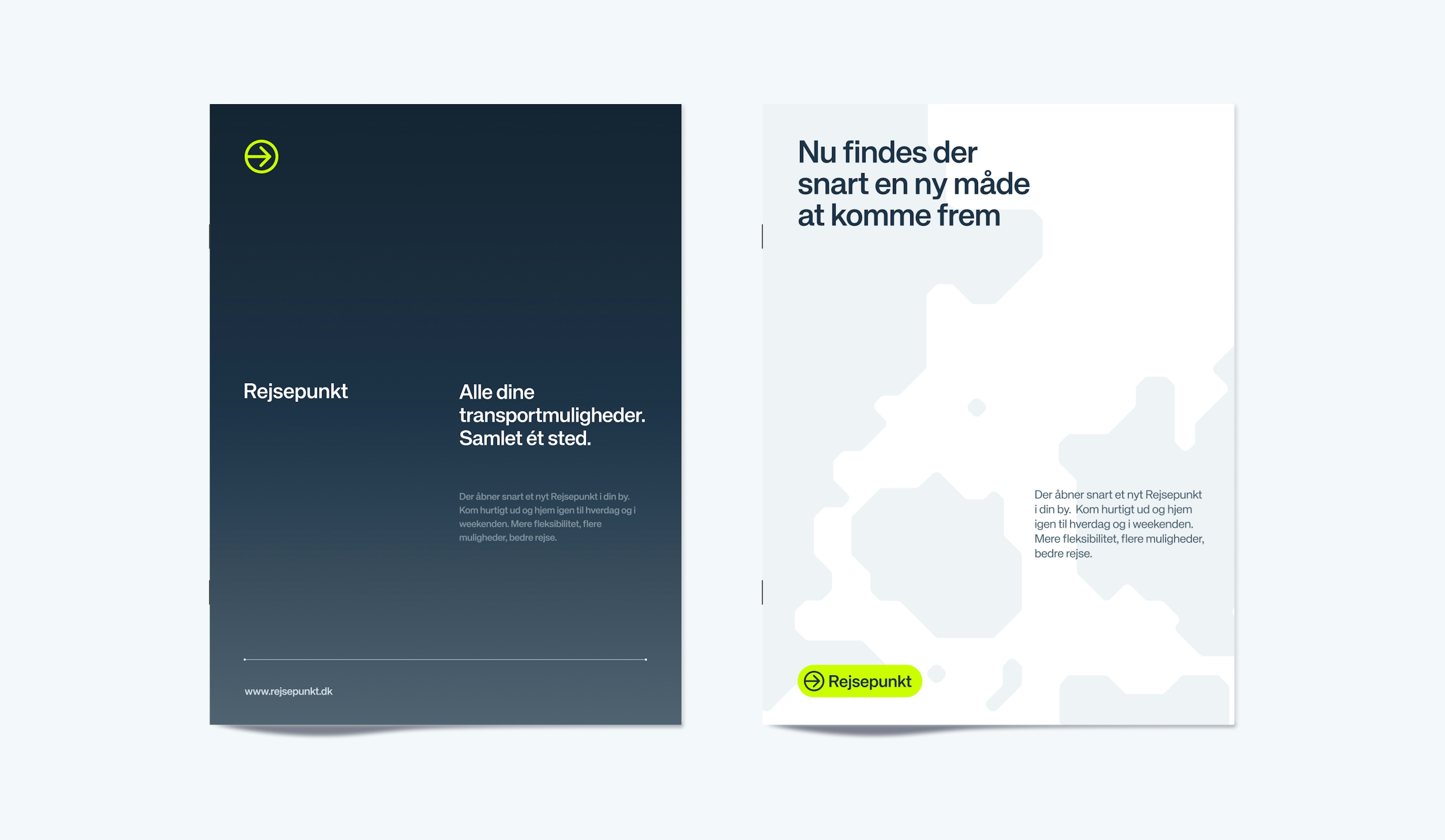
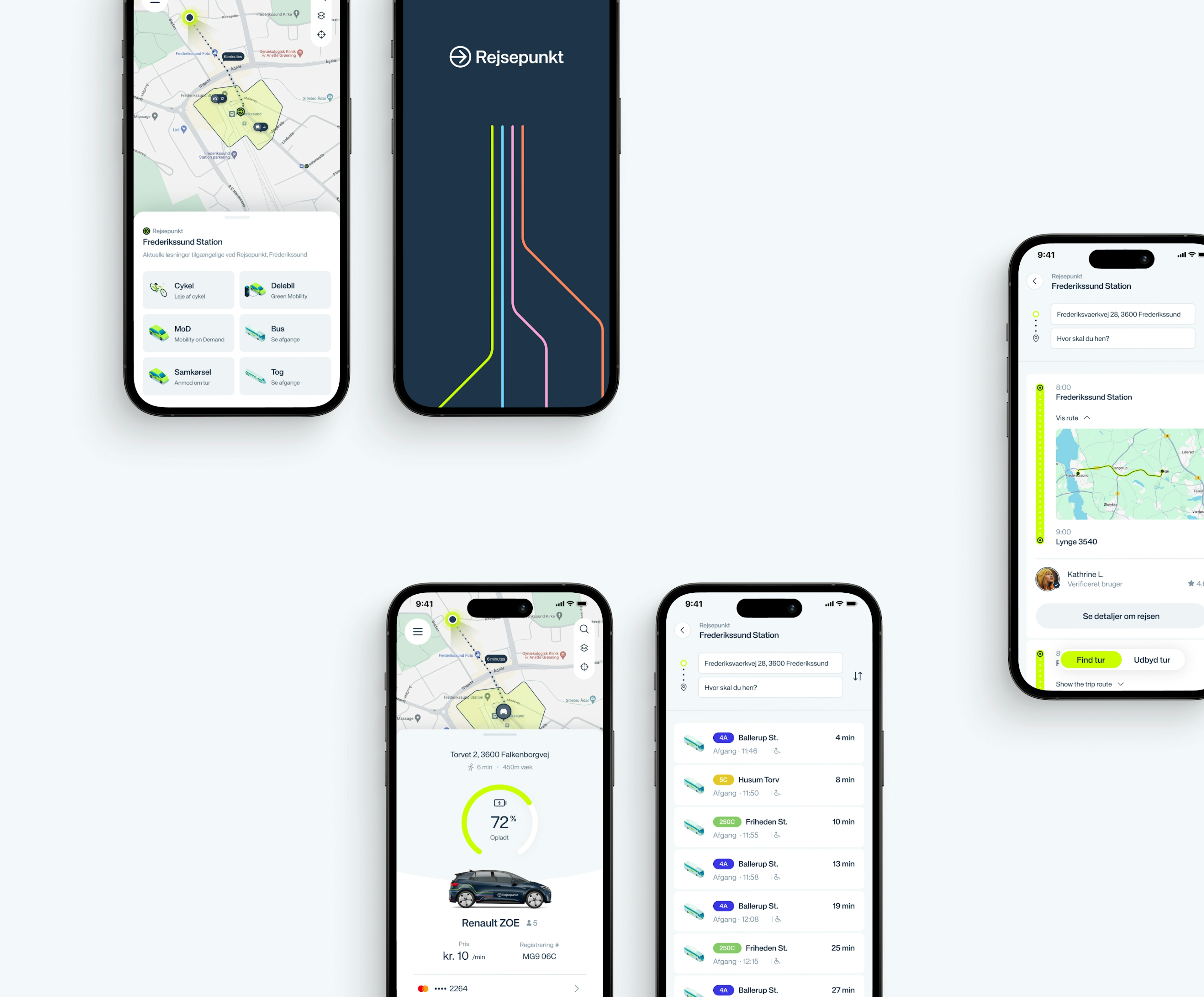
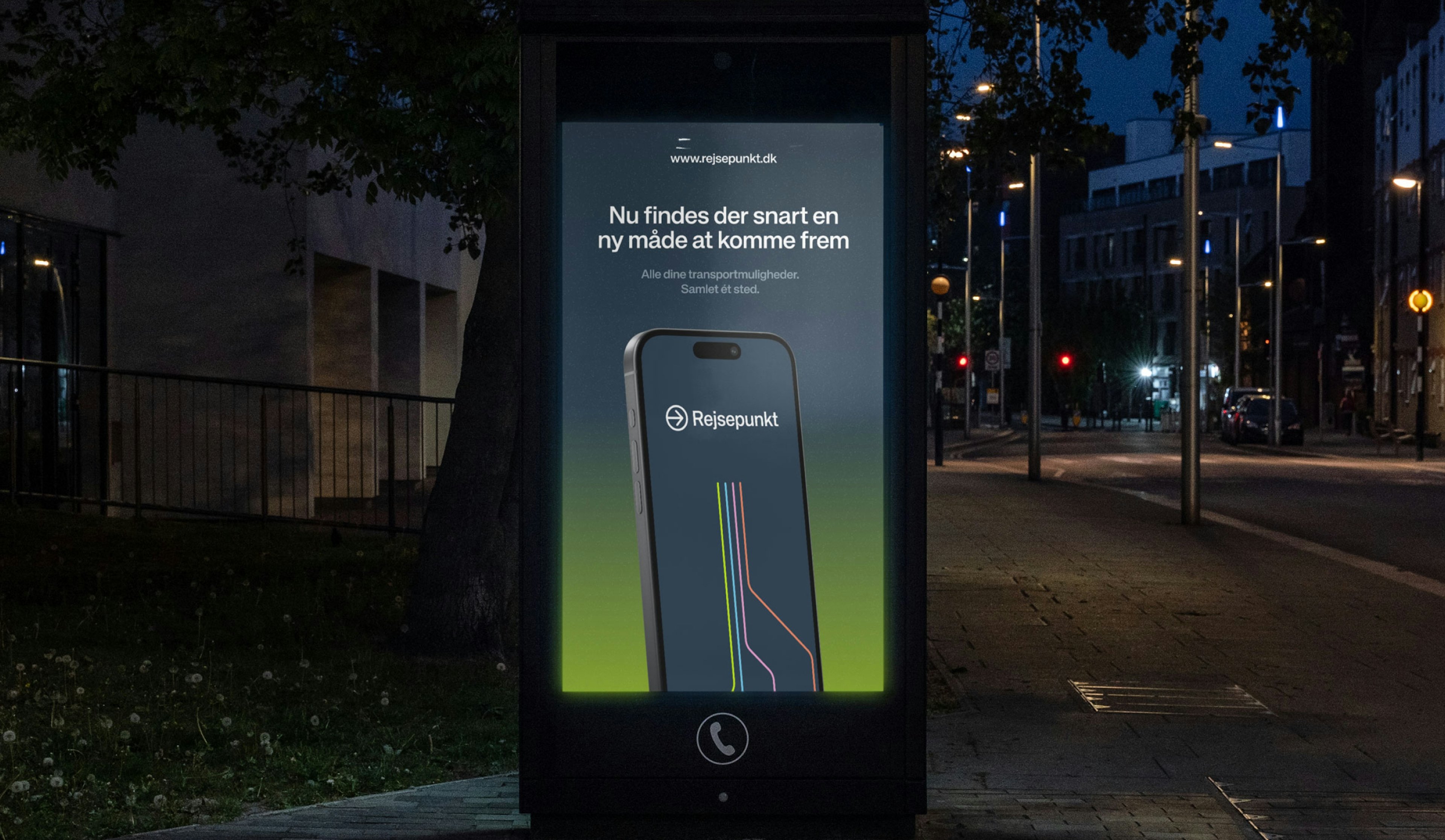
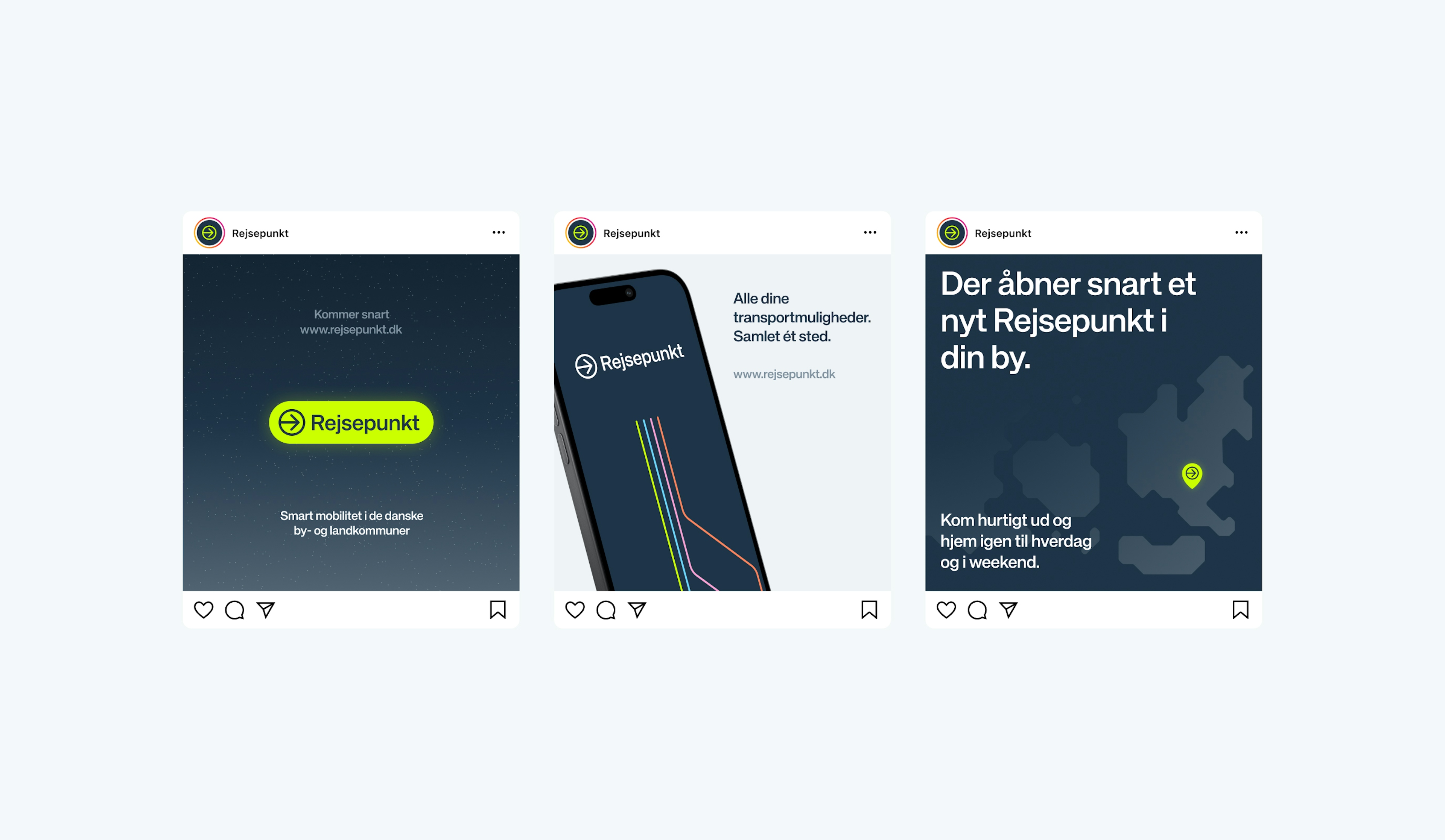
While Denmark's urban areas benefit from well-established transport systems, with strong digital integrations, rural regions continue to face significant mobility challenges. To bridge this gap, Rejsepunkt was created—a unified digital platform with ambitions to facilitate multiple transportation services into one intuitive, easy-to-use platform for those in less connected areas.
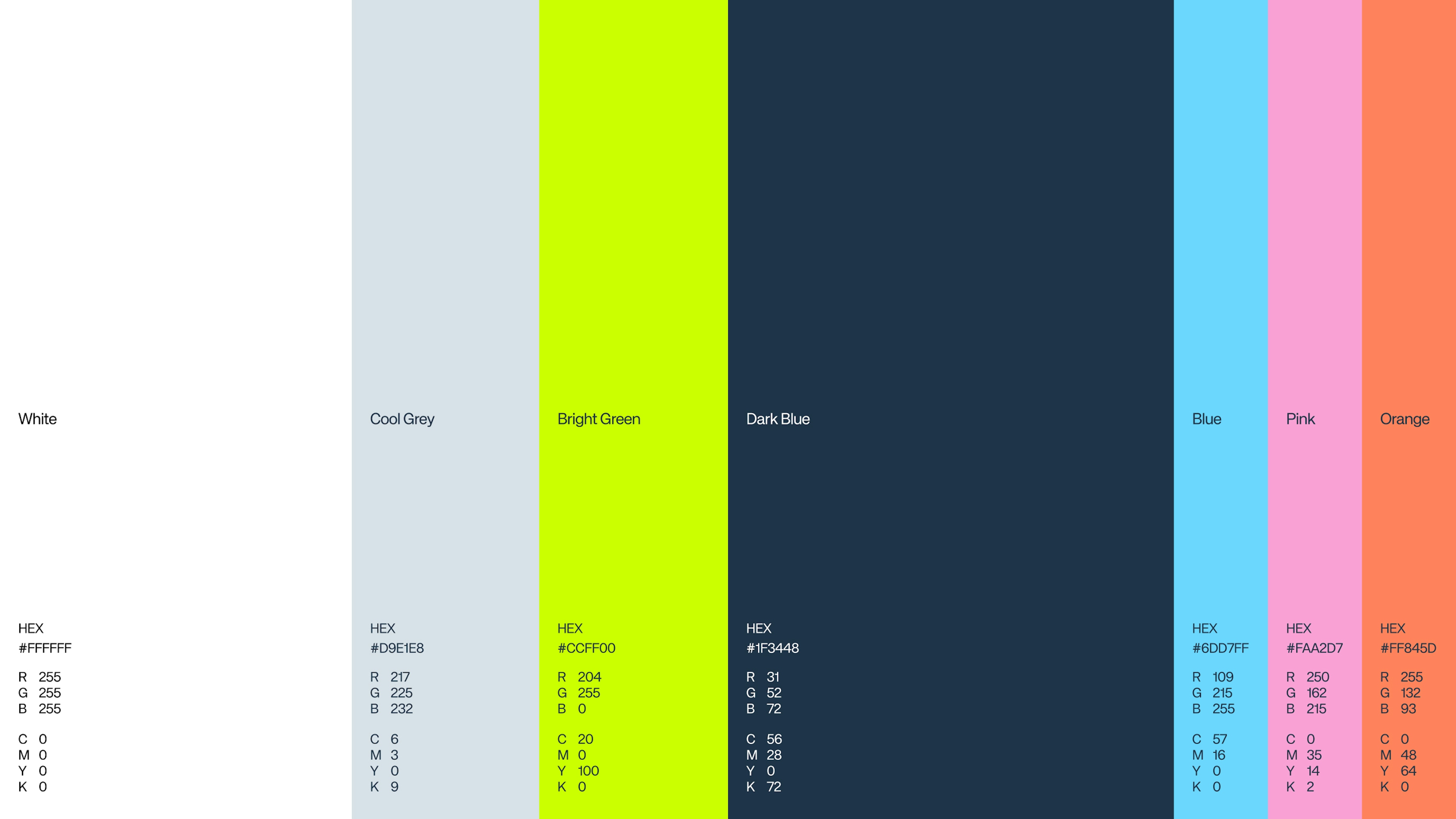
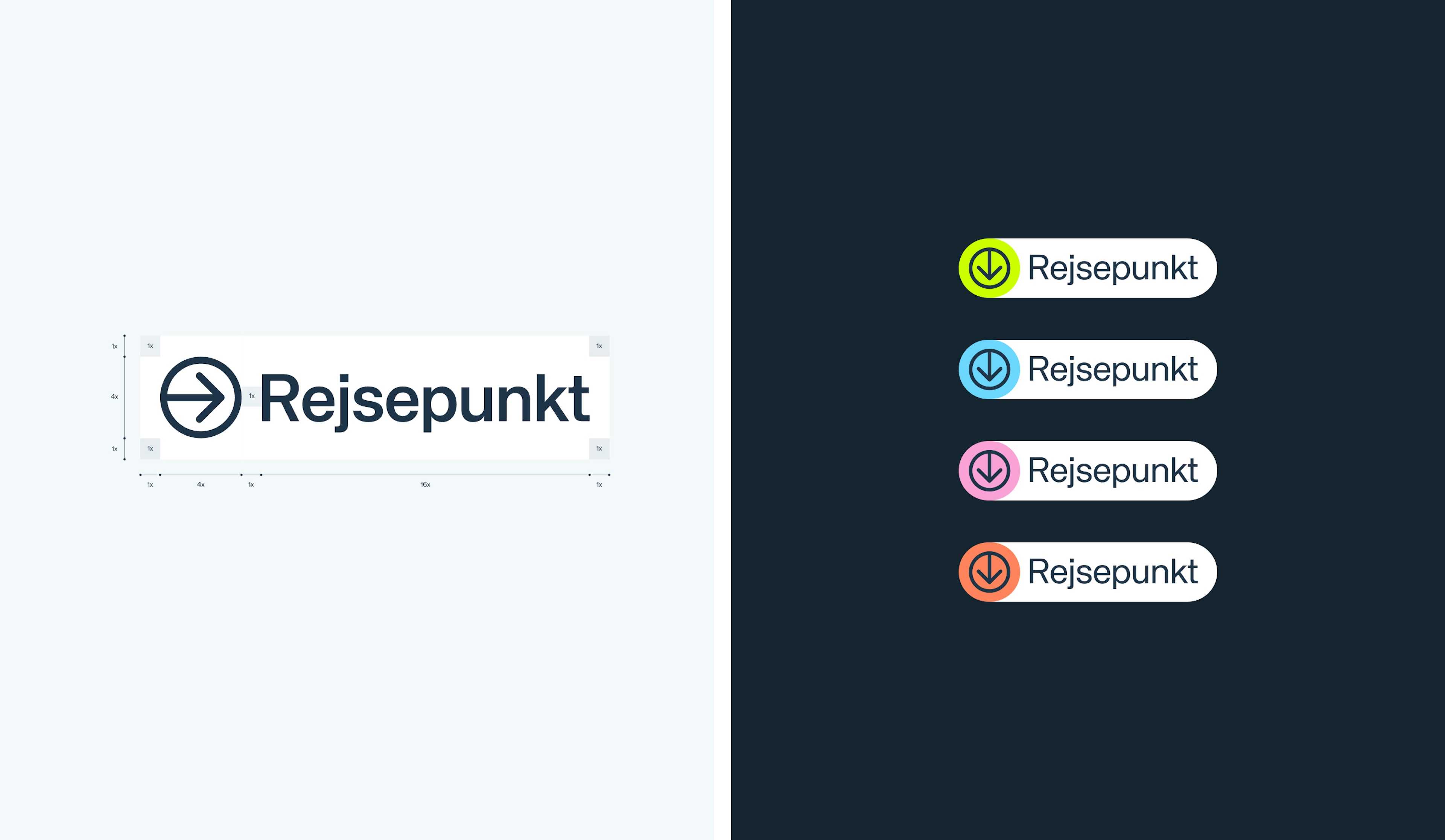
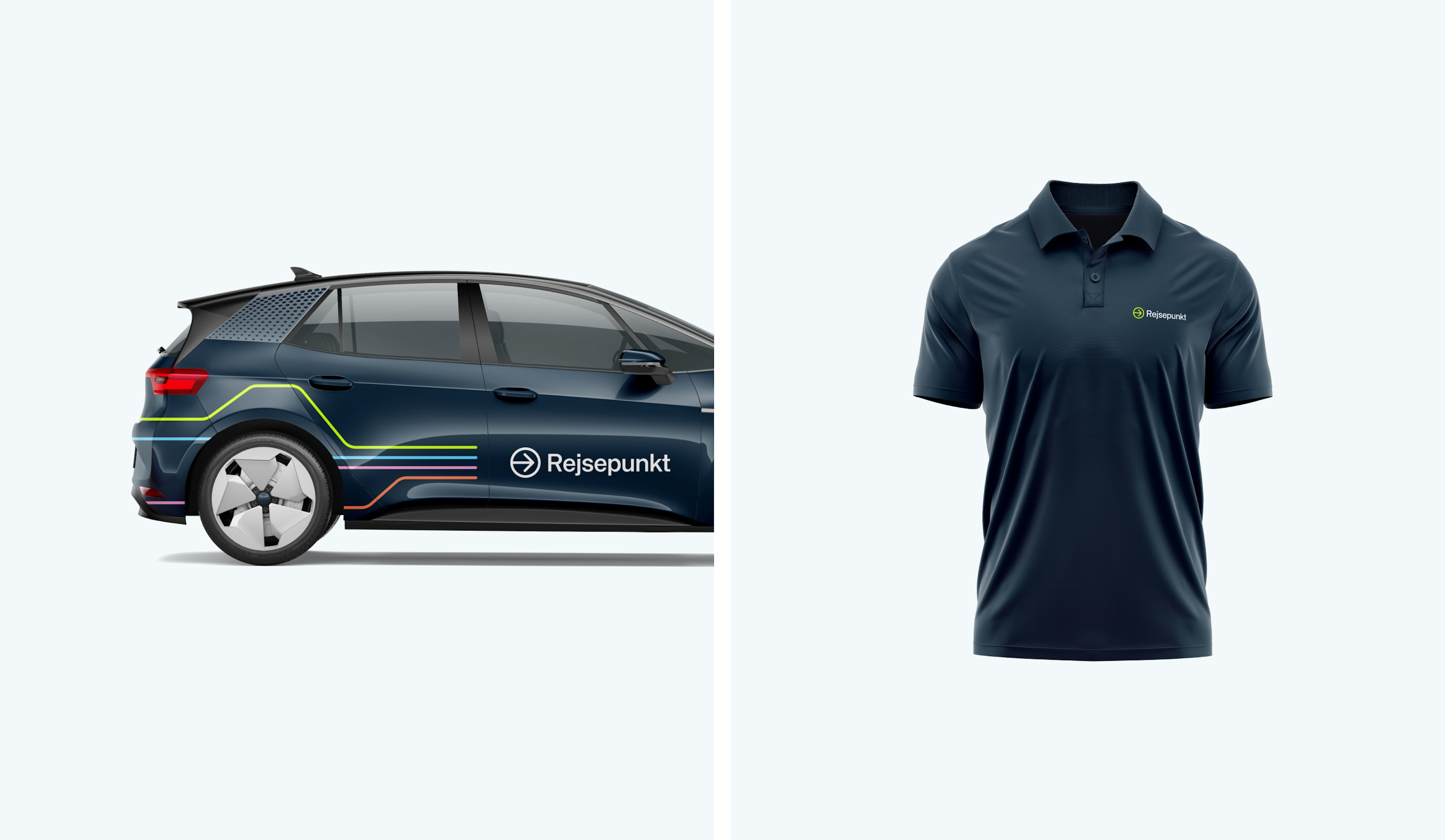
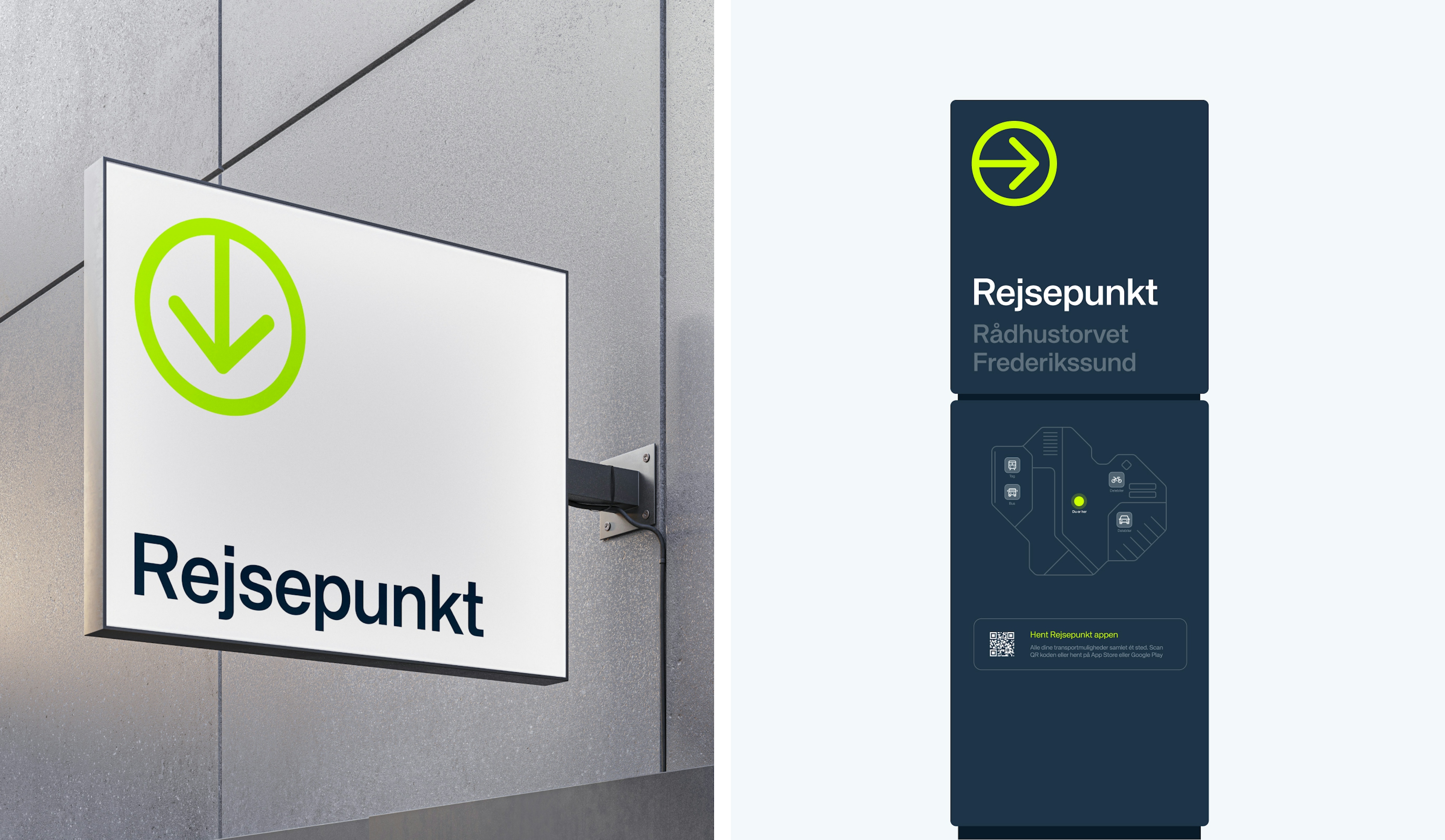
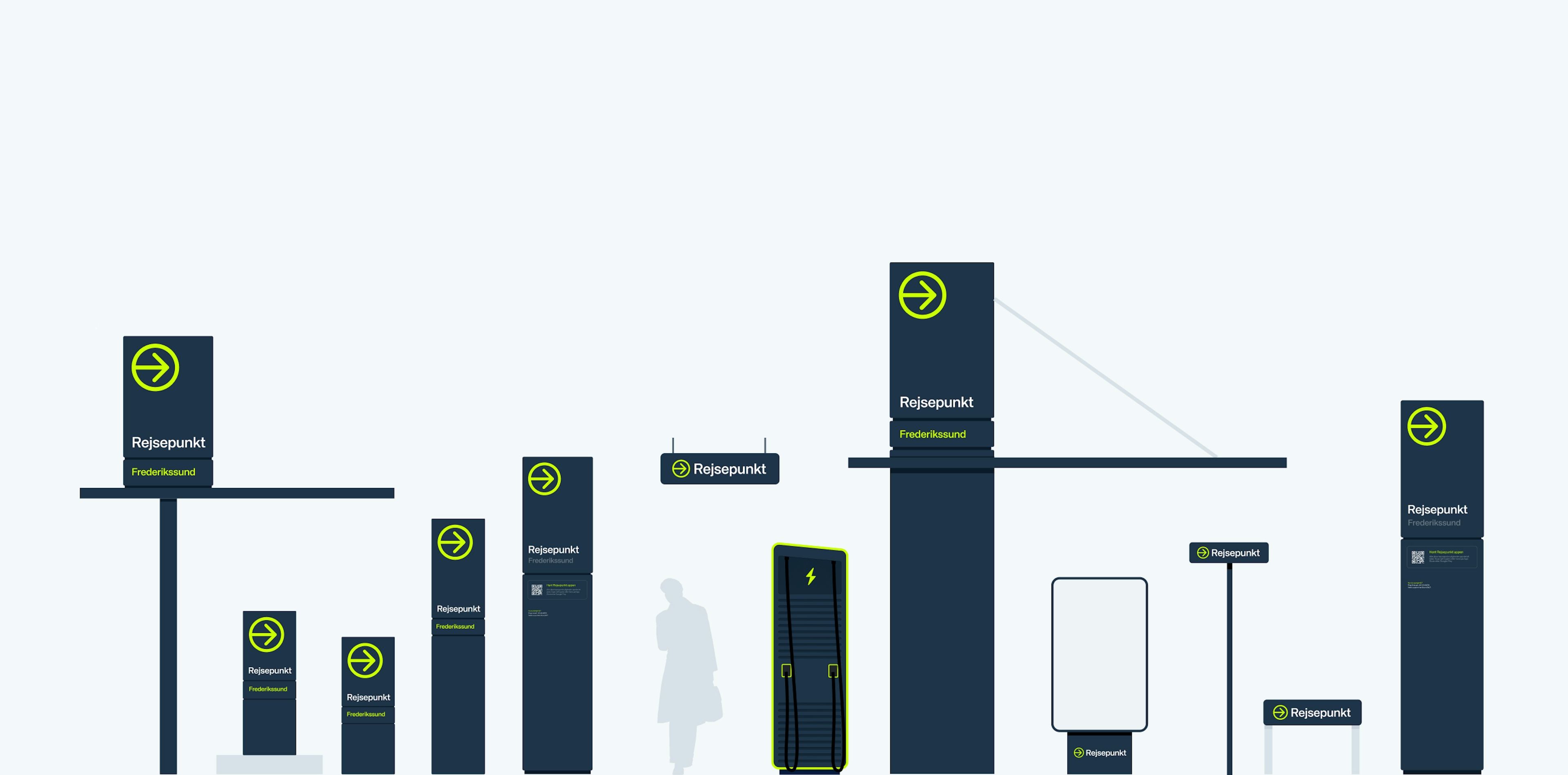
The name “Rejsepunkt” and its visual identity were carefully crafted to embody the brand’s commitment to simplicity and accessibility. The logo and design accents were inspired by well-known travel signage, with bright colors that appear almost ‘lit up’. Graphic elements, like interconnected lines, symbolize travel routes, while color gradients draw inspiration from countryside night skies— well known to rural commuters.
Kudos to
Project Manager / Michael Valentin
Project Manager / Mathilde Lundgreen
Strategist and Copywriter / Sofie Henriksen
Visual Identity / Alexander Spliid
Digital Designer / Lukas Jurcik
Design / Christopher Ashton
Design support / Søren Schrøder
Developer / Day Anh Nguyen
Related work
Petainer
PET Packaging Solutions
Client: Petainer
Partnership Lead: Jamie Vaughan
Key Focus: Branding
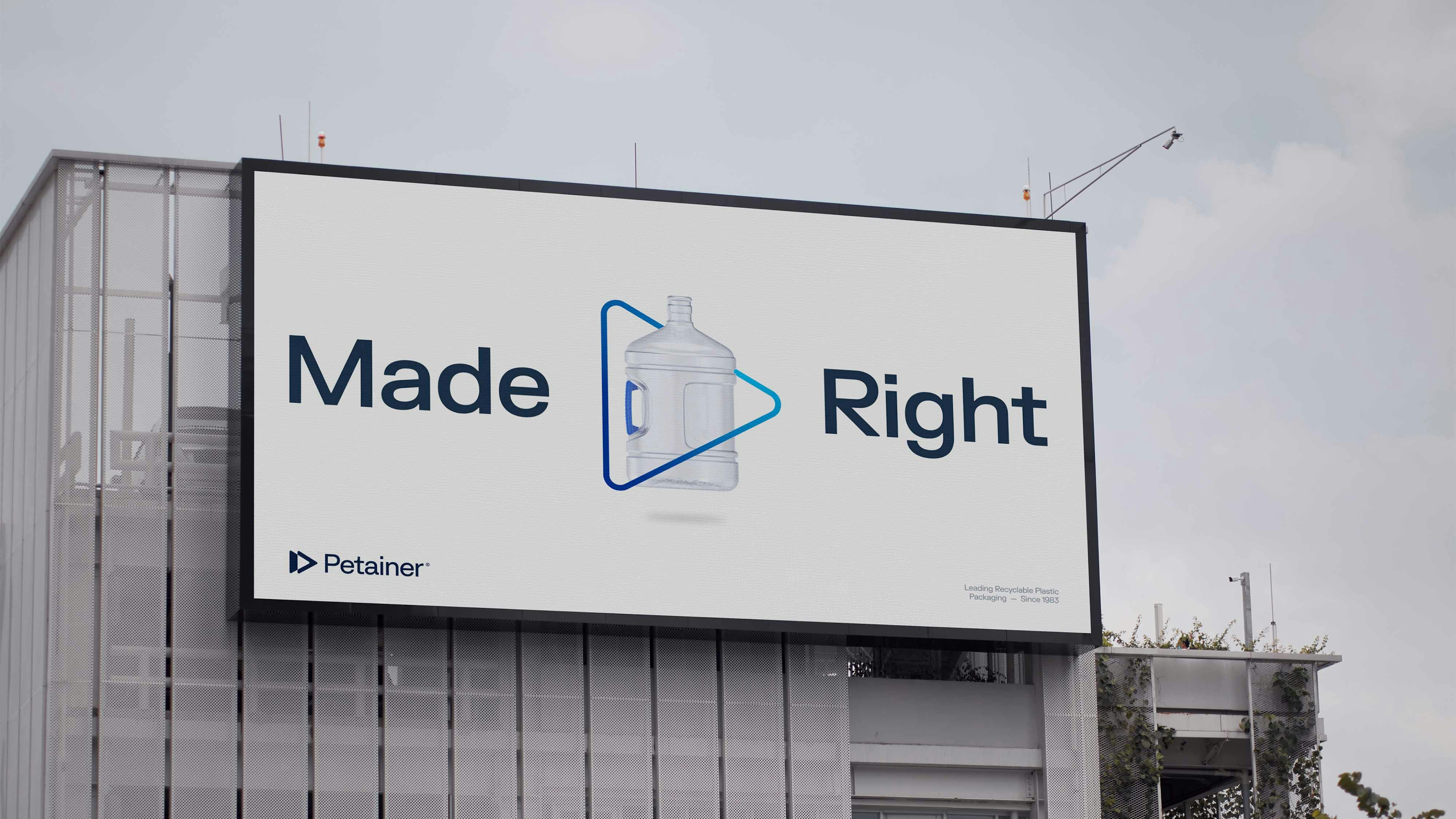
How do you transform a brand’s visual identity without losing the elements at the core of consumer recognition?
As a premium supplier of various PET packaging solutions for leading brands such as Coca-Cola, Carlsberg and Super Bock, Petainer had already earned brand equity and gained recognition due to their well-established reputation and dedication to sustainable plastic development. However, their visual identity felt flat rather than bubbled, so Petainer needed a refresh that instead embodied their feel, reflecting consistency, coherence and intention.
Today, Petainer’s logo, colour scheme, product illustrations and company brochure have more of a pop to them. They’ve been modernised to reflect a uniform feel, whilst still maintaining aspects of their original brand identity.
We'll drink to that!