Rejsepunkt
Connecting every city across the country
Client: Rejsepunkt
Key Focus: Branding, App design, Visual identity
Timespan: Jan ’24 - Present
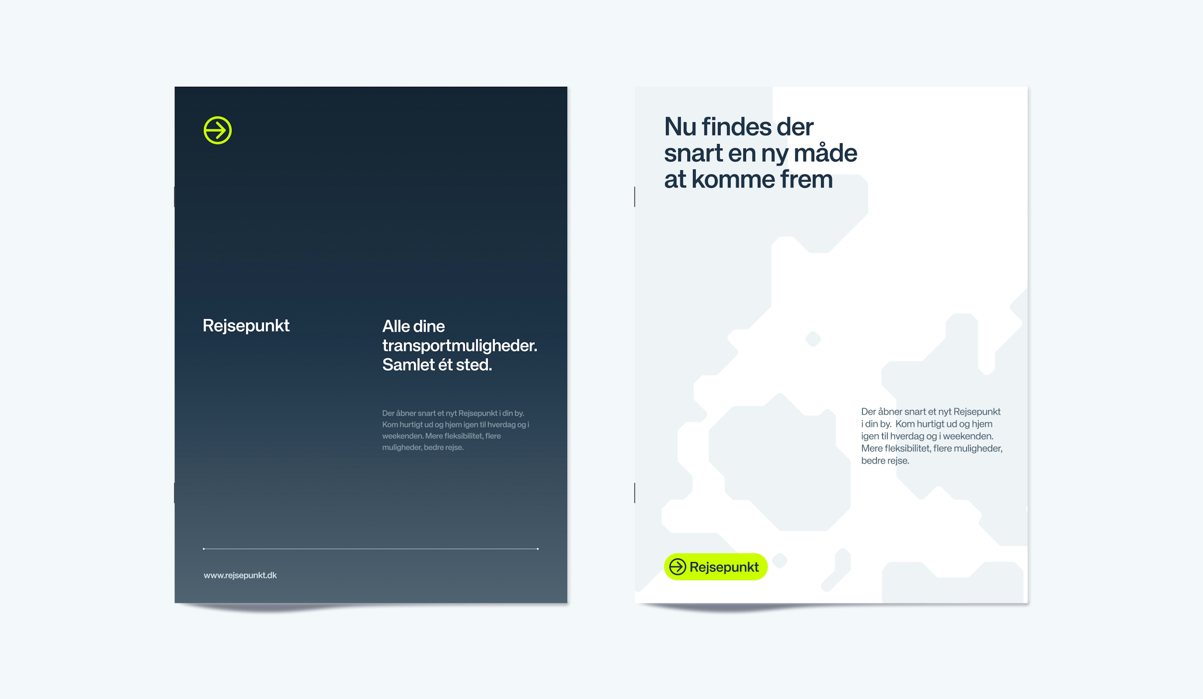
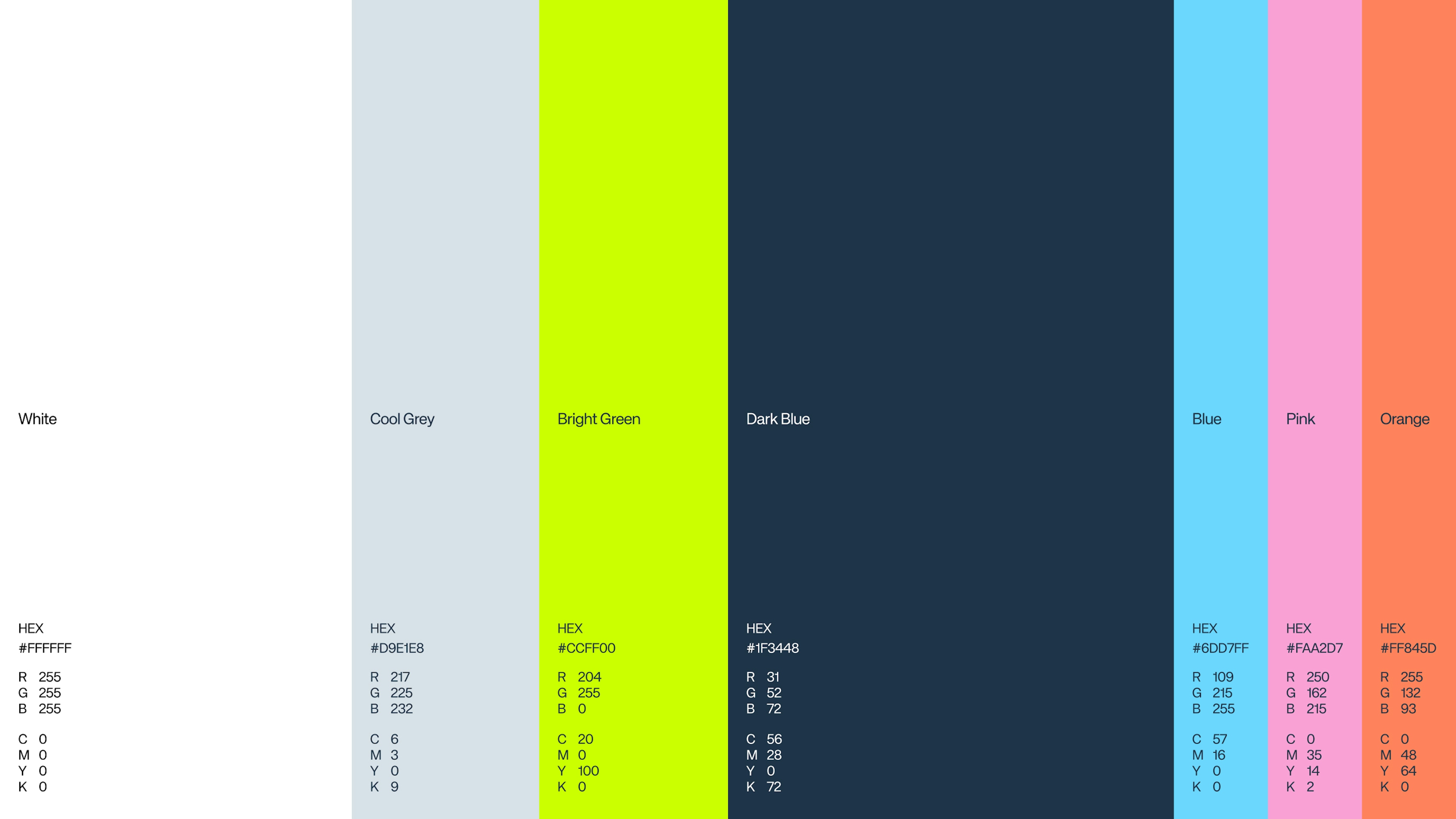
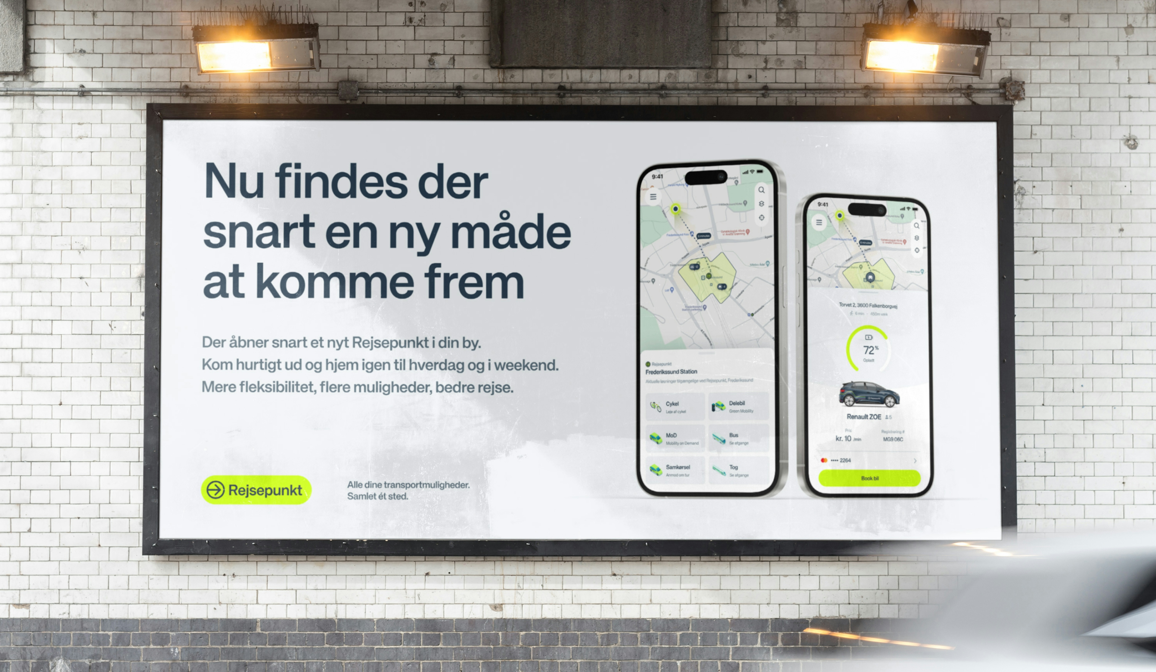
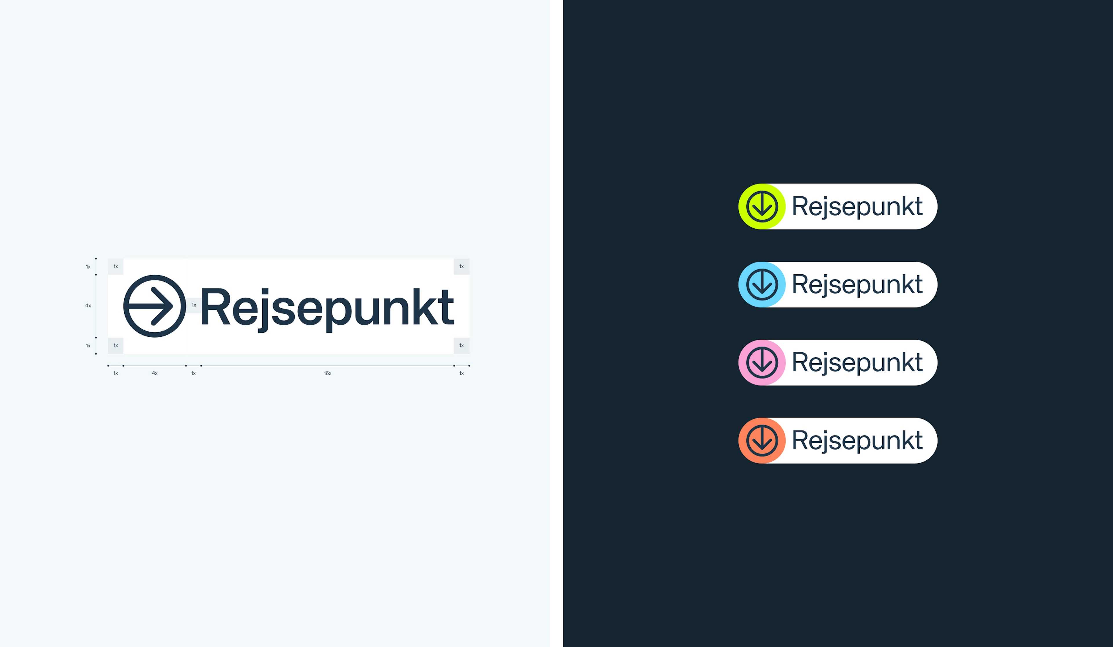
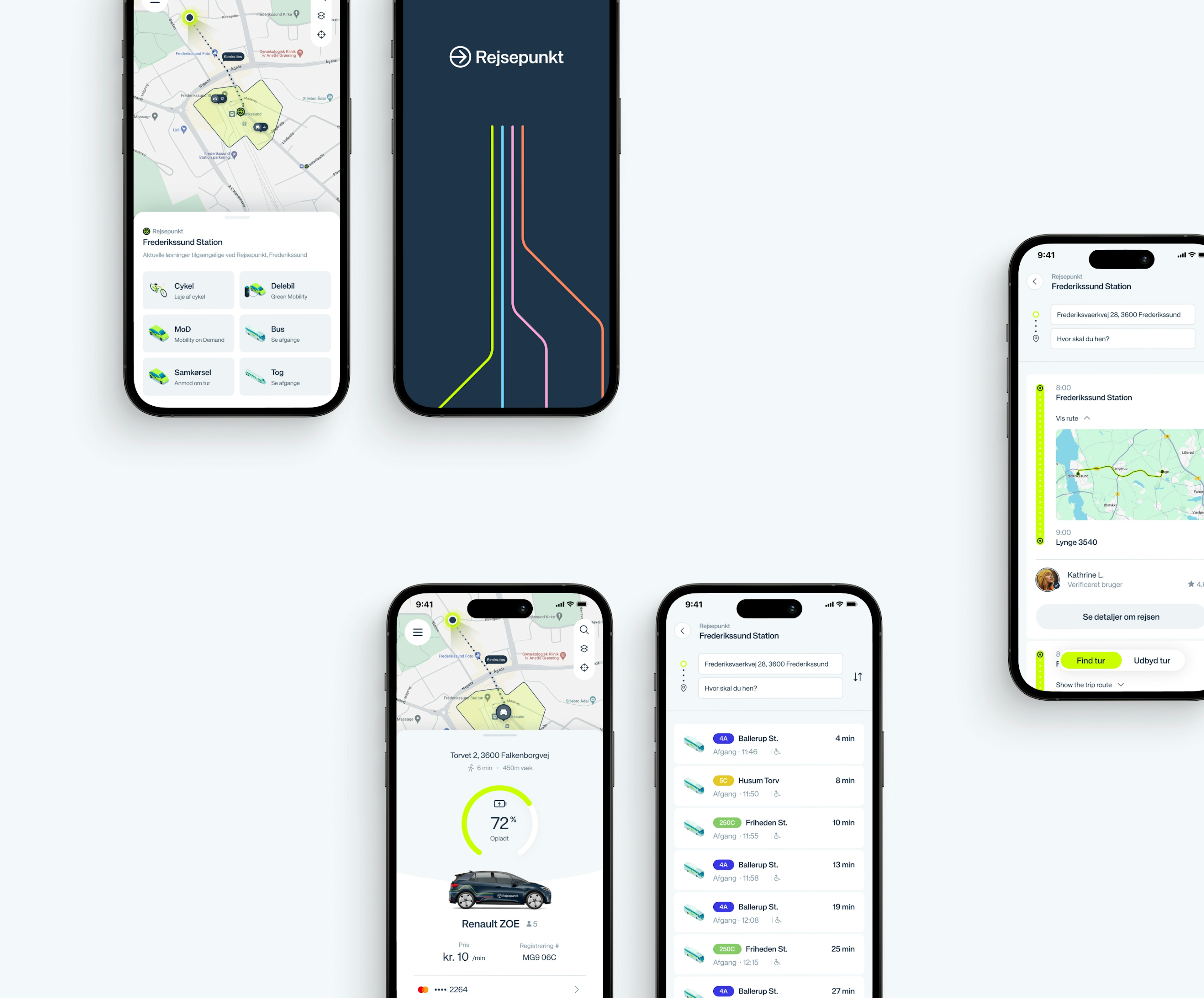
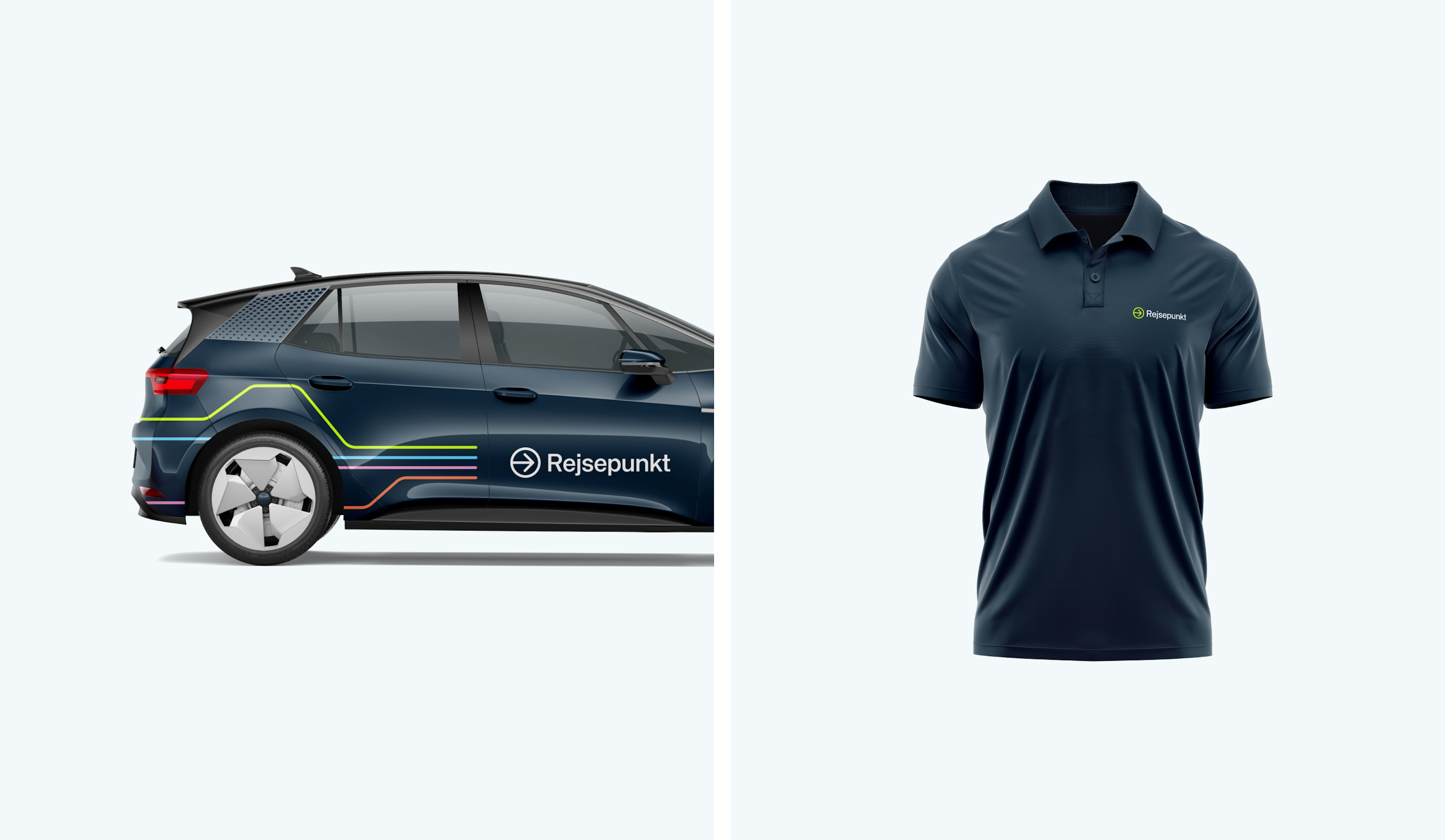
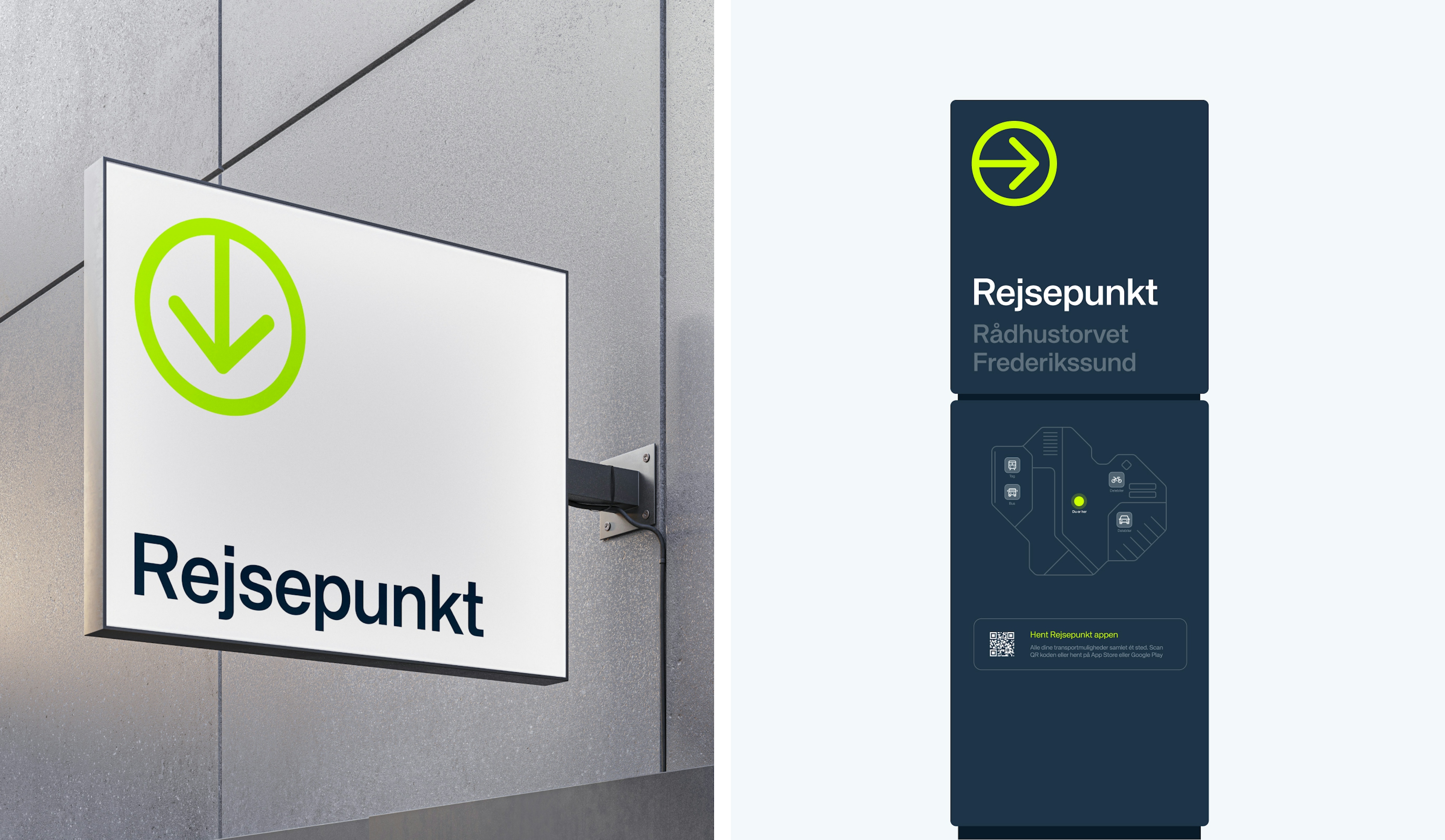
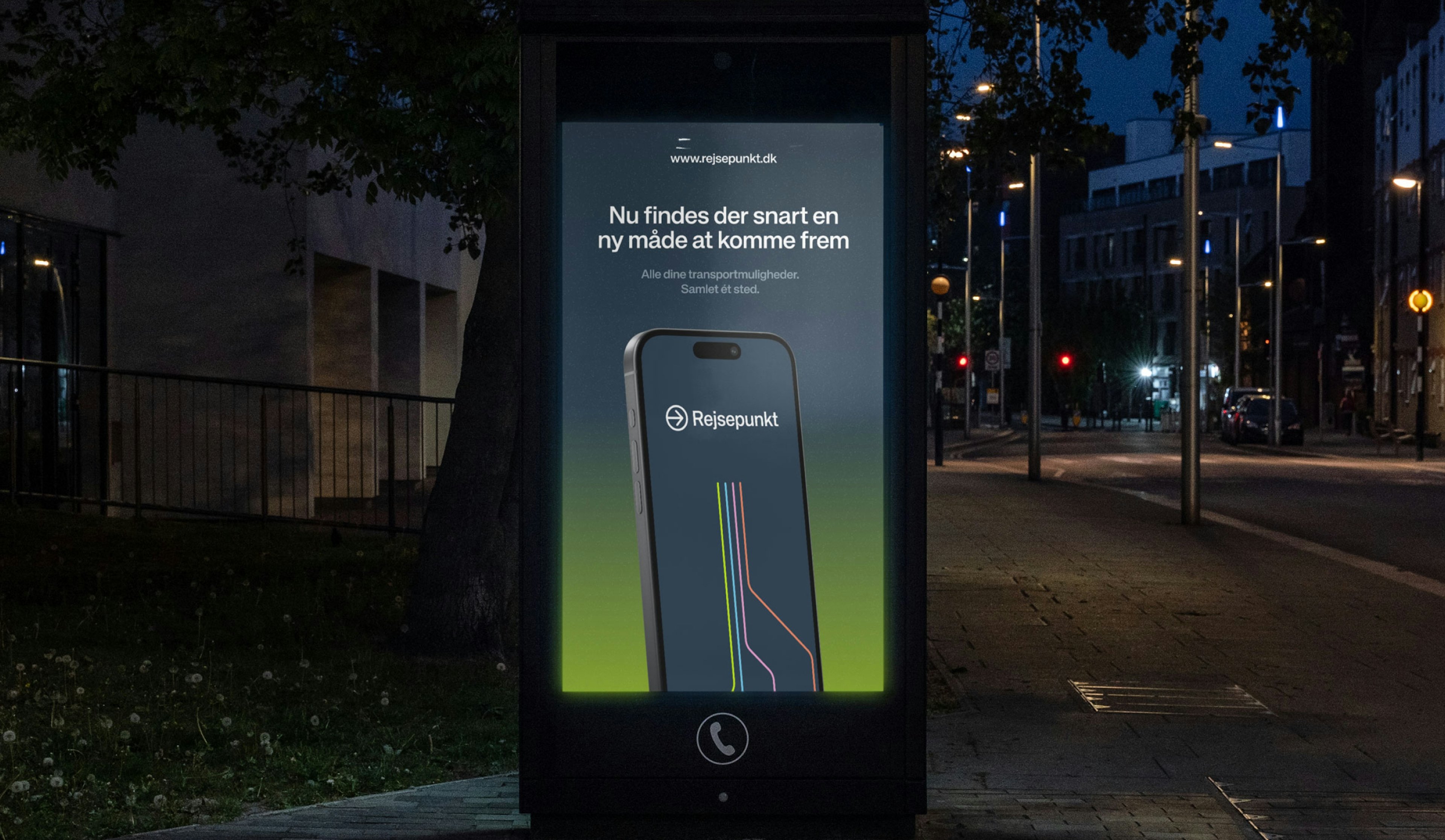
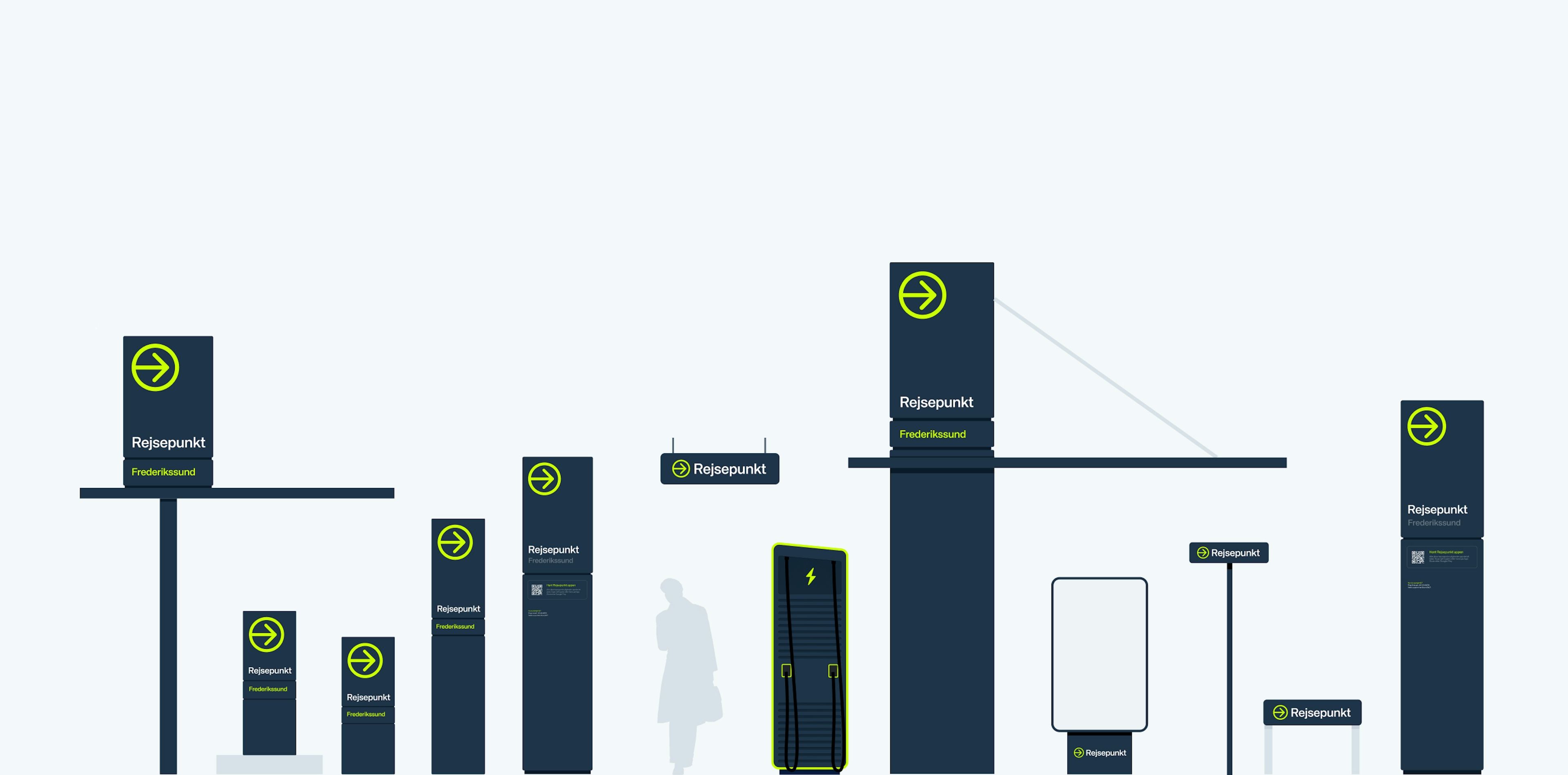
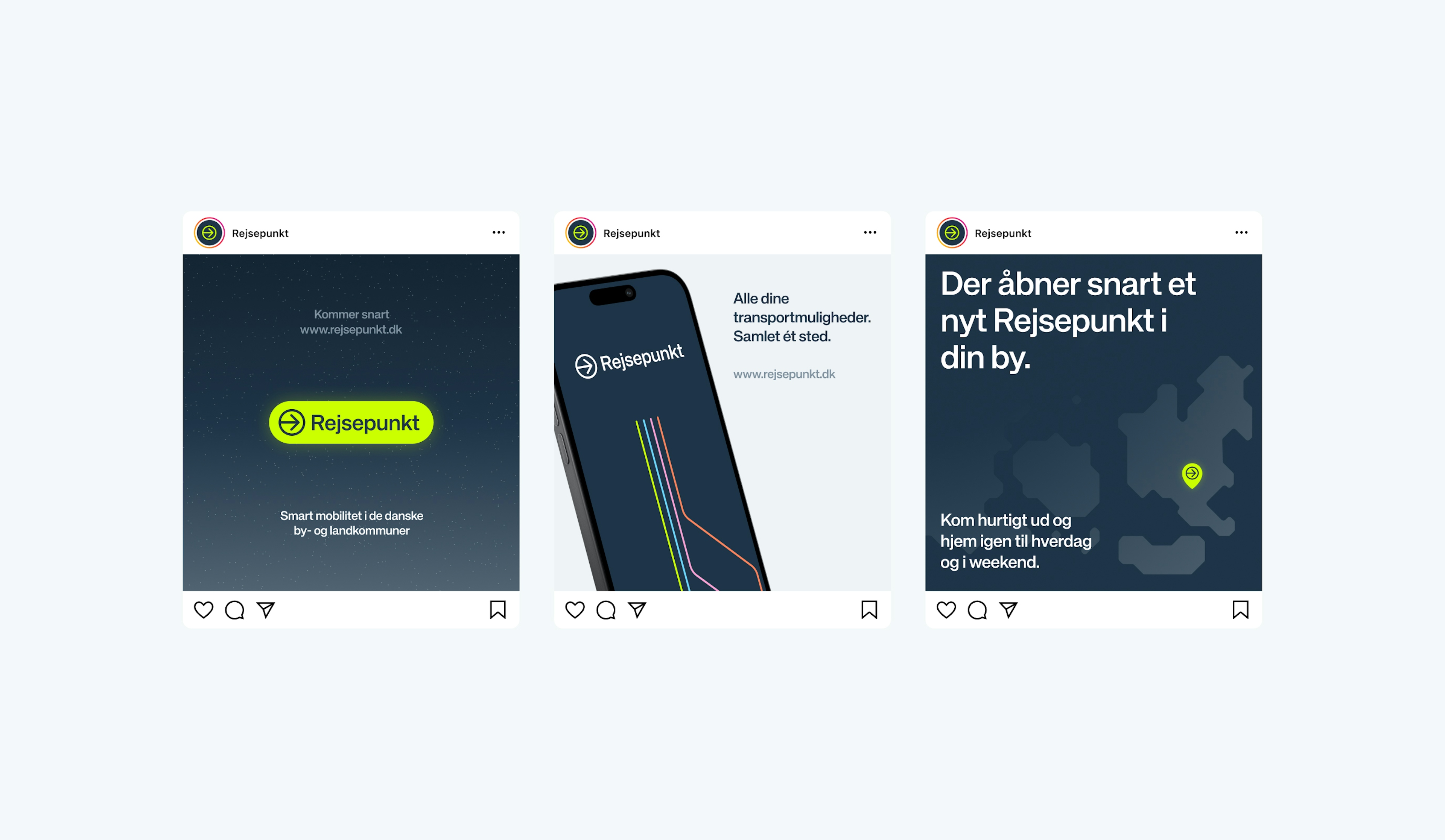
The name “Rejsepunkt” and its visual identity were carefully crafted to embody the brand’s commitment to simplicity and accessibility. The logo and design accents were inspired by well-known travel signage, with bright colors that appear almost ‘lit up’. Graphic elements, like interconnected lines, symbolize travel routes, while color gradients draw inspiration from countryside night skies— well known to rural commuters.
Kudos to
Project Manager / Michael Valentin
Project Manager / Mathilde Lundgreen
Strategist and Copywriter / Sofie Henriksen
Visual Identity / Alexander Spliid
Digital Designer / Lukas Jurcik
Design / Christopher Ashton
Design support / Søren Schrøder
Developer / Day Anh Nguyen
Related work
7-Eleven
We’ve got you covered.

Client: 7-Eleven Norvège
Partnership Lead: Hedvig Aanesen
Key Focus: Brand & Digital