Waitly
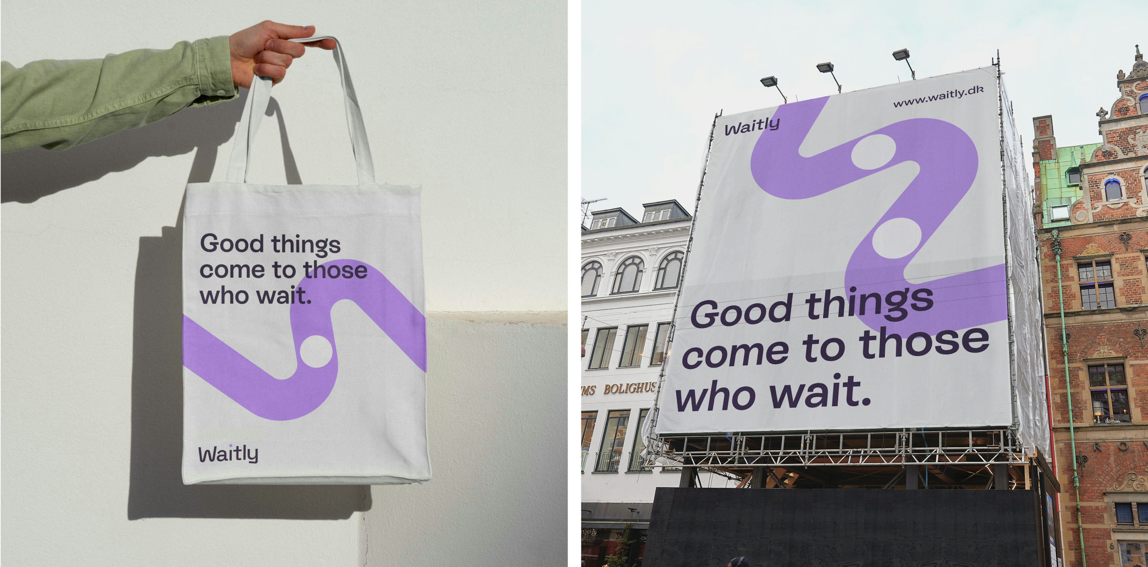
Good things come to those who wait
Client: Waitly
Key Focus: Brand, E-commerce
Timespan: Sep '23 - present
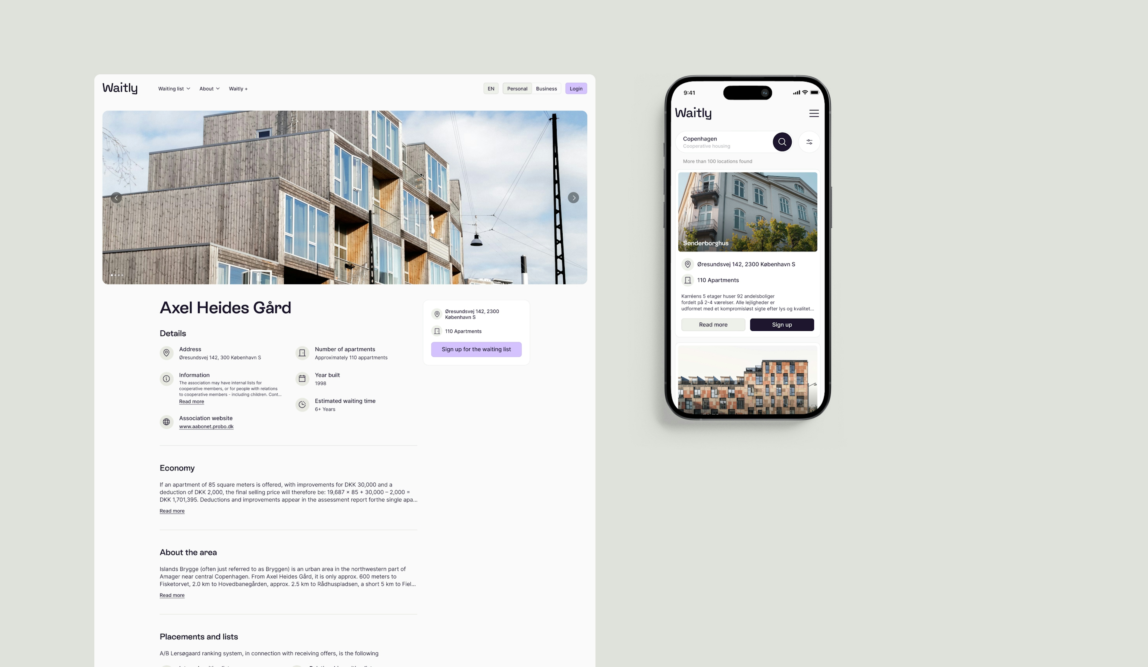
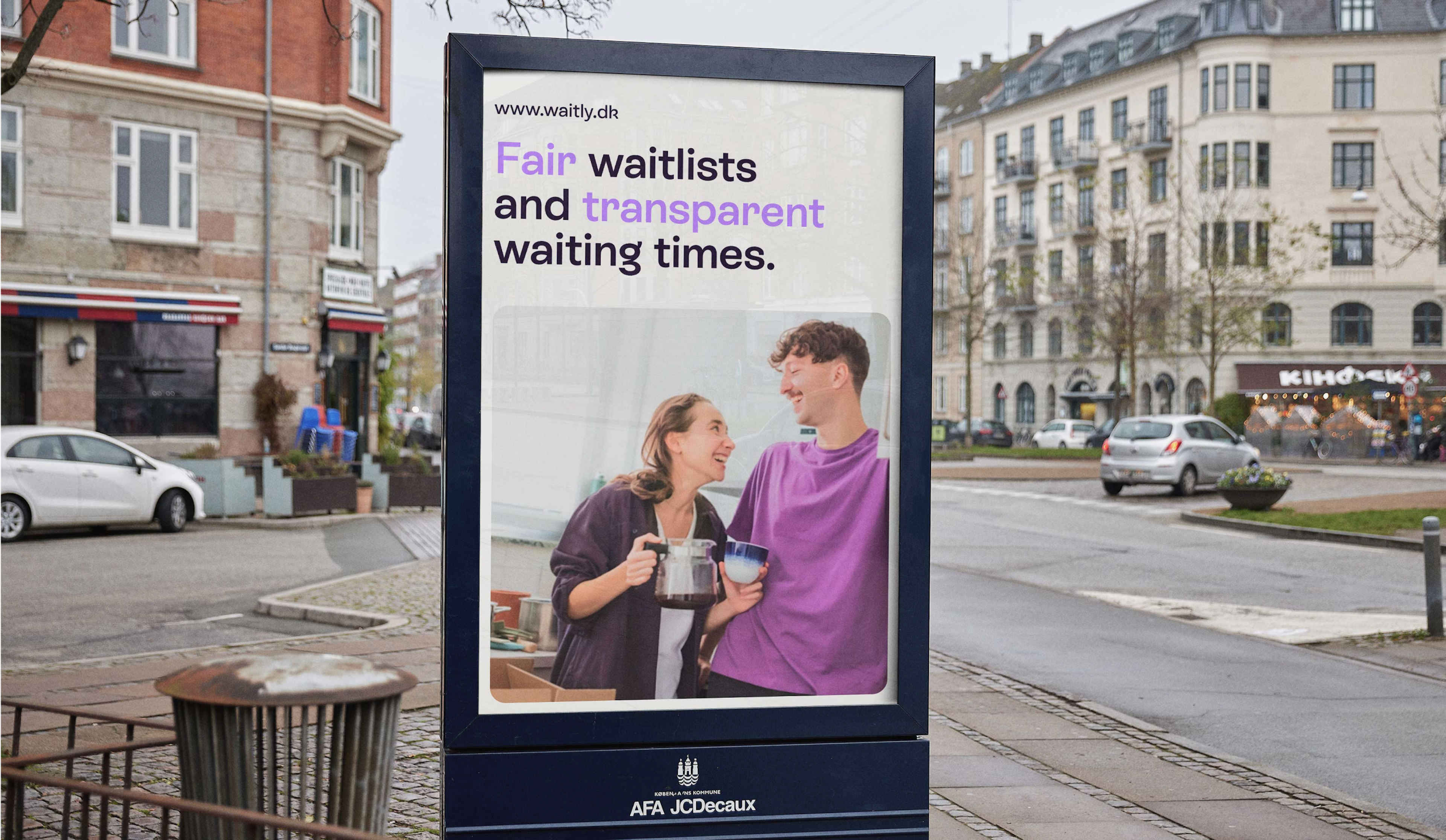
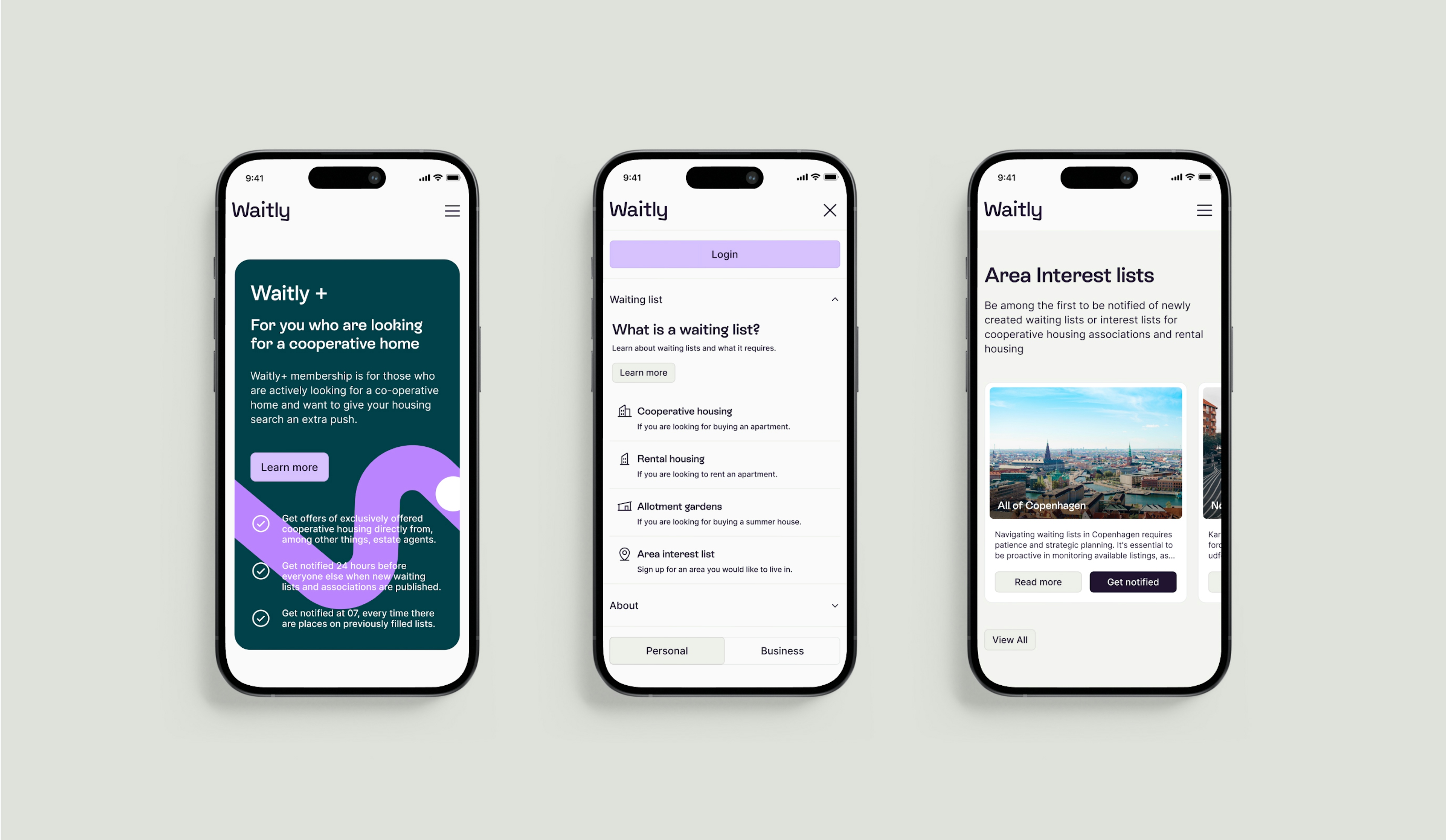
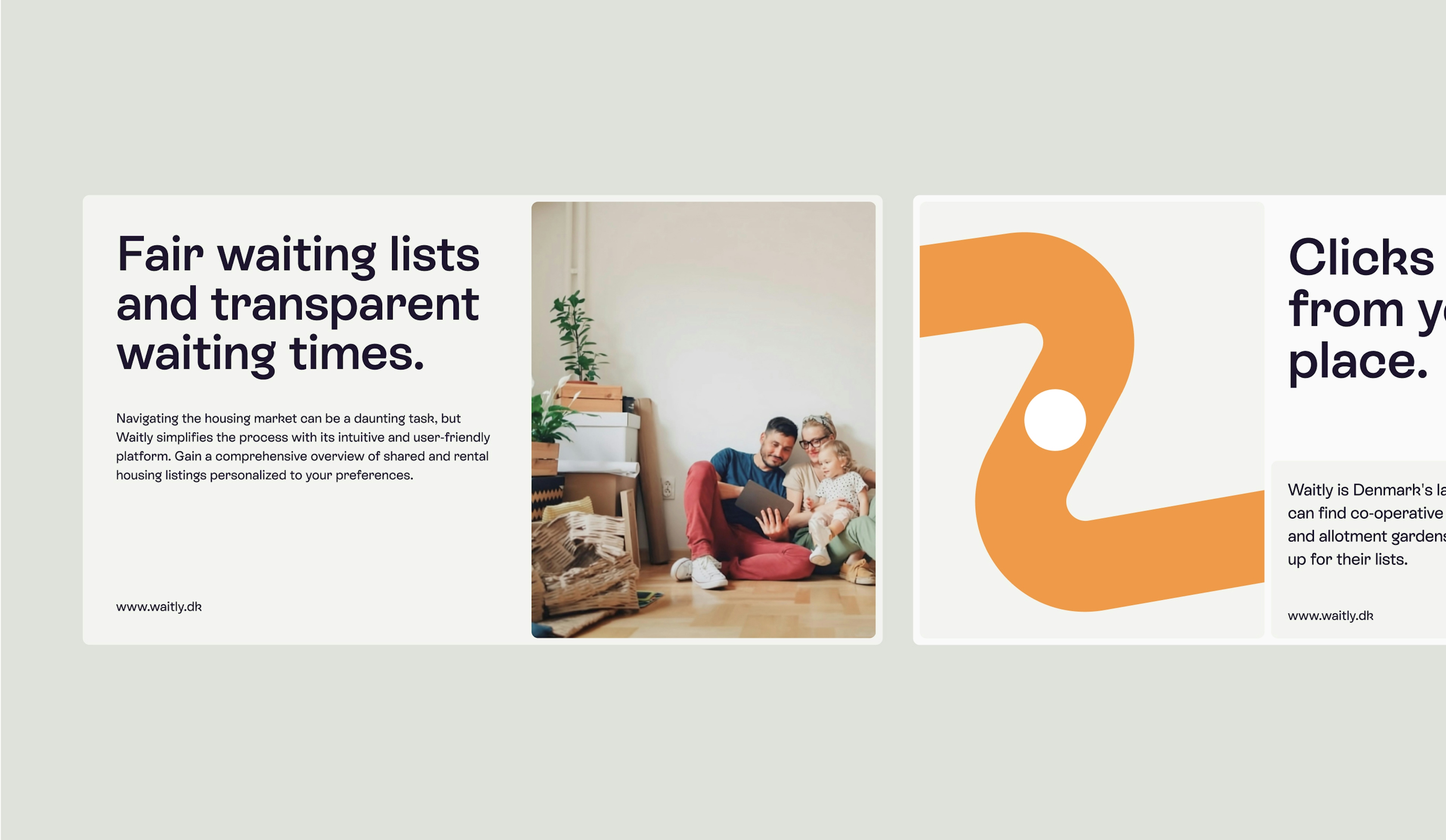
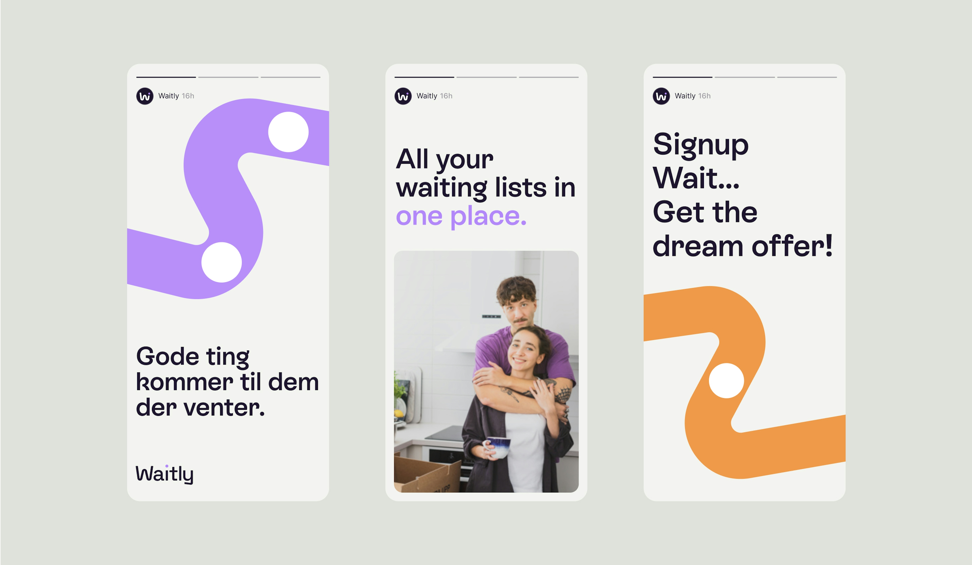
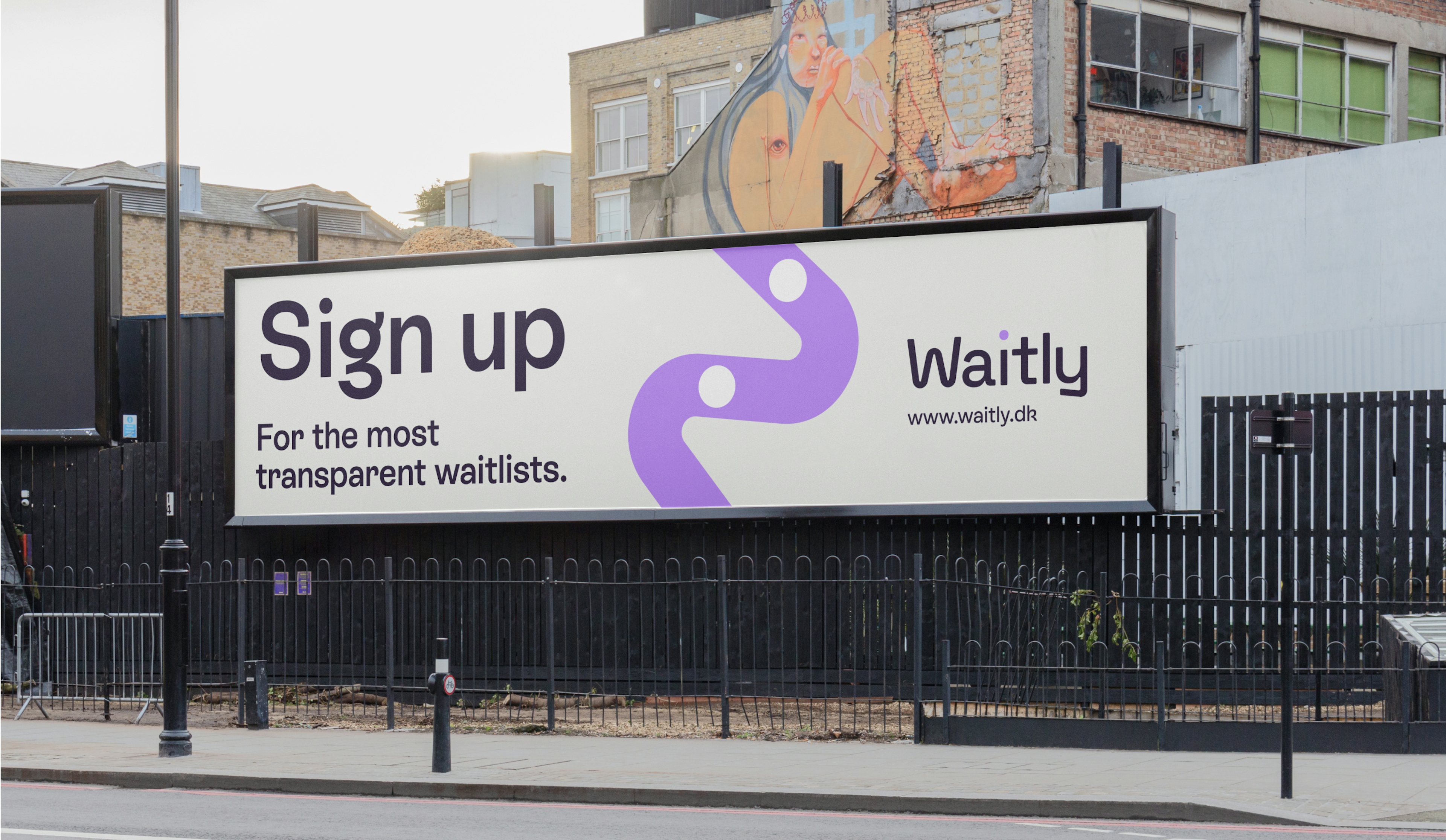
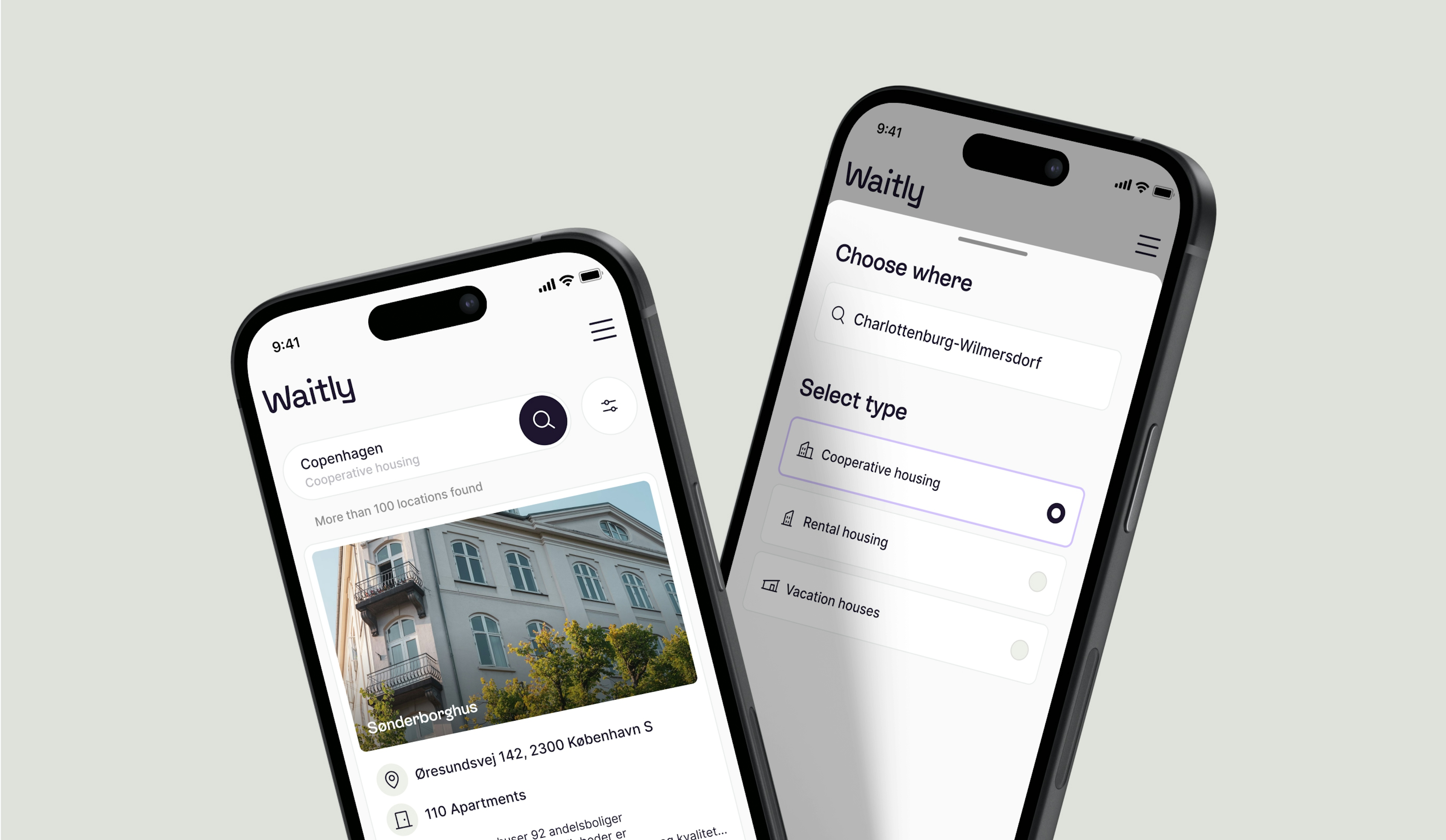
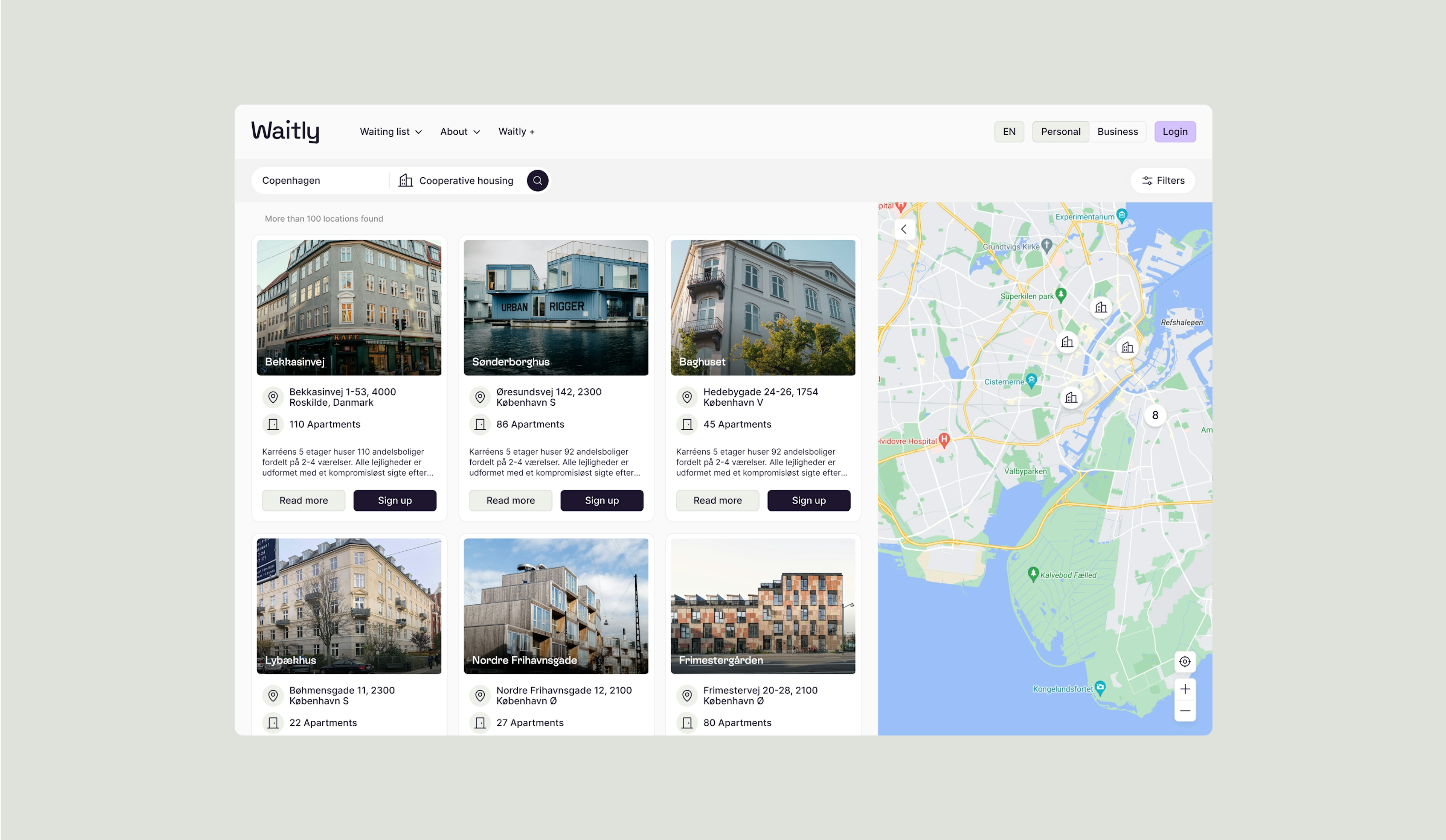
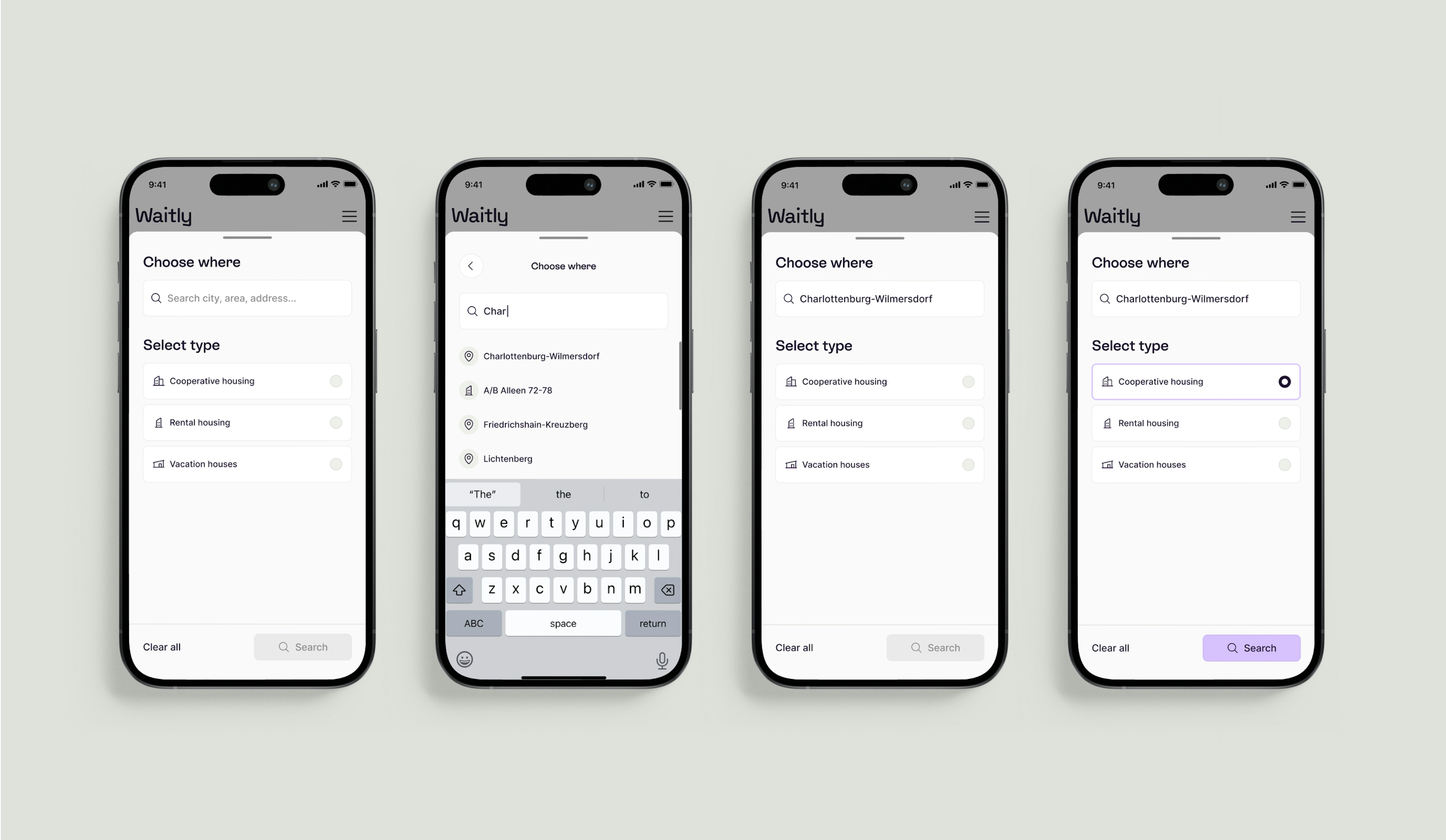
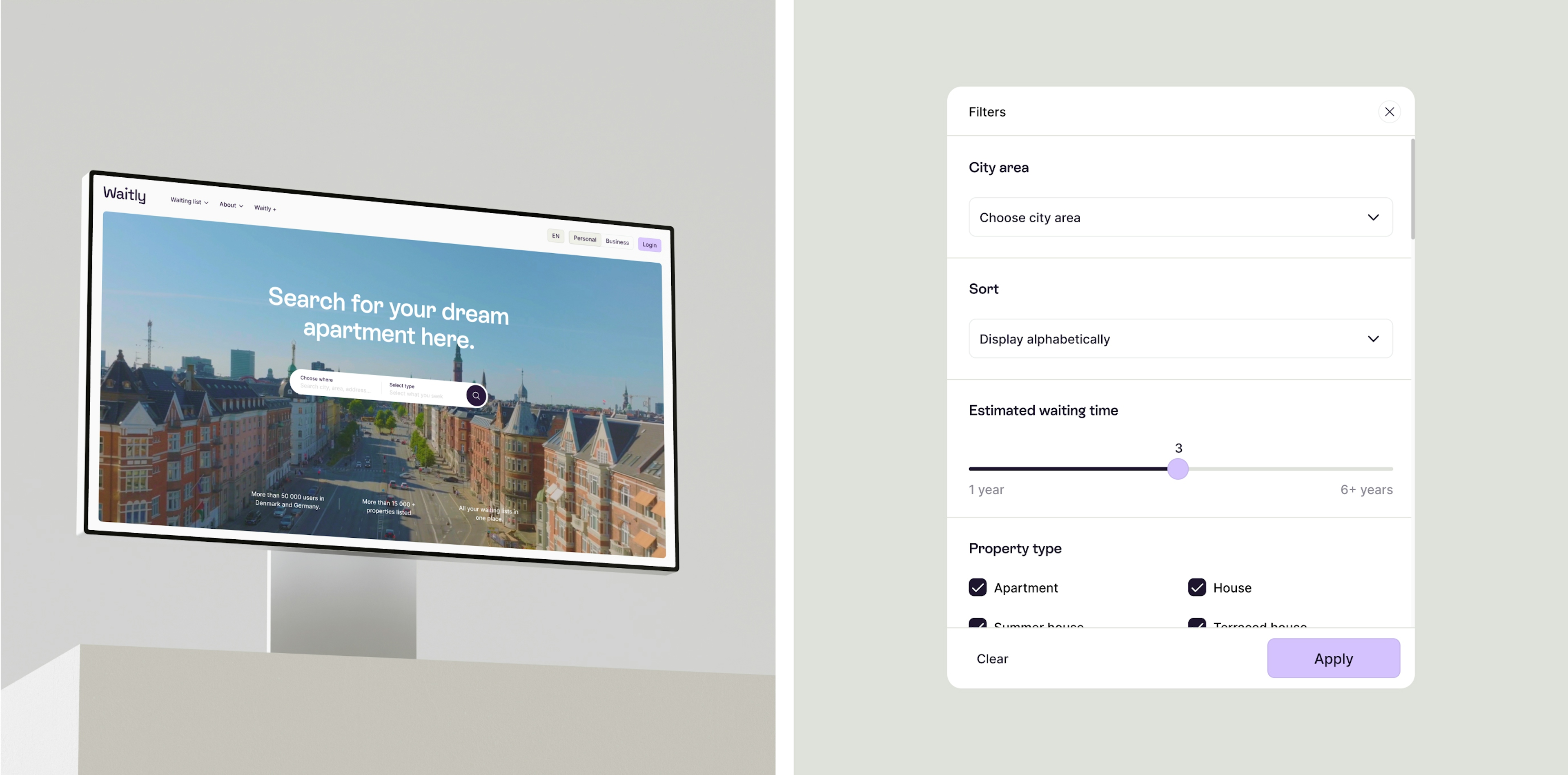
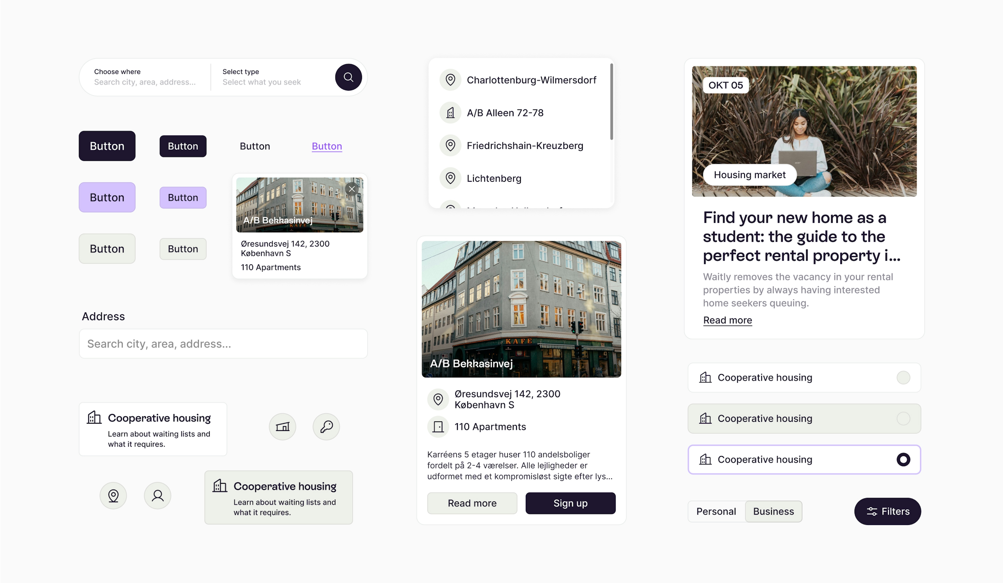
Waitly is a pioneering SaaS company specializing in digital waiting lists, initially focused on the housing sector in Denmark and expanding into Germany. Recognizing the importance of adapting to diverse markets, Waitly began a journey to redefine its brand identity, aiming to appeal to its youthful audience while improving the digital user experience.
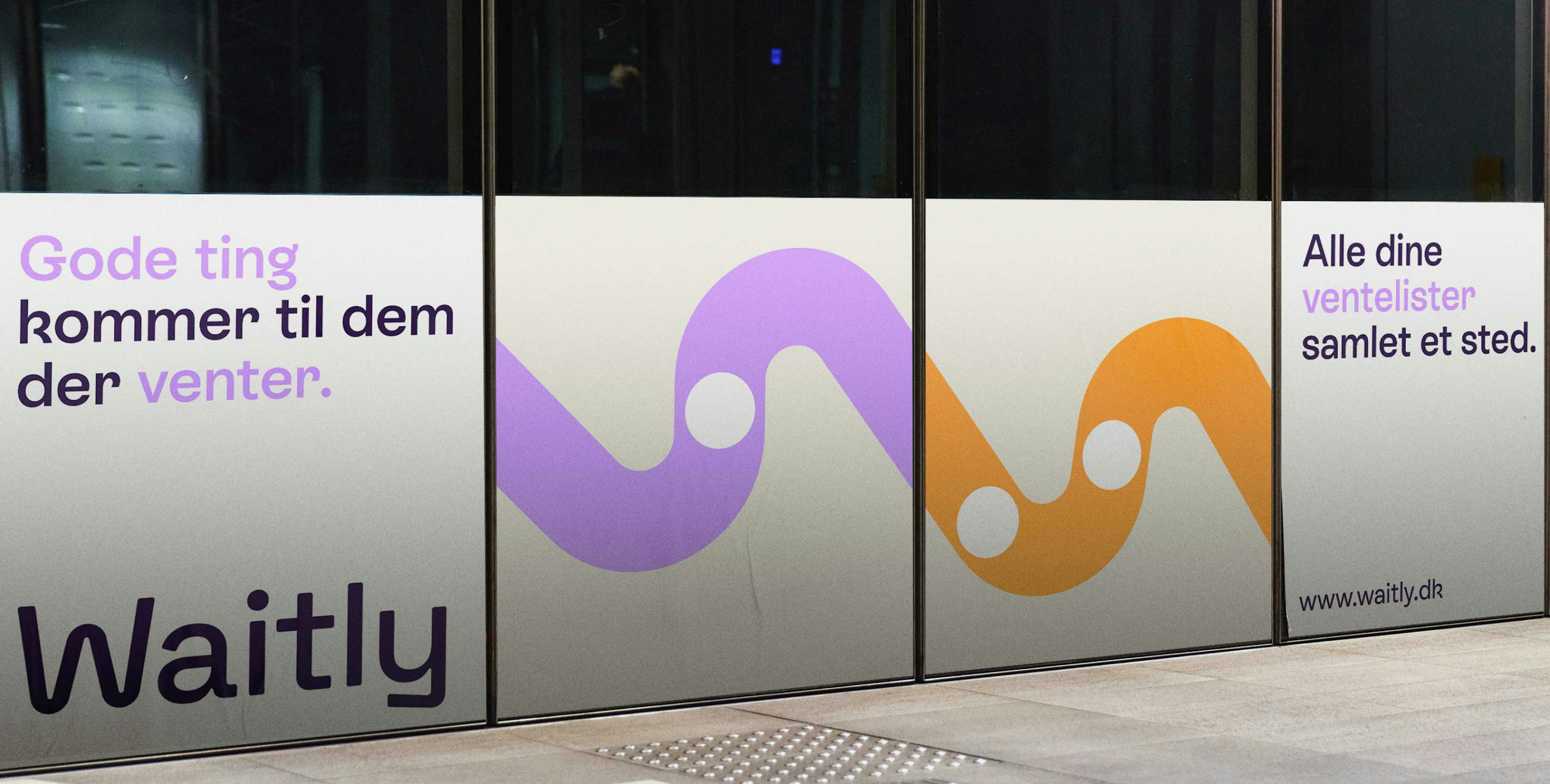
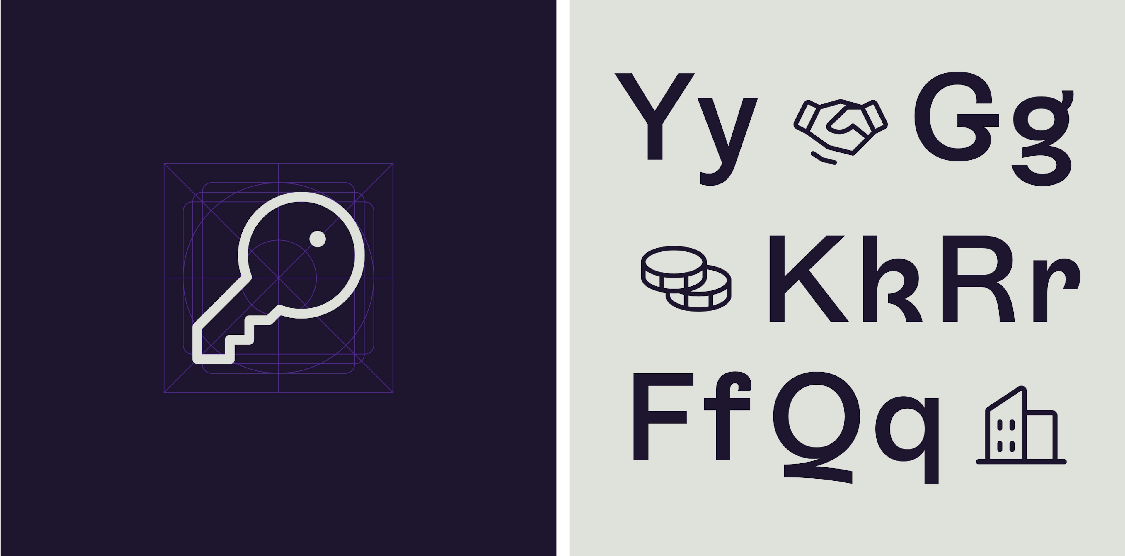
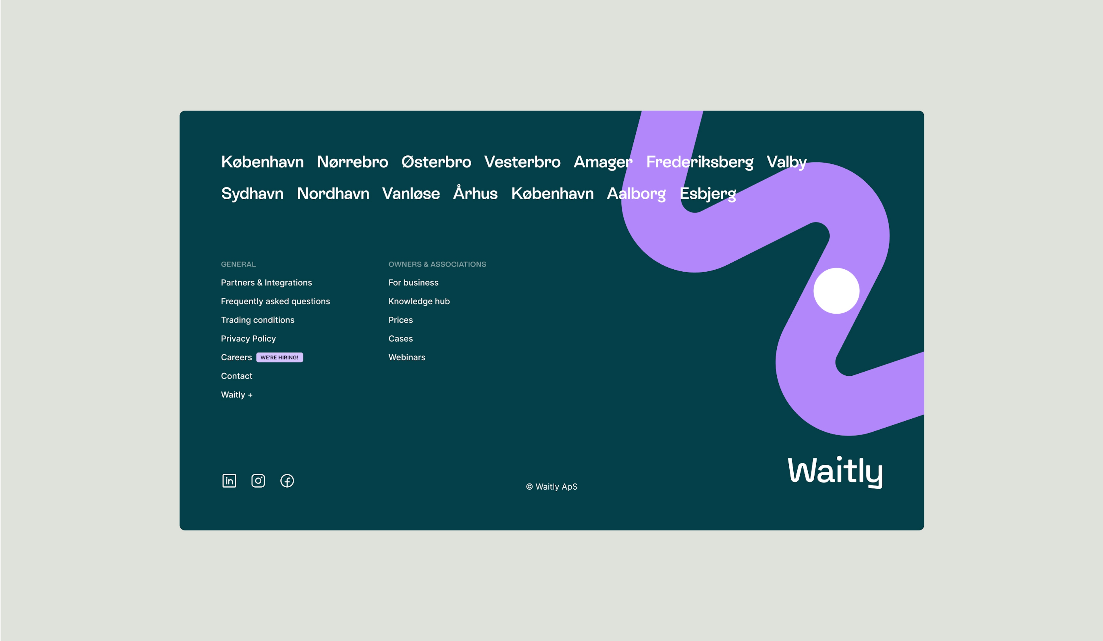
The outcome is a vibrant and playful brand identity. Waitly’s dedication to transparency lies at the core of its identity, exemplified by its new visual symbol: the “worm.” This straightforward yet meaningful graphic portrays a line of waiting with a dot representing an individual, capturing the essence of the company’s mission.
Kudos to
Project Manager / Jana Erichsen Opsahl
Project Manager / Sara Pallesen
Designer / Lukas Jurcik
Copywriter and Strategist / Gabby Olivas
Copywriter and Strategist / Sara Pallesen
Creative editor / Nikolaj Trane
Photographer and film editor / Lukas Gottlieb
Creative Producer / Nana Skak
Front-end developer / Junhwan Im
Tech Support / Christoffer Skytte Wielsøe
Growth Support / Laura Herrera
Related work
MarketWire
Rebranding financial news
Client: Ritzau Finans
Partnership Lead: Hans Theisen
Key Focus: Name & Brand
Ritzau Finans, a news agency, needed a new name and identity, without compromising its core values and the credibility that characterizes the agency today. To find a name that resonated with the company's history and area of expertise, the news agency took inspiration from when news agencies would send out syndicated news copy to subscribers by wire transmission.
The name, MarketWire, emerged, and was accompanied by a fresh and modern visual ID and an upgraded website.