Original Talks
Stand out, speak up
Client: Original Talks and Opus Group ApS
Key Focus: Brand, App and e-com
Timespan: Oct '23 – present
Feeling bored? Just tap a few times on your phone, and entertainment will come, endless entertainment. But nothing compares to the energy of a live talk, in the flesh.
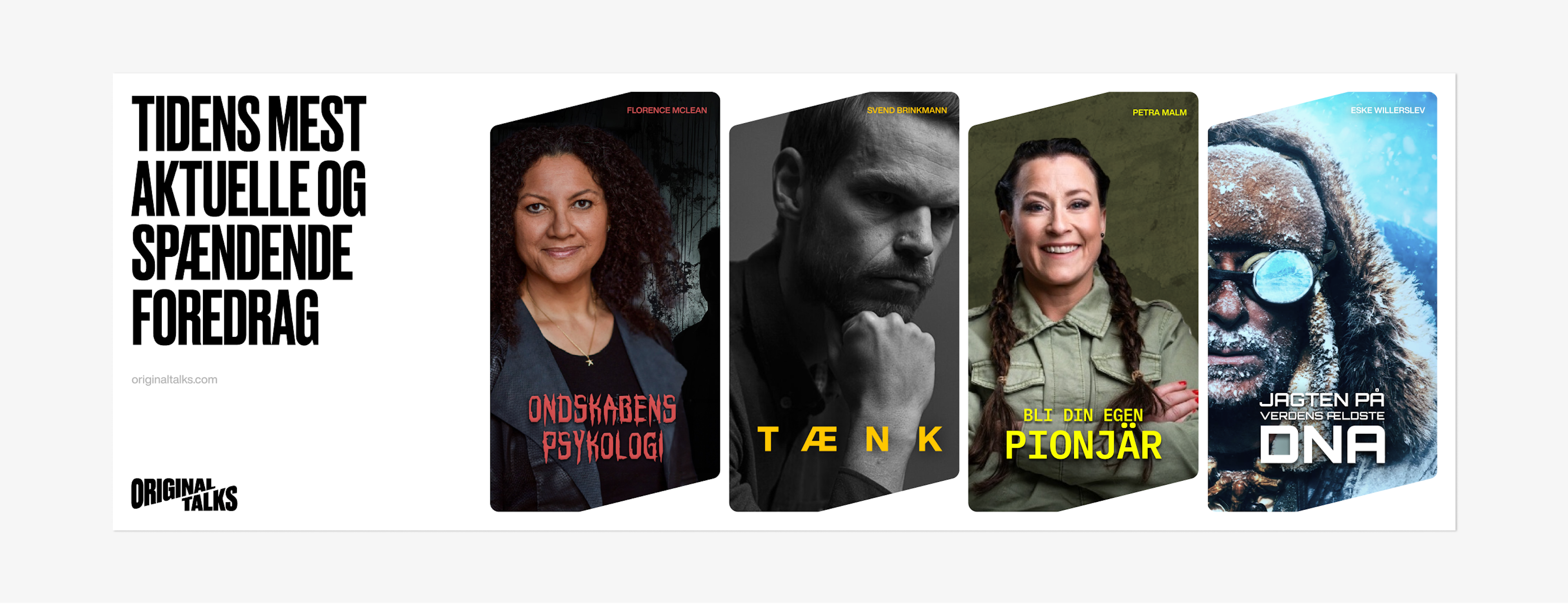
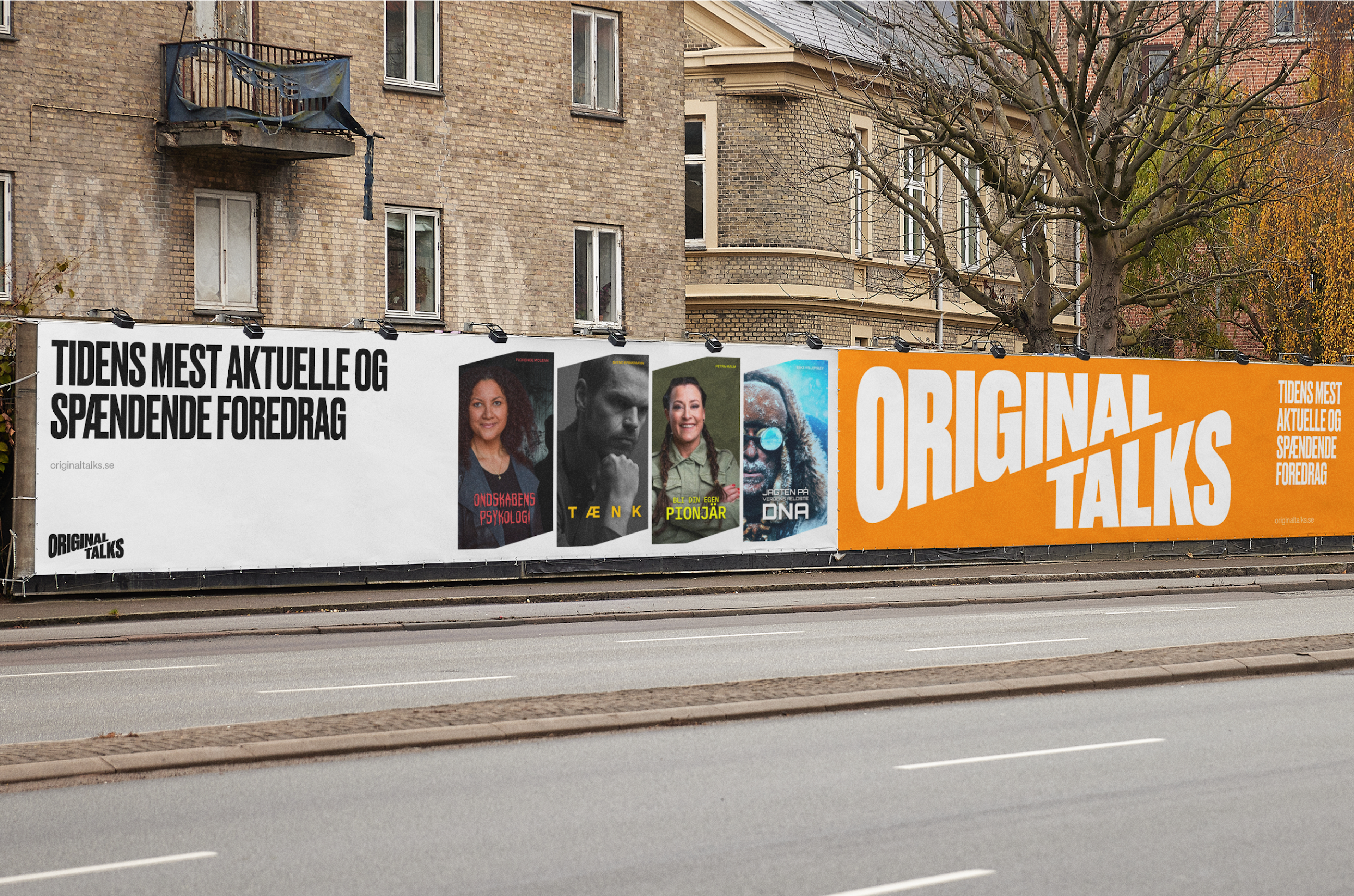
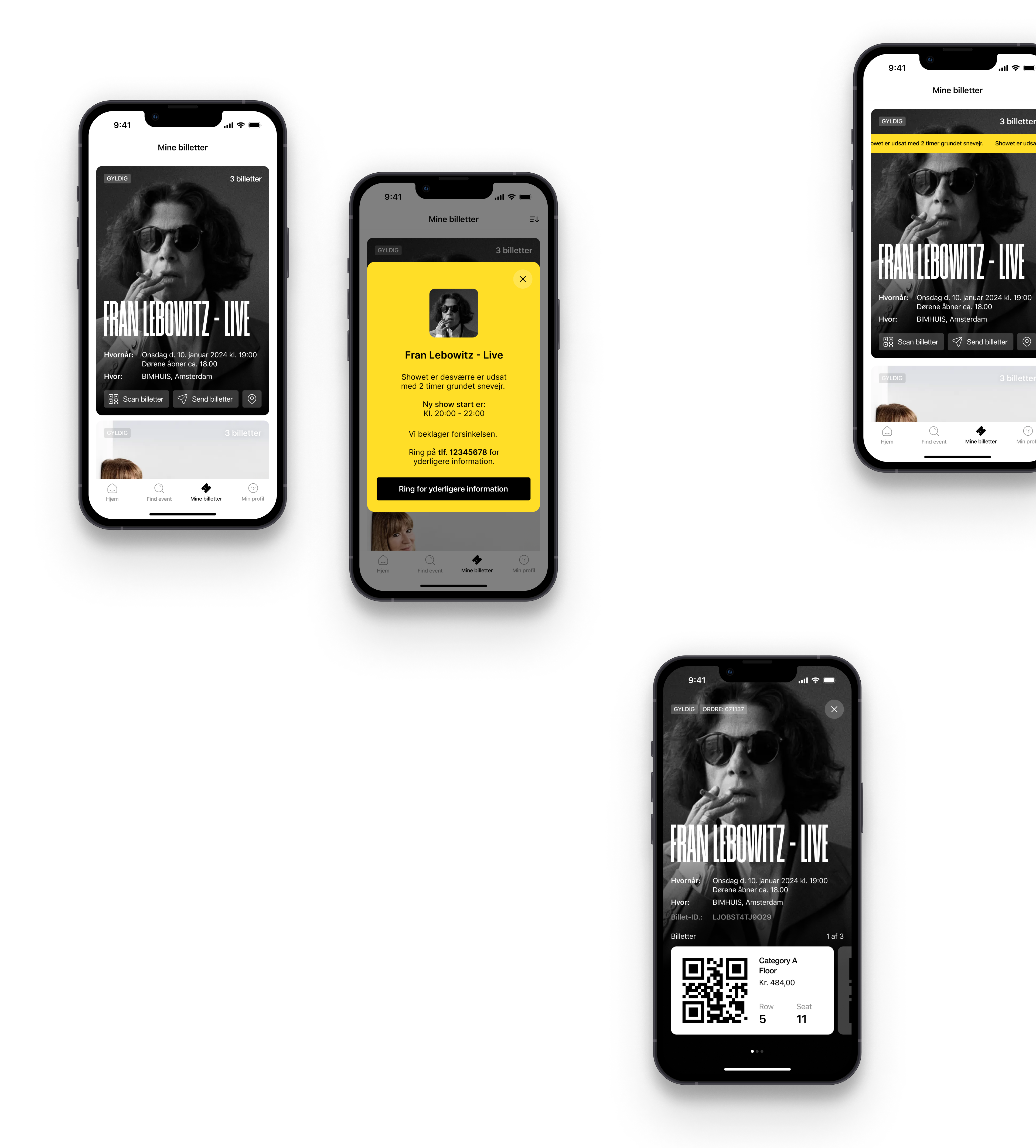
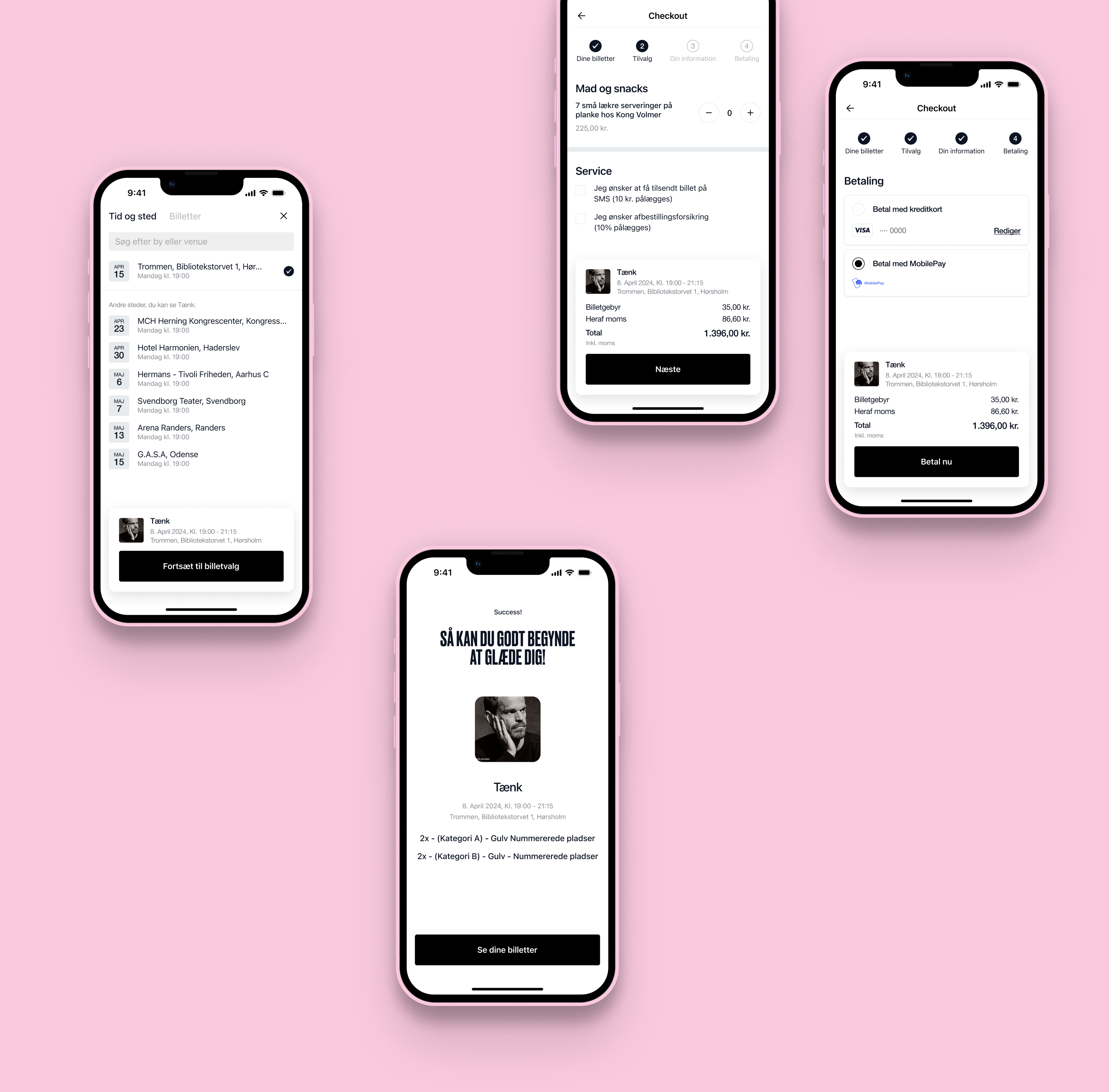
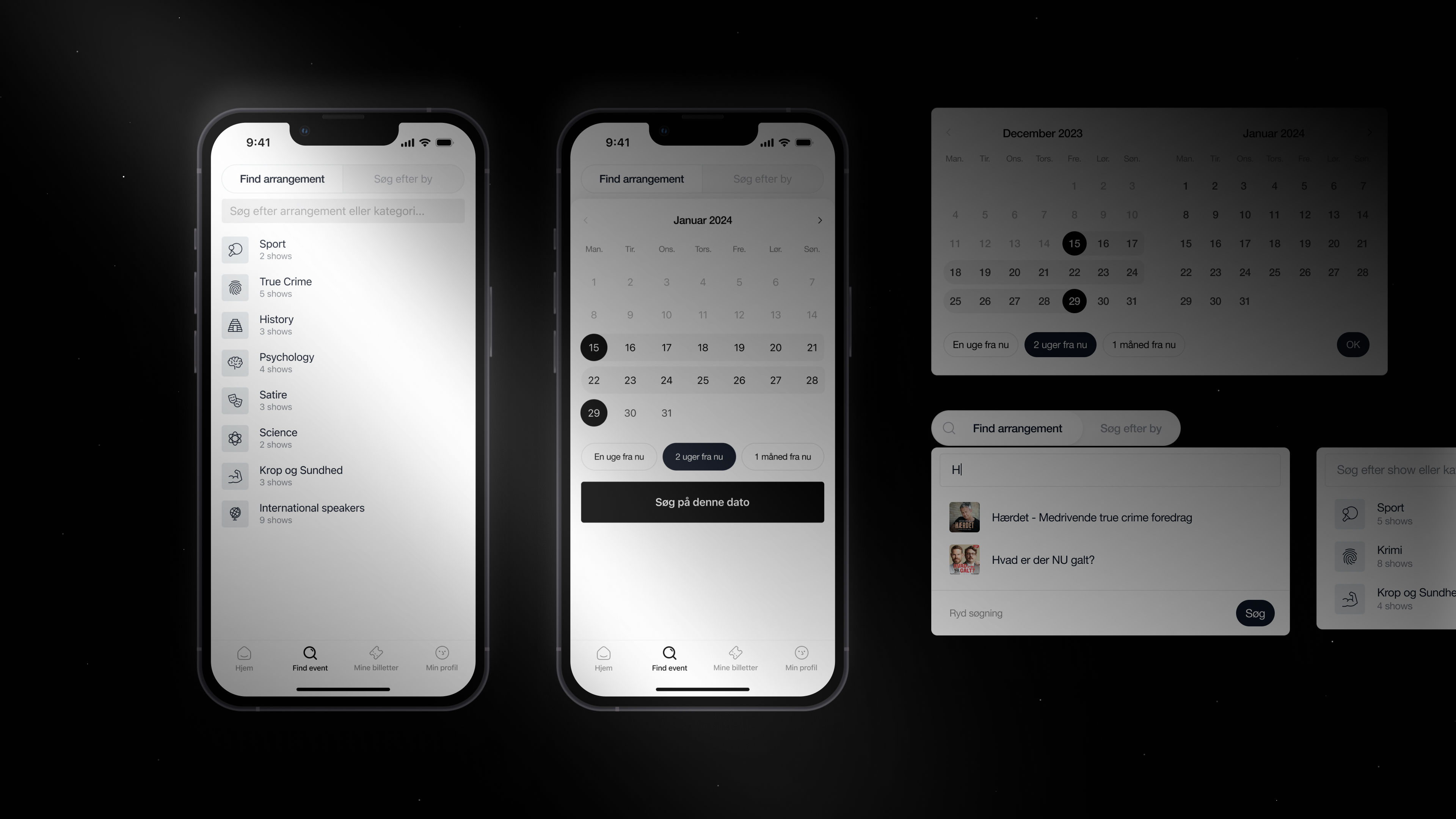
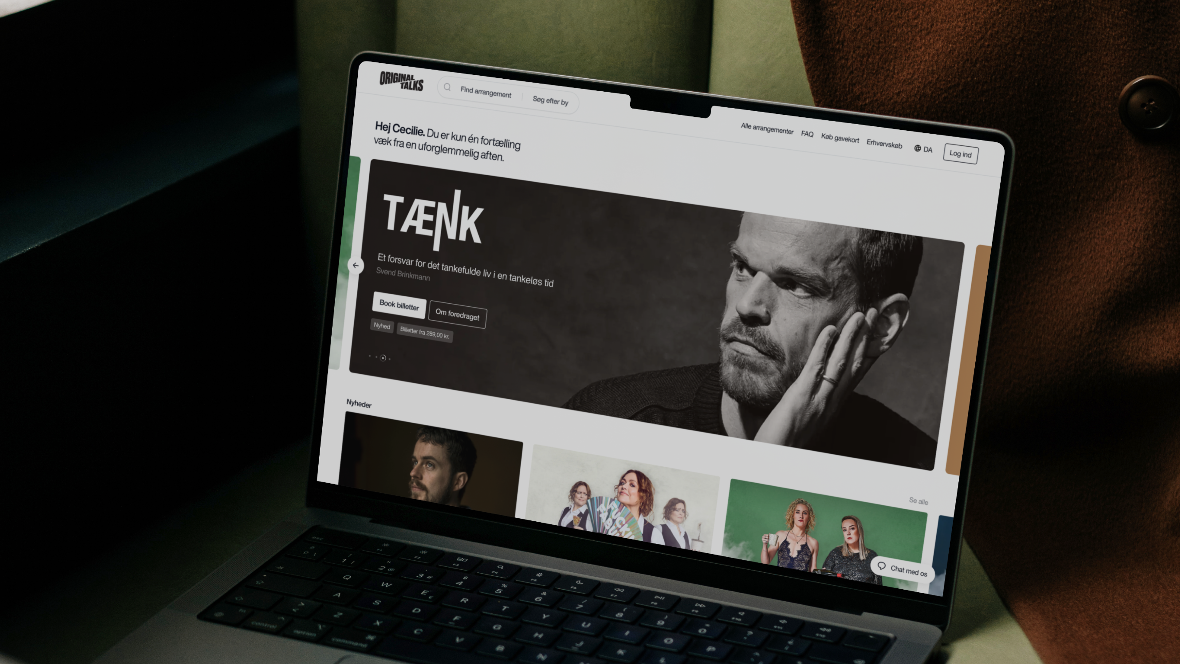
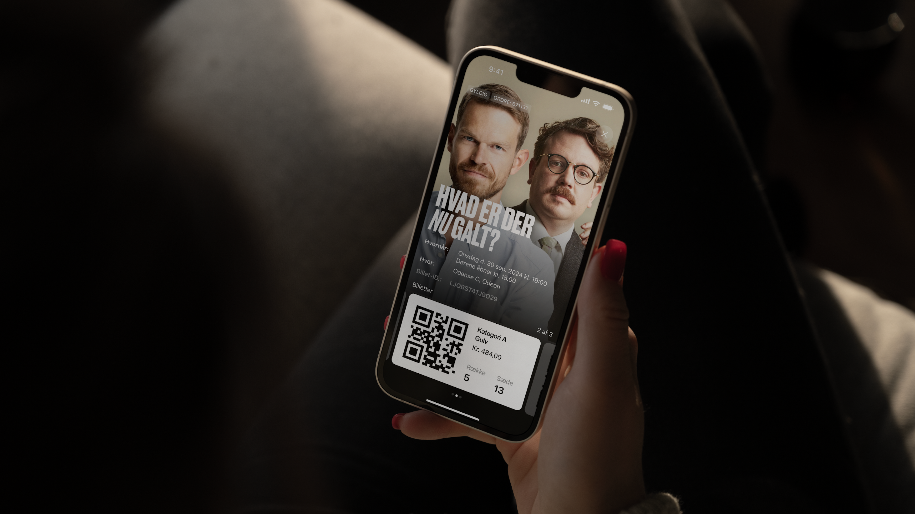
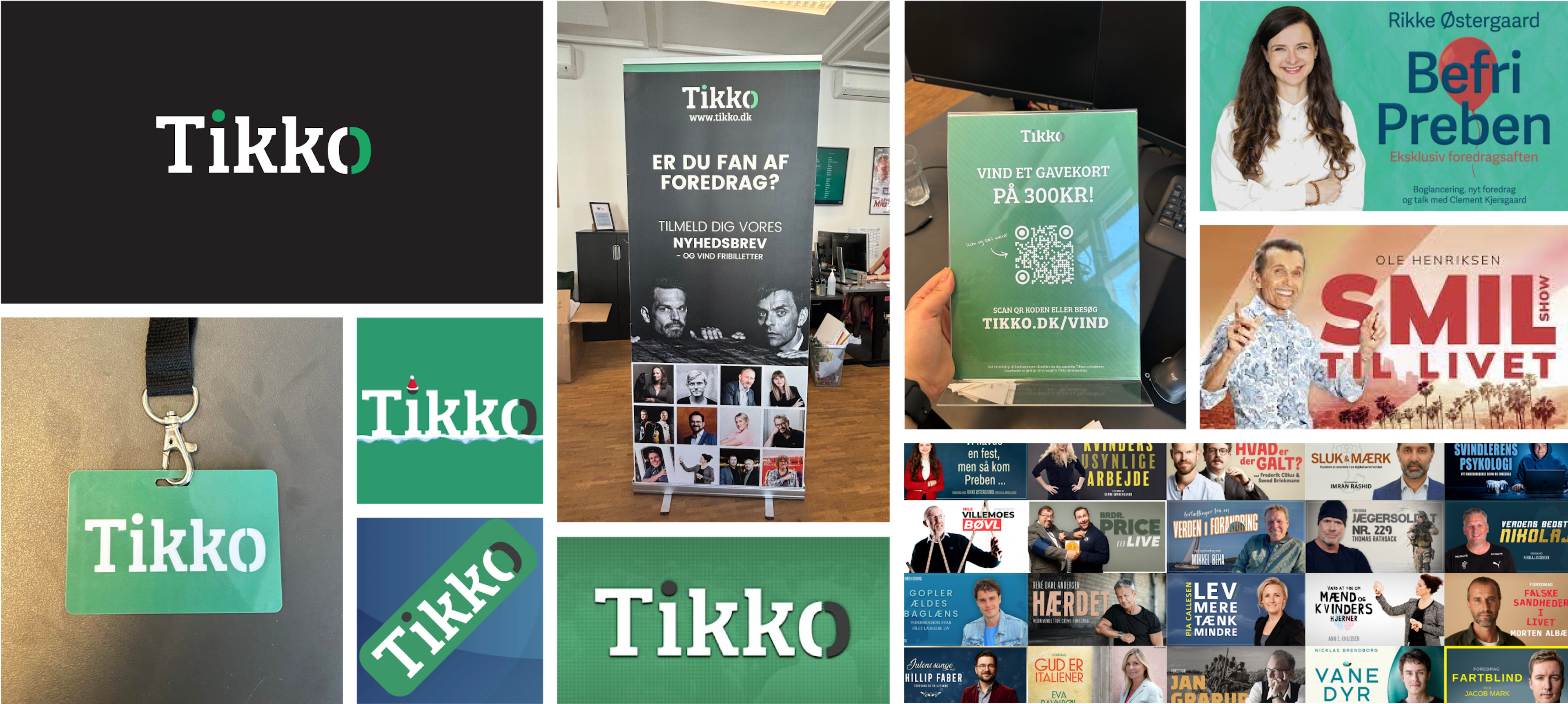
Still, even the most captivating experiences need to stand out in today’s crowded market. And that’s what Tikko needed help doing. Over the past eight years, the Danish company has grown to host 700+ talks annually, yet its previous name, brand and website didn’t reflect its unique position as a curator of live experiences.
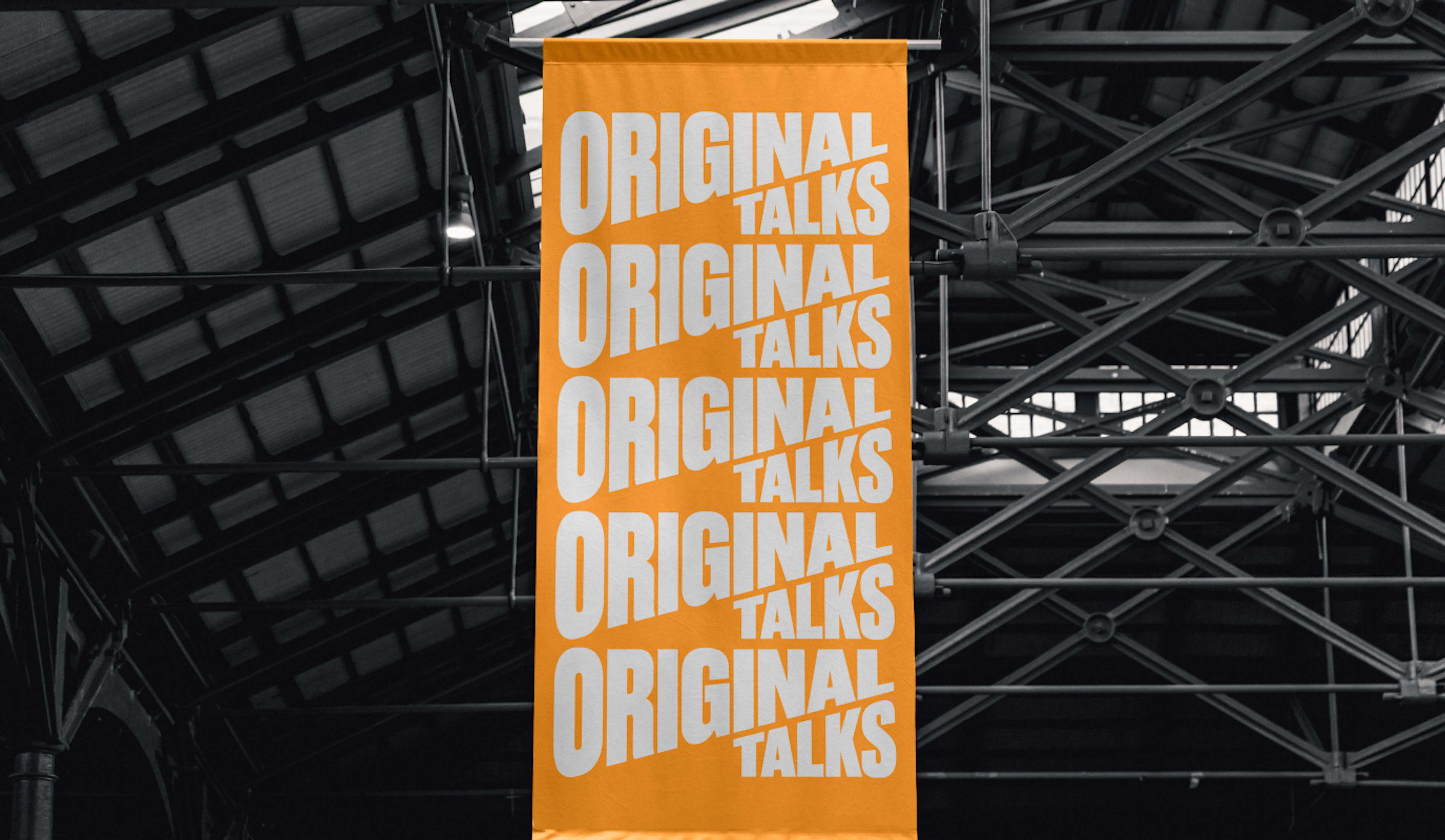
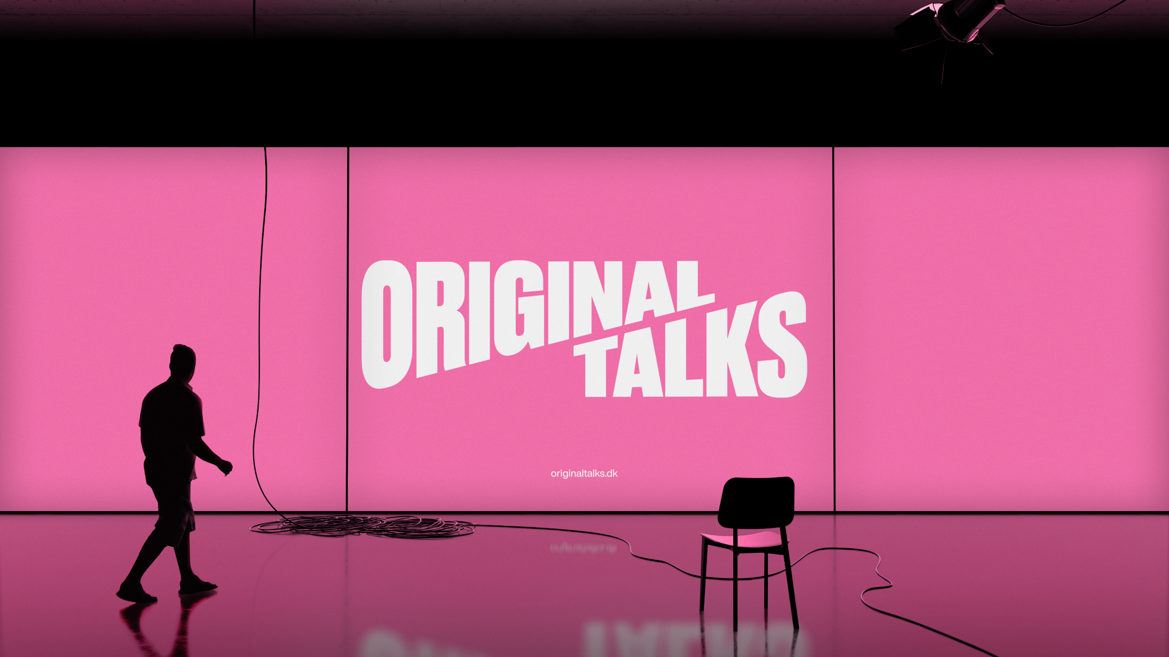
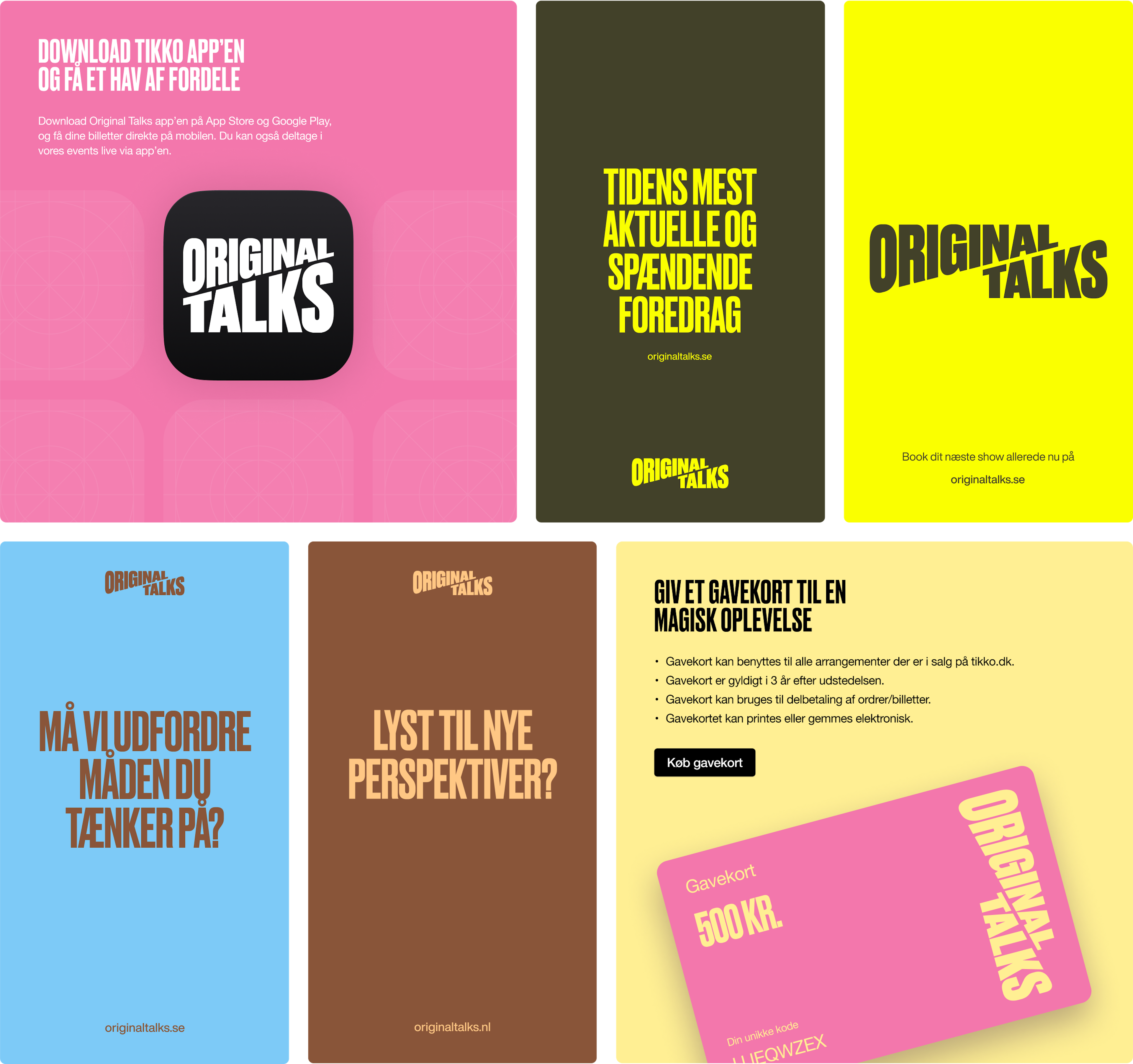
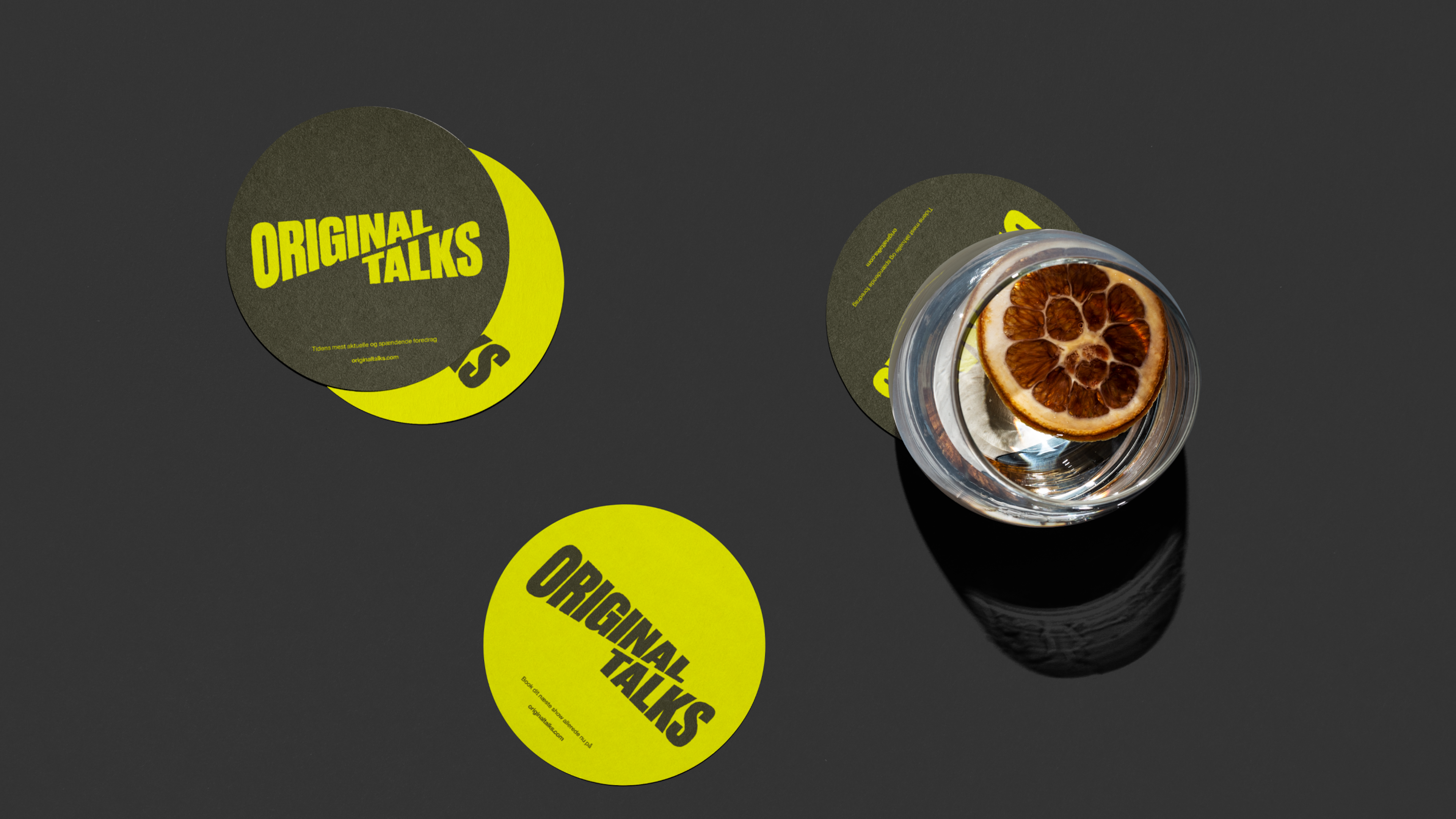
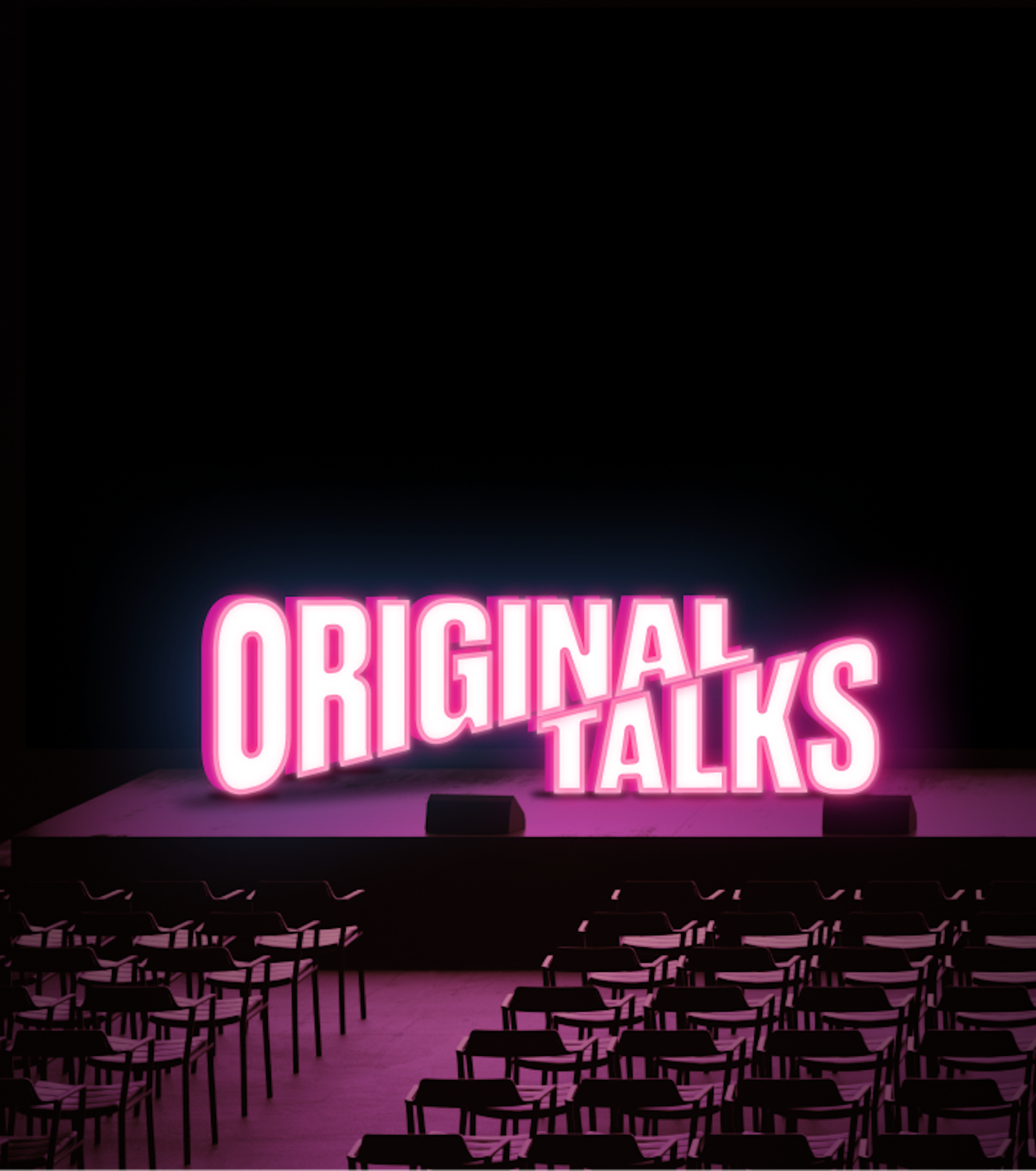
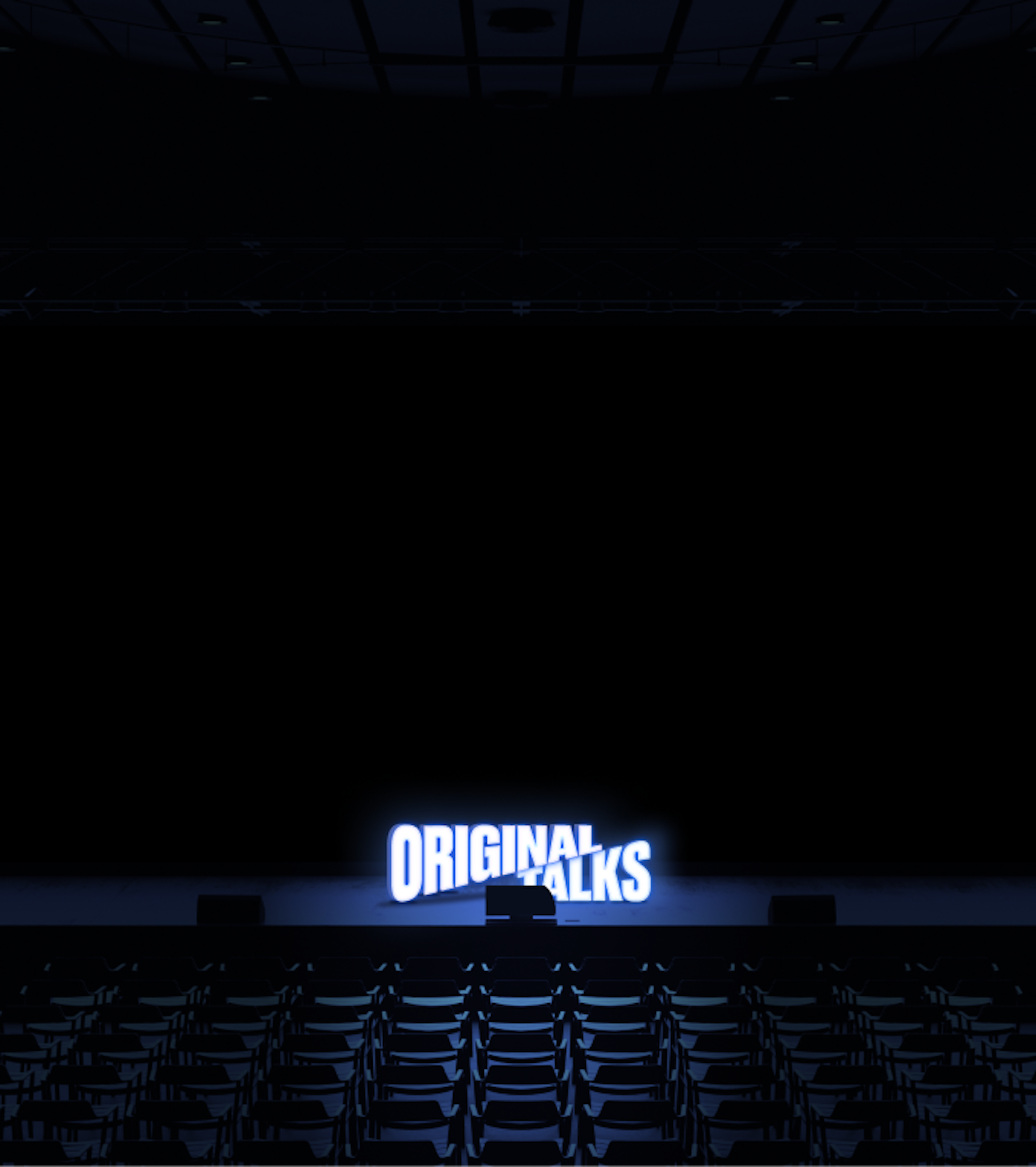
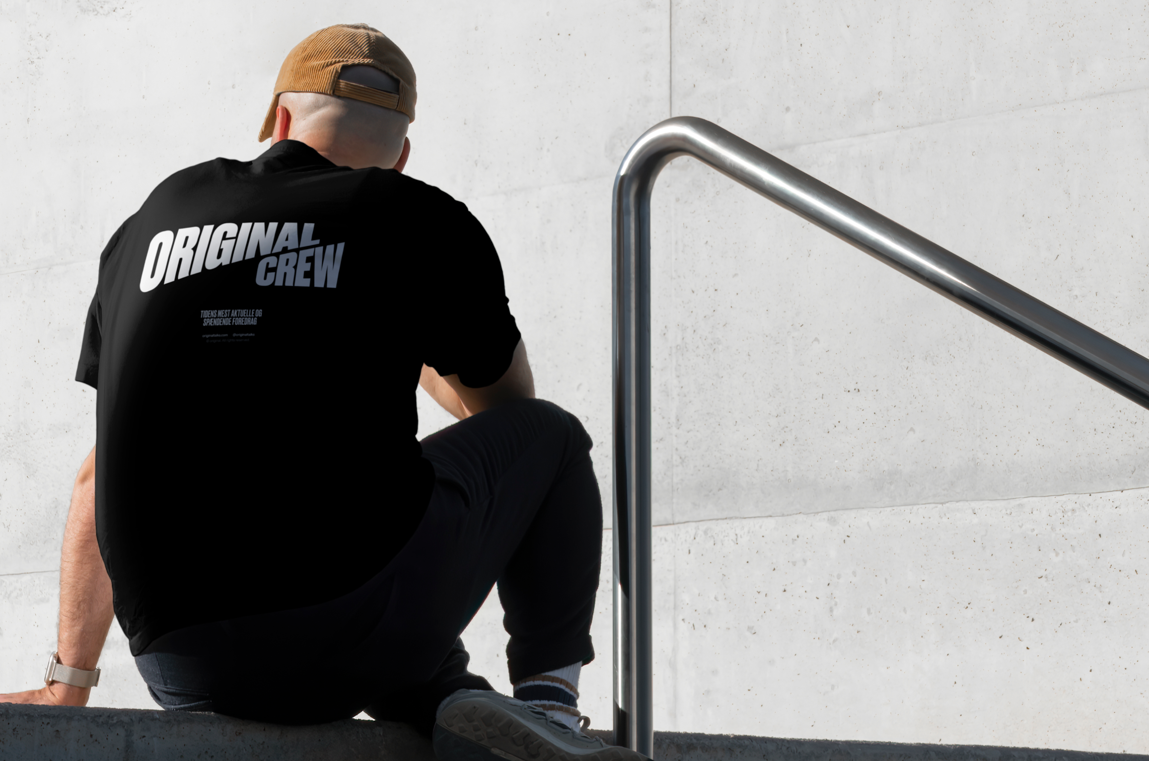
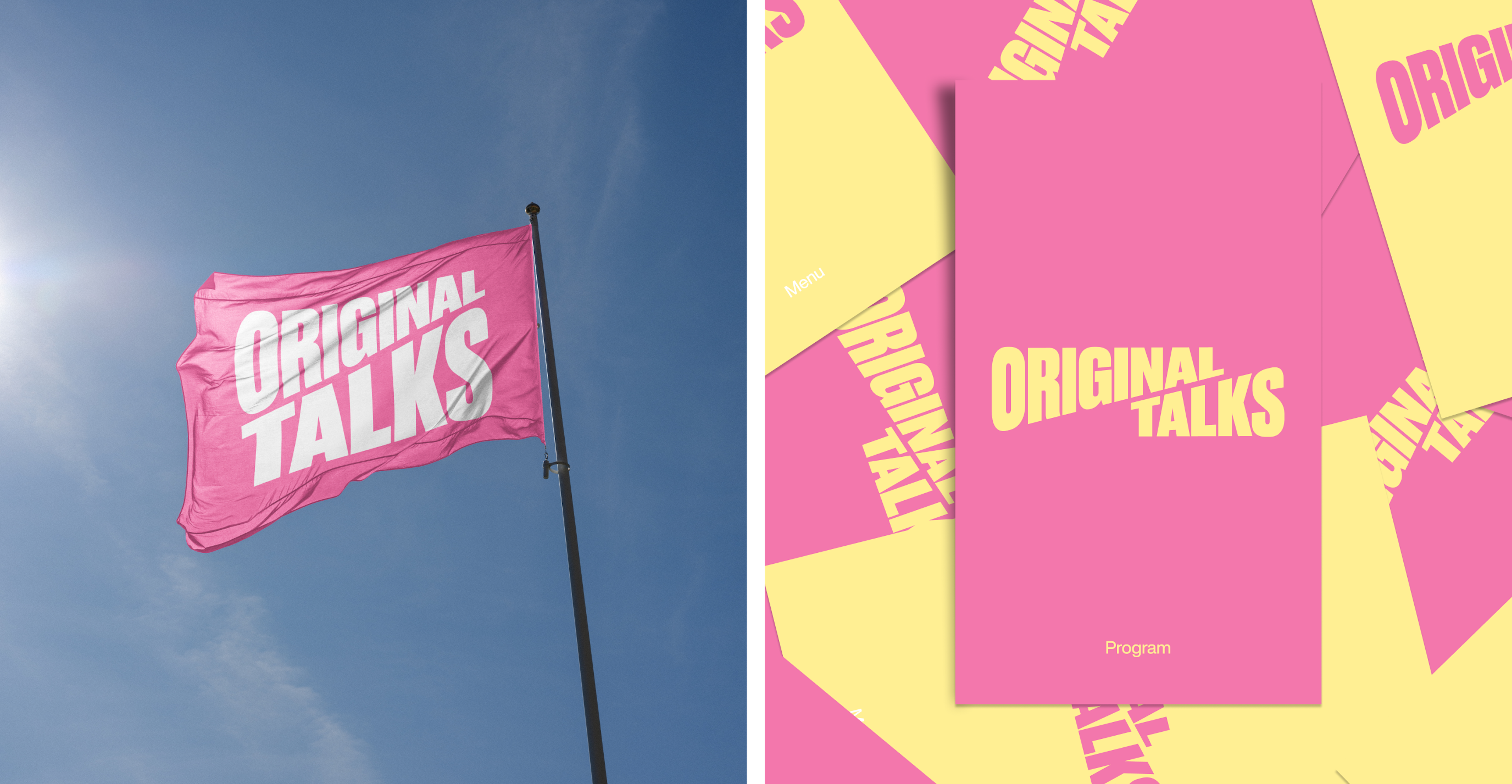
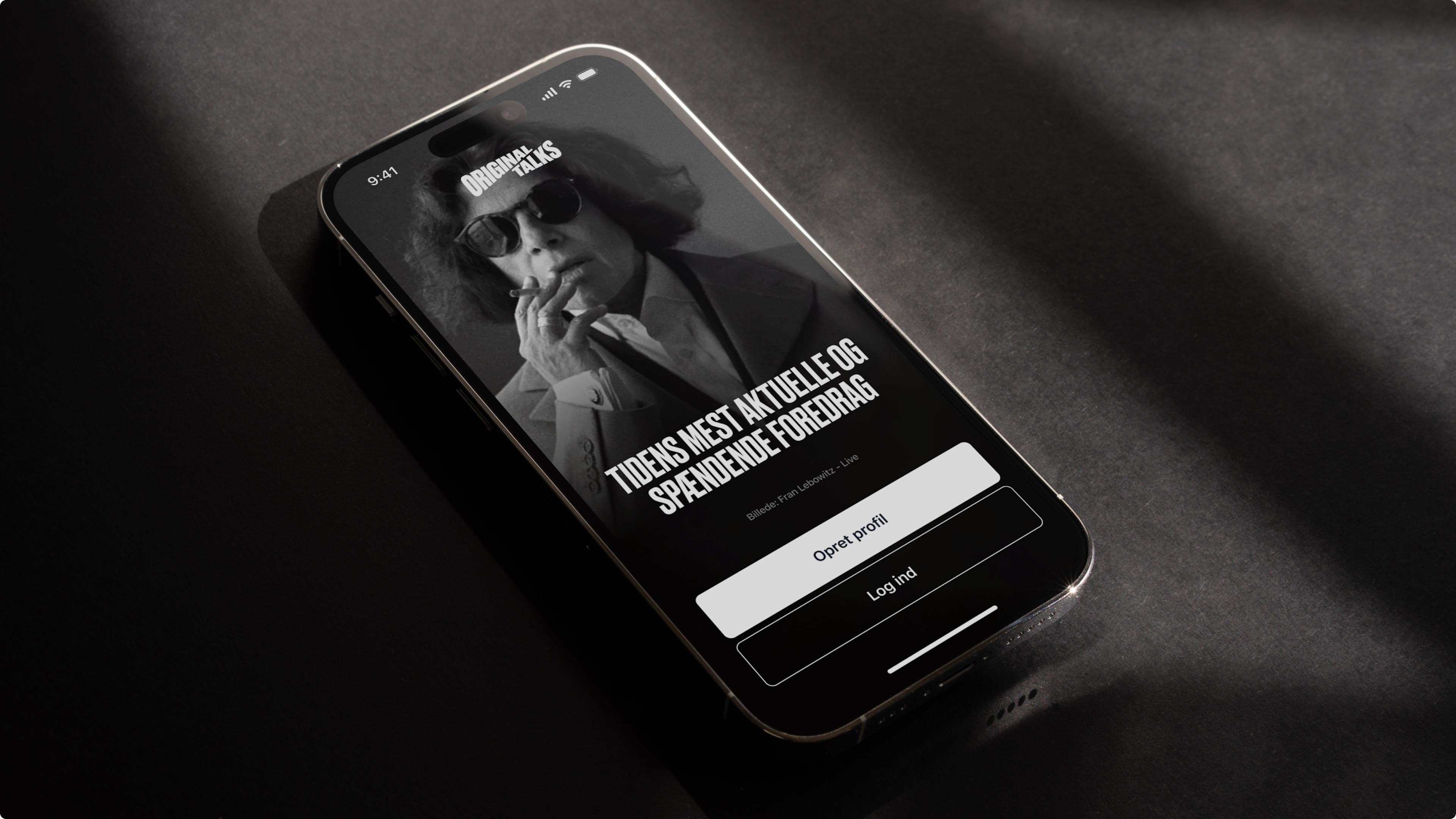
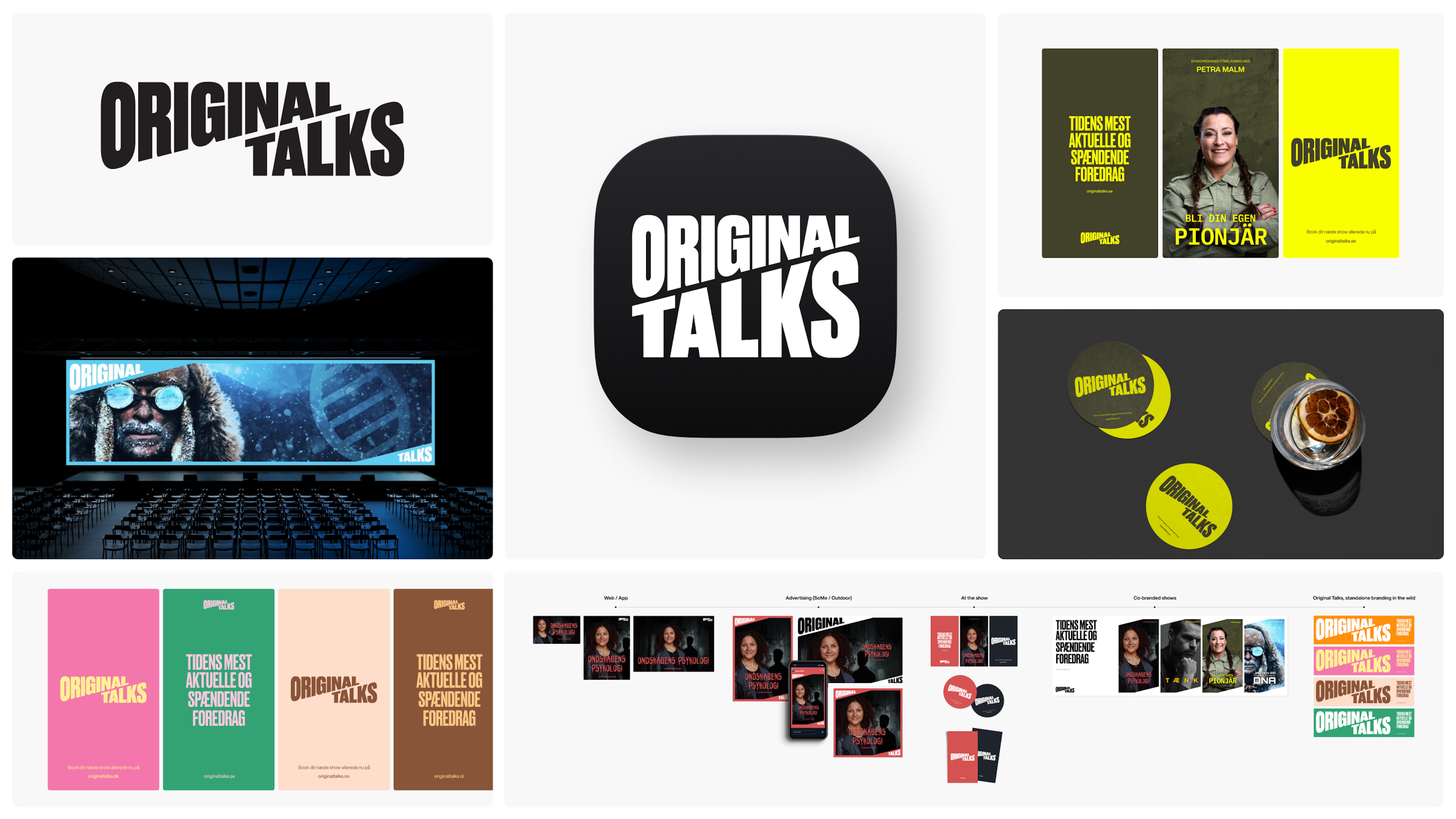
Things kicked off with a renaming process, landing on “Original Talks”—a name that encapsulates its mission to connect audiences with inspiring speakers. From there, a vibrant brand identity and website were developed to elevate the platform and its speakers.
Now, Original Talks is ready to compete with entertainment giants like Netflix and Disney, bringing people together for engaging and enlightening talks. With this rebrand, they’re poised for continued growth across seven new markets.
7 market launches
At the same time
26.000 tickets
Sold in the first month
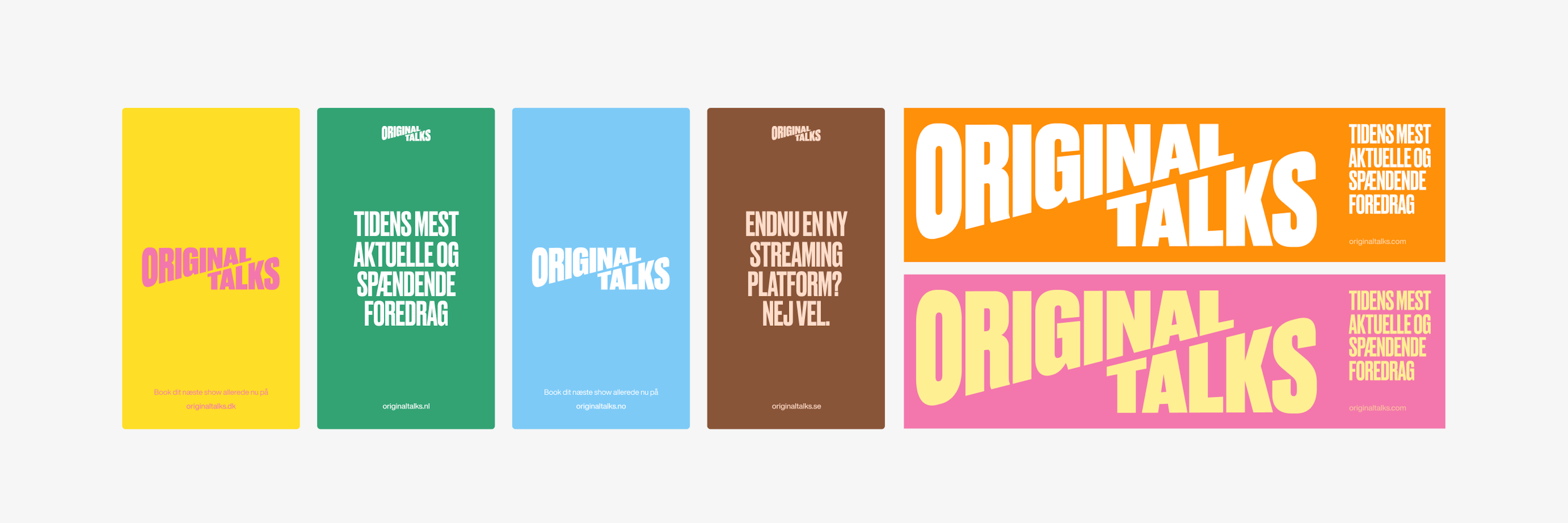
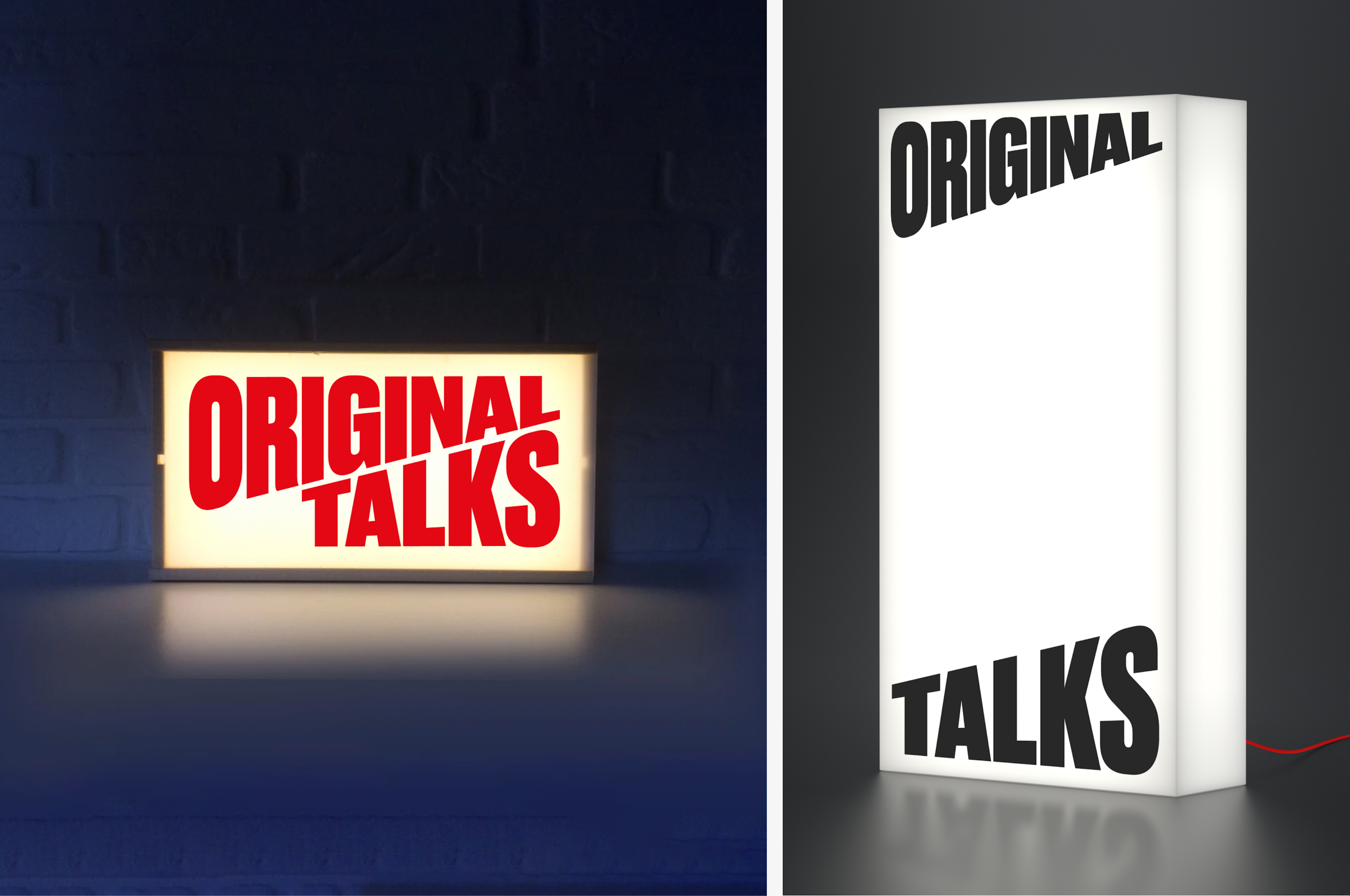
Old identity
New identity
Kudos to
Client Lead / Mathilde Ive
Project Manager / Oliver Alminde
Designer / Alexander Spliid
Designer / Martin Balle
Front - End developer / Frederik Højriis
Strategist / Gabby Olivas
In close collaboration with the Original Talks Team<3
Related work
Waitly
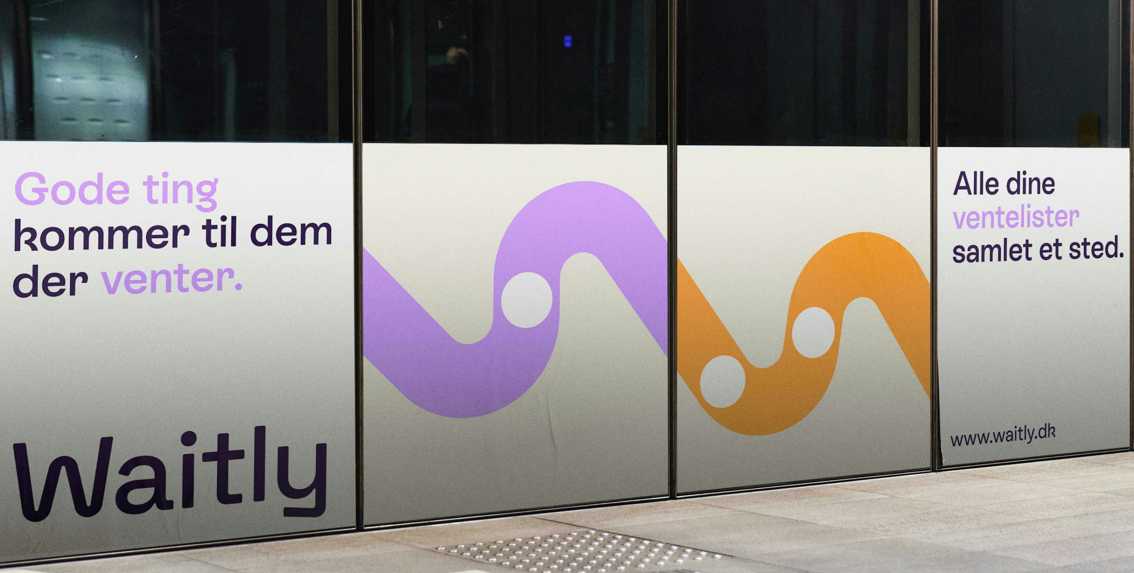
Good things come to those who wait
Client: Waitly
Partnership Lead: Sara Pallesen
Key Focus: Brand, E-commerce
Waitly is a pioneering SaaS company specializing in digital waiting lists, initially focused on the housing sector in Denmark and expanding into Germany. Recognizing the importance of adapting to diverse markets, Waitly began a journey to redefine its brand identity, aiming to appeal to its youthful audience while improving the digital user experience.
The outcome is a vibrant and playful brand identity. Waitly’s dedication to transparency lies at the core of its identity, exemplified by its new visual symbol: the “worm.” This straightforward yet meaningful graphic portrays a line of waiting with a dot representing an individual, capturing the essence of the company’s mission.